
Orange paint is having a moment in 2027, but we are not talking about the pumpkin-spice variety your aunt used in the 90s. This is elegant orange, burnt, peach, and vibrant shades that feel luxurious rather than loud. If you have been eyeing the trend but worried it might overwhelm your space, this article is for you.
We are walking through 28 real-room ideas that prove orange can be grown-up, from a single accent wall to a full-on velvet sofa moment. No neon, no regrets, just warm, confident color that makes a room feel intentional.
Boho bedroom oasis with a vibrant orange duvet
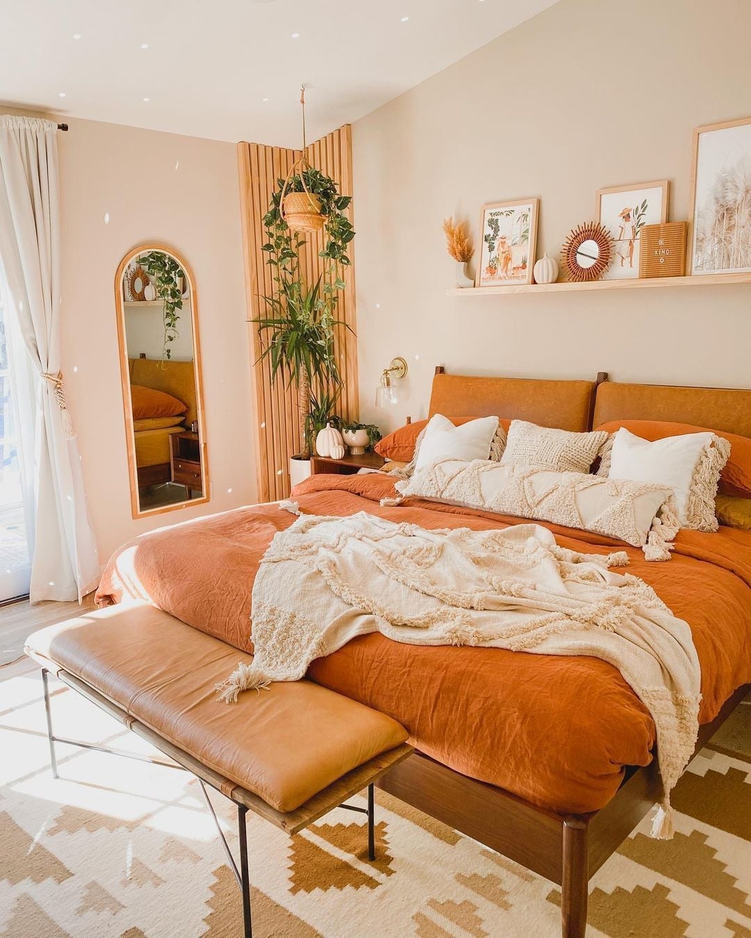
A roomy bedroom with a centered platform bed lets that vibrant orange bedding become the natural focal point, with cream, beige, and wood tones keeping the palette grounded. The leather bench at the foot of the bed adds a textural contrast to the woven textiles and the arched mirror on the side wall. A wall sconce provides a warm glow that complements the natural light. The boho style here looks curated rather than cluttered, with each piece from the hanging plants to the ceramic accents earning its place. What defines this look is the ratio of one bold color to several neutral ones, roughly one part orange to three parts calm.
Eclectic living room corner with bold orange walls
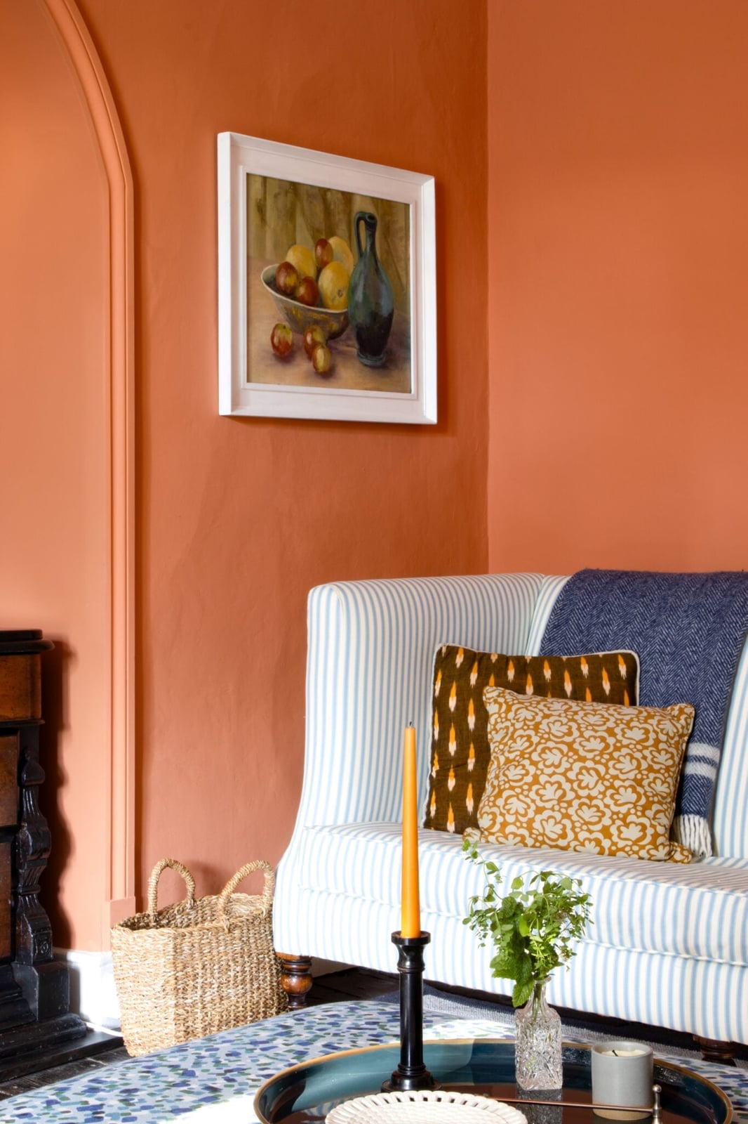
A compact corner vignette in an eclectic living room uses vibrant orange walls as the backdrop for a striped sofa that bridges blue, white, and brown tones. The dark wood cabinet and woven basket add natural texture, while the glass vase introduces a lighter element. The orange walls are the anchor, and the striped sofa breaks the solid color with its linear pattern. The palette here works because orange is the dominant hue, with blue and white appearing in smaller doses through the sofa and framed painting. For a similar setup, let the wall color lead and pull accent colors from the sofa pattern, keeping the overall ratio at about 60 percent orange to 40 percent everything else.
Bedroom sanctuary featuring striking orange walls
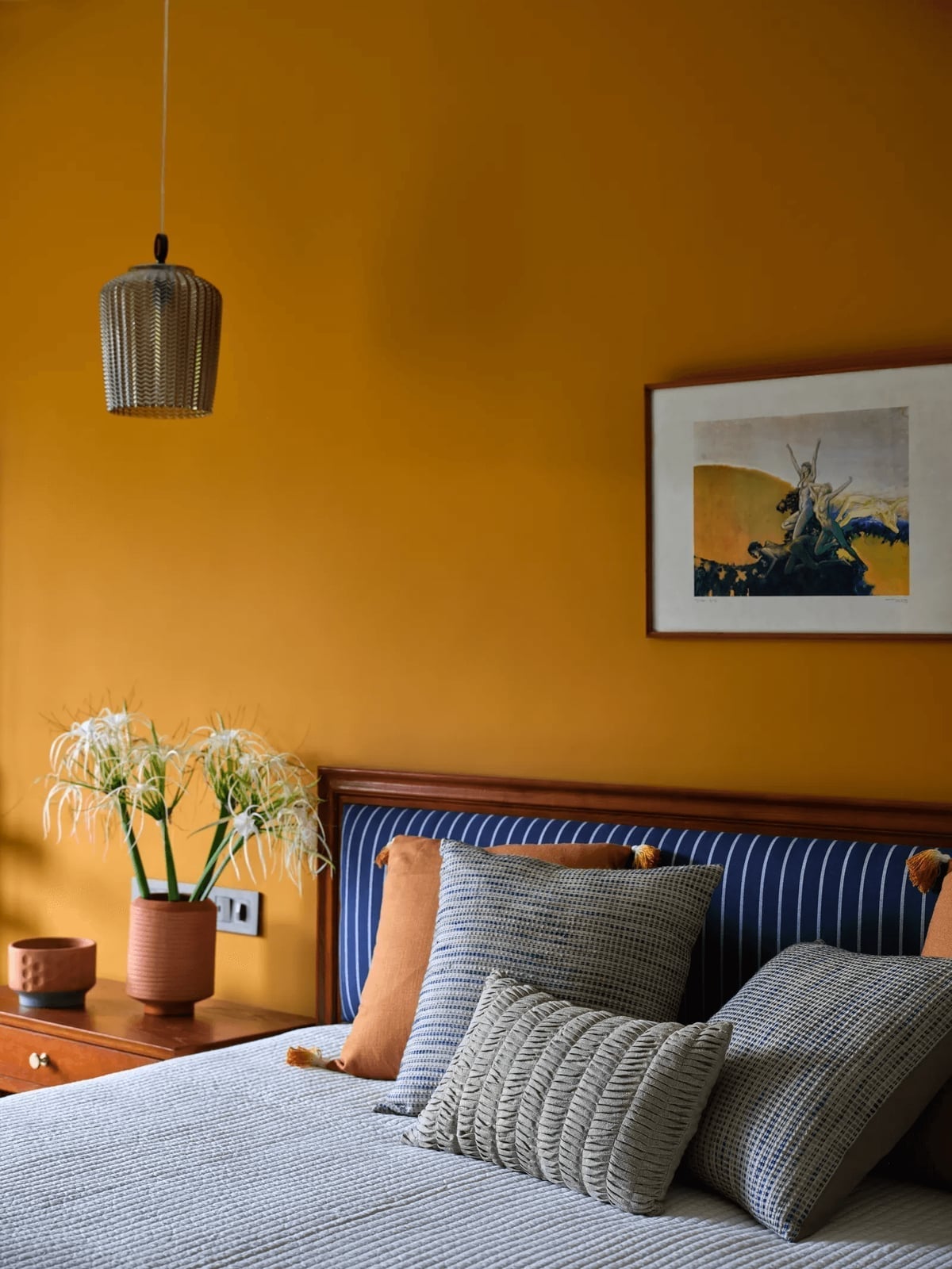
Can a bedroom feel both bold and restful at the same time? This roomy space proves it can, with striking orange walls setting an energetic backdrop and a bed with a blue and white striped headboard providing the visual counterpoint. Patterned pillows layer in more texture, and the bedside table in wood with a metal base keeps the look grounded.
The pendant light and ambient light soften the orange, making the palette feel warm rather than overwhelming. The style here is eclectic, with the orange walls defining the room and the blue and white stripes breaking the color in a deliberate way. The ratio leans heavily on orange, about 70 percent, with blue and white filling the rest. A terracotta accent on the bedside table ties back to the wall color without matching it exactly.
Watercolor swatch capturing orange hues
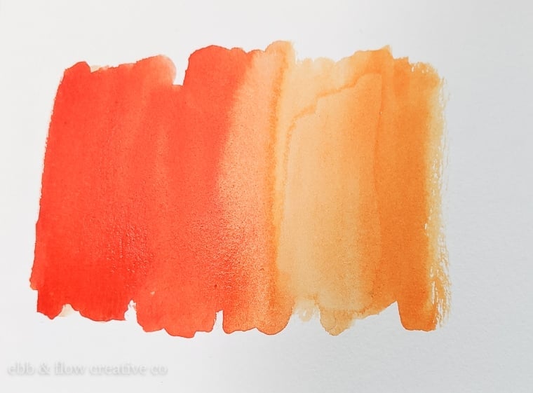
A single watercolor swatch on paper captures a gradient of orange hues that shifts from vibrant orange through soft peach to deep coral, all in bright, even light. This kind of swatch is a practical tool for seeing how orange behaves across its tonal range before committing to a full wall or piece of furniture. The gradient shows that orange is not a single note but a family of colors that can look energetic at one end and soothing at the other. For choosing an orange for your space, this swatch approach lets you compare undertones side by side, which is more reliable than relying on a single paint chip.
Textured burnt orange wall in a boho living room
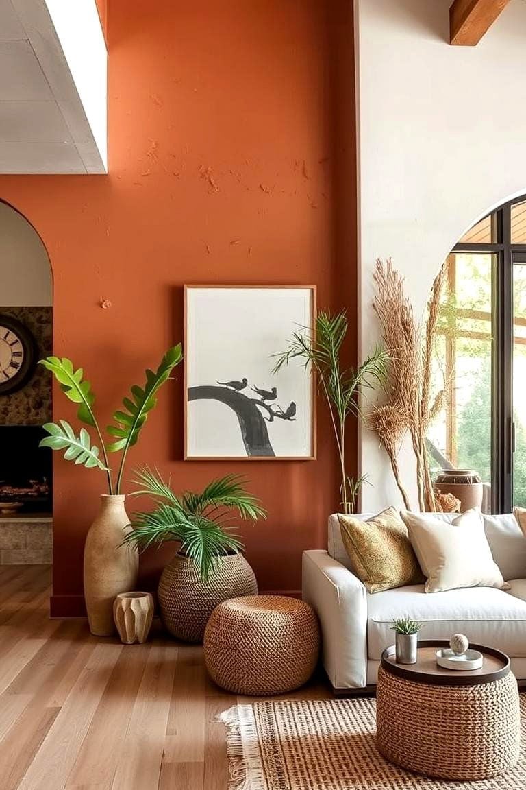
To use a textured burnt orange wall in a boho living room, let the wall finish do the visual work while keeping the furniture simple. Here, a cream sofa faces framed art, with wicker poufs in front and a large vase adding height. The plaster-like texture on the wall gives the burnt orange color depth, catching natural light in a way that a flat paint finish cannot. The cream sofa acts as a neutral anchor, and the wood, wicker, and linen materials reinforce the boho look. This setup works because the texture adds interest to the orange, so the room does not need patterned curtains or busy accessories to feel complete.
Modern kitchen with burnt orange and terracotta palette
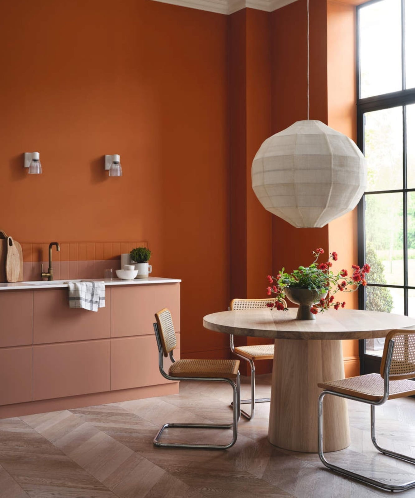
If the thought of a fully orange kitchen feels like too much, this modern space shows a more measured approach. The dining set anchors the room with a round pedestal table and cane chairs, while the palette stays grounded in burnt orange, terracotta, and wood tones. Open plan layouts need a visual anchor, and this dining area provides one without competing with the adjacent cabinetry. A large geometric pendant light draws the eye upward, which helps the room feel spacious. The materials mix wood, cane, and metal, so the orange feels deliberate.
Mid-century modern bedroom with geometric orange wallpaper
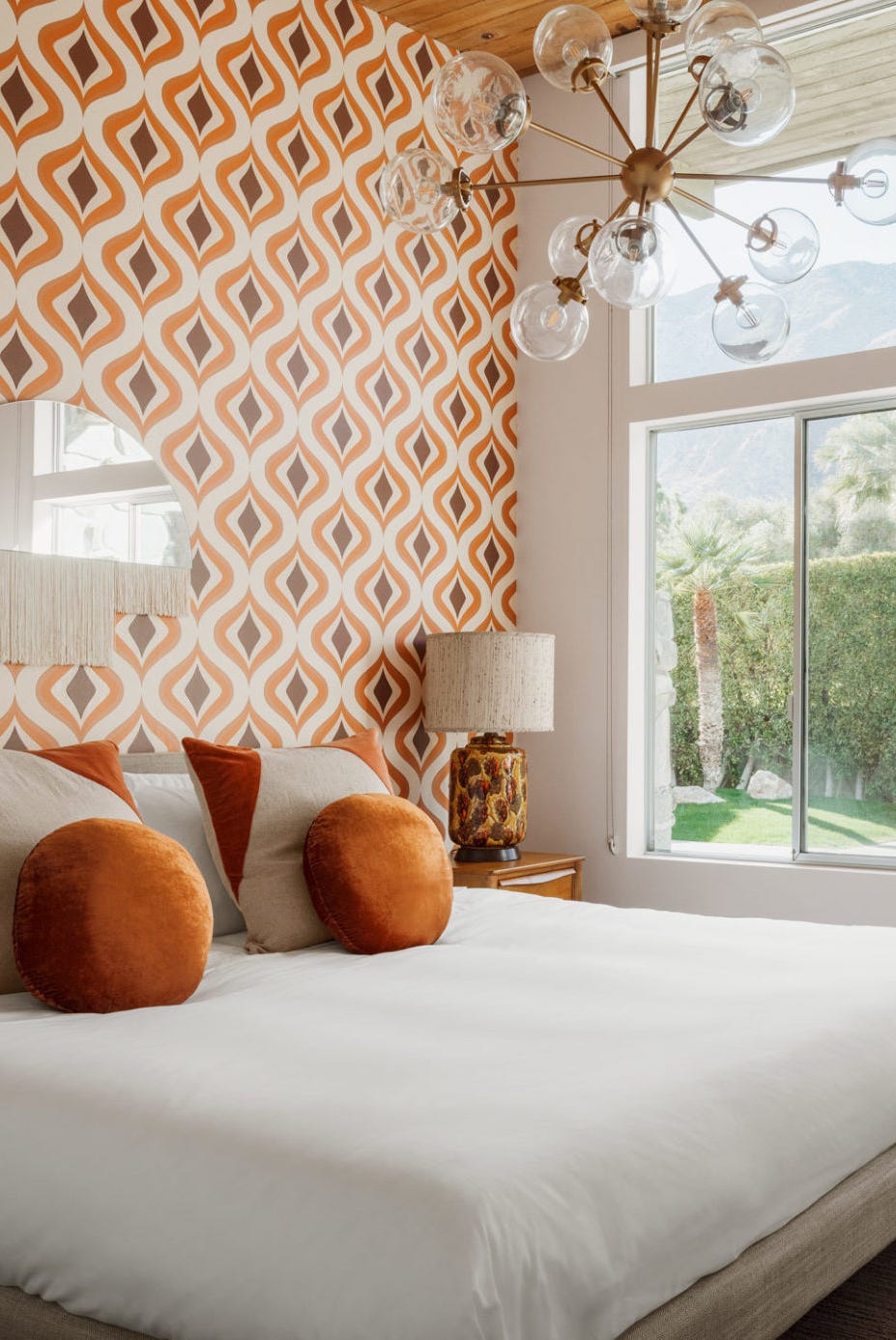
The geometric orange and brown wallpaper covers the accent wall behind the bed, and that single move defines the room’s mid-century character. Renter friendly by nature, wallpaper can be installed as a removable option, so this look works in a leased space. The bed faces the window, letting natural light play across the pattern throughout the day. Wood, glass, and textured fabric keep the palette from feeling flat, and the overhead chandelier adds a neat finish.
Traditional mantel display with orange accents
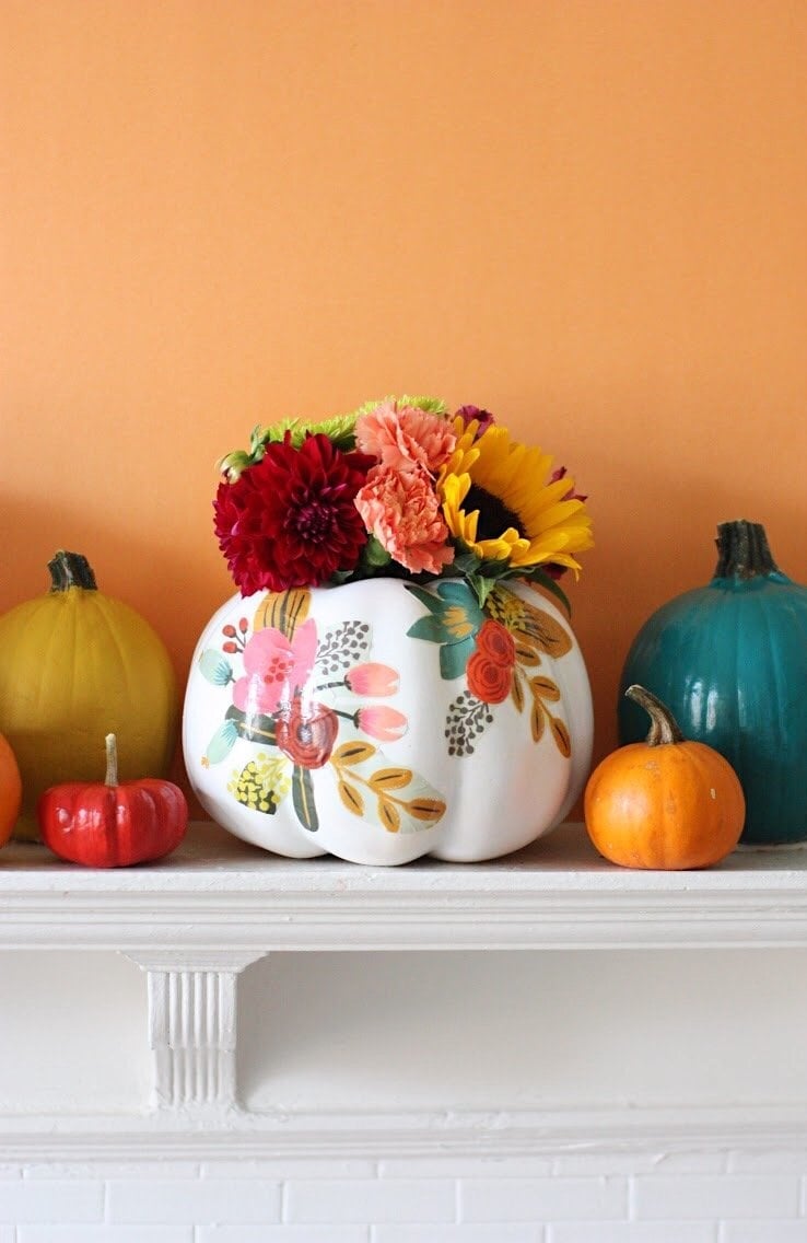
This mantel arrangement proves that orange works beautifully in a traditional setting. The painted pumpkin vase holding flowers acts as the hero element, surrounded by assorted decorative pumpkins in orange, yellow, red, and teal. The compact shelf display benefits from a mix of heights and shapes, so the eye travels across the arrangement without landing on any one spot. Adding a few white and green pieces keeps the display from feeling too warm, and the light helps the ceramic finishes glow.
Elegant vignette with a warm orange wall
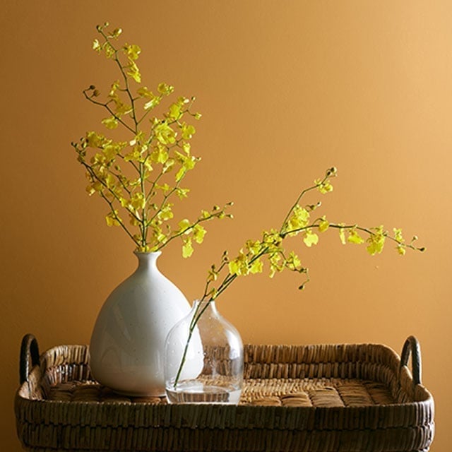
Can a warm orange wall feel elegant without extra decoration? This vignette says yes. The wall color itself is the hero, and the supporting pieces stay minimal: two vases in ceramic and clear glass sit on a wicker tray. The yellow flowers add a fresh contrast without overwhelming the orange. When working with a bold paint color, limit the accessories to a few well-chosen pieces. The wicker texture introduces a natural element that softens the overall look, and the clear glass vase keeps the composition light.
Illuminated "good morning" lamp on a nightstand
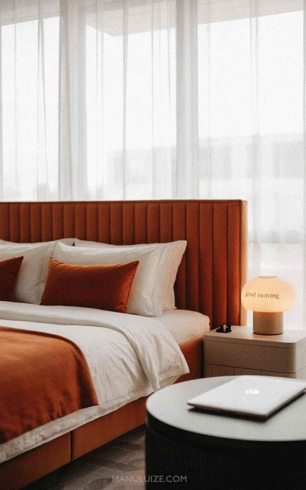
The orange tufted headboard is the standout piece in this modern bedroom, and its scale makes the room feel generous. A table lamp on the nightstand provides ambient light, which highlights the fabric texture of the headboard. The burnt orange, white, and beige palette keeps the space calm while still adding color. When choosing a headboard for a roomy bedroom, consider the proportion: a tall tufted style anchors the bed and defines the sleeping area without needing additional wall decor.
Warm glow from a lit candle on a mantel
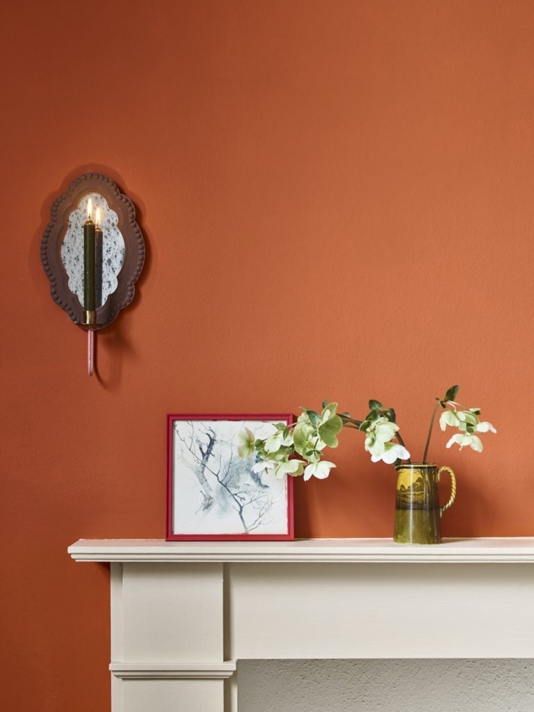
A burnt orange wall works best when it has company. Here the mantelpiece display does the job, with cream and green accents that keep the palette from going too dark. The candlelight and wall sconce add warmth, while the framed art and floral arrangement break up the painted plaster. This is a style that leans traditional but stays relaxed, letting the orange wall act as a backdrop rather than the whole show.
Curved beige sofa against textured orange walls
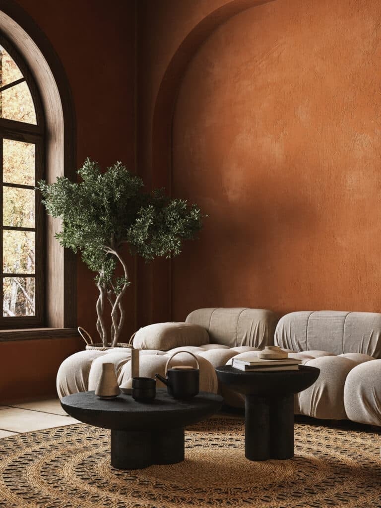
A beige sofa might seem safe next to orange walls, but the curved shape here gives it presence. The palette is orange, beige, black, and natural jute, with the sofa and round coffee table sitting on a patterned rug. The arched window lets in natural light, and the potted plant beside the sofa adds a soft, organic note.
The materials tell the story: plaster walls, fabric upholstery, wood and jute on the floor, ceramic for the plant. Nothing feels precious. The orange walls are textured, so they catch light differently than a flat finish would. If you want orange walls without the full commitment, this is the approach. The beige sofa and neutral rug keep the room grounded, and the black accents add a bit of edge.
Vibrant rumba orange paint for grown-up interiors
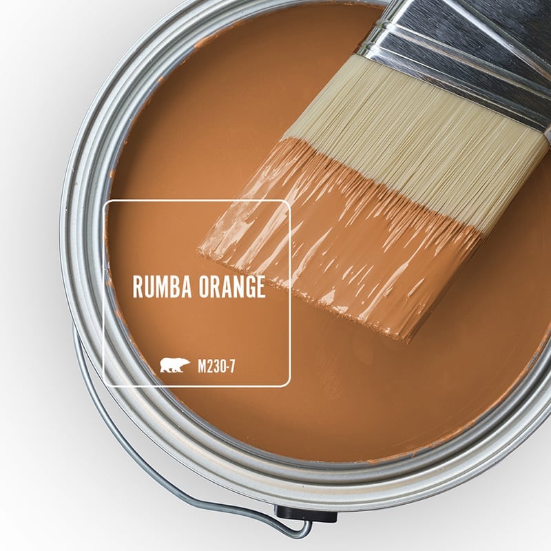
A paint can is a paint can until you notice the color. This one holds a vibrant orange that is grown-up, not loud. The metal can and wooden brush handle are standard, but the shade itself is what matters. It is a warm, saturated orange that could work on walls, furniture, or an accent piece. The key is to use it in a room with enough natural light or warm lighting to keep it from feeling flat.
Stone fireplace with a striking orange accent wall
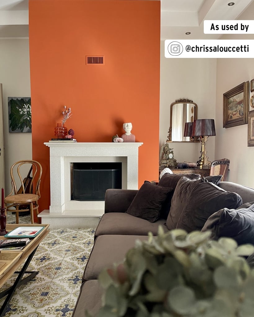
This room makes a clear statement: the orange accent wall is the focal point, and the stone fireplace is the anchor. The palette runs from cream and brown to blue and green, with the orange wall tying it all together. The sofa and armchair face the fireplace, and the table lamps and ceiling lights provide even illumination. The mirror above the fireplace reflects light back into the space. The eclectic style works because the orange wall is bold but the neutral tones in the room keep the look balanced.
Plush orange velvet sofa anchors a living room
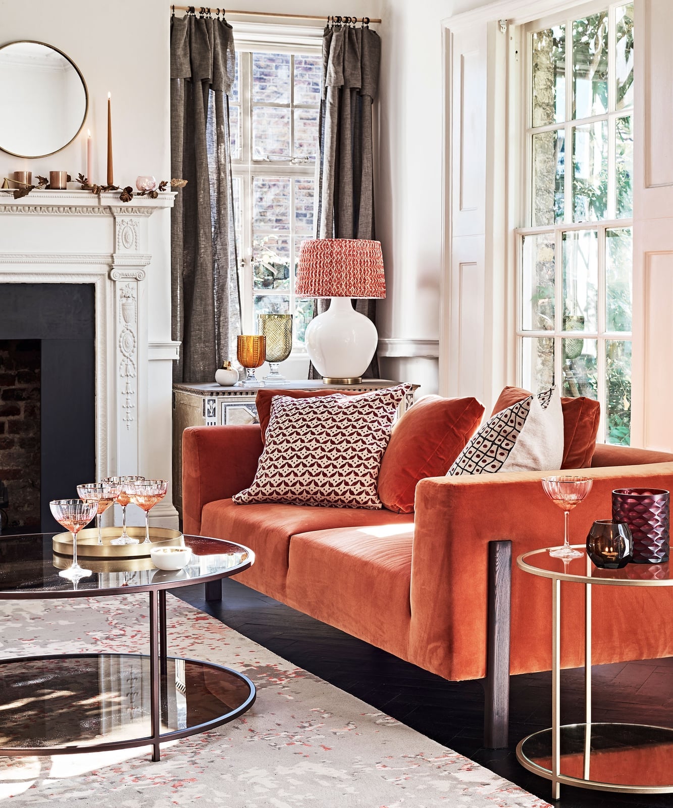
A plush orange velvet sofa can anchor a room without overwhelming it. Keep everything else simple. Here the palette is orange, white, gray, gold, and brown, with the sofa facing the fireplace and a round coffee table in front. Windows and a table lamp keep the space bright, while the side table and fireplace add function.
The velvet fabric gives the sofa a soft, inviting look, and the gold and brown accents add warmth without clutter. The room feels roomy because the layout is open: sofa to fireplace, coffee table in between. If you want a bold sofa but worry about it taking over, pair it with neutral walls and a simple rug. The orange will still stand out, but it will feel deliberate rather than loud.
Tall fluted velvet headboard anchors a bedroom

A tall fluted velvet headboard in burnt orange is the kind of piece that makes a room feel finished before you add anything else. The platform bed sits centered, flanked by simple nightstands and table lamps, with a small ottoman at the foot for balance. The velvet brings a softness that keeps the strong orange from feeling harsh, while the white and brown around it let the headboard carry the color. If you want the same anchor without the commitment, a painted wood headboard in a similar orange tone costs less time and money to swap out later.
Peach wall with a striking diamond pattern
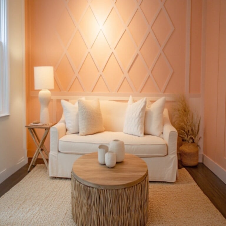
A bold wall pattern like this peach diamond design works best when the room stays quiet. The diamond pattern covers the wall behind the sofa, with a cream sofa, beige rug, and white vases keeping the palette simple. The round coffee table and floor lamp in natural materials like wood and rattan add texture without competing. This approach works well for renters because a patterned wall can be a peel-and-stick wallpaper or a stencil project that comes down cleanly. The peach tone is warm and modern, and the cream and beige keep it from feeling busy.
Mid-century modern bedroom with abstract orange artwork
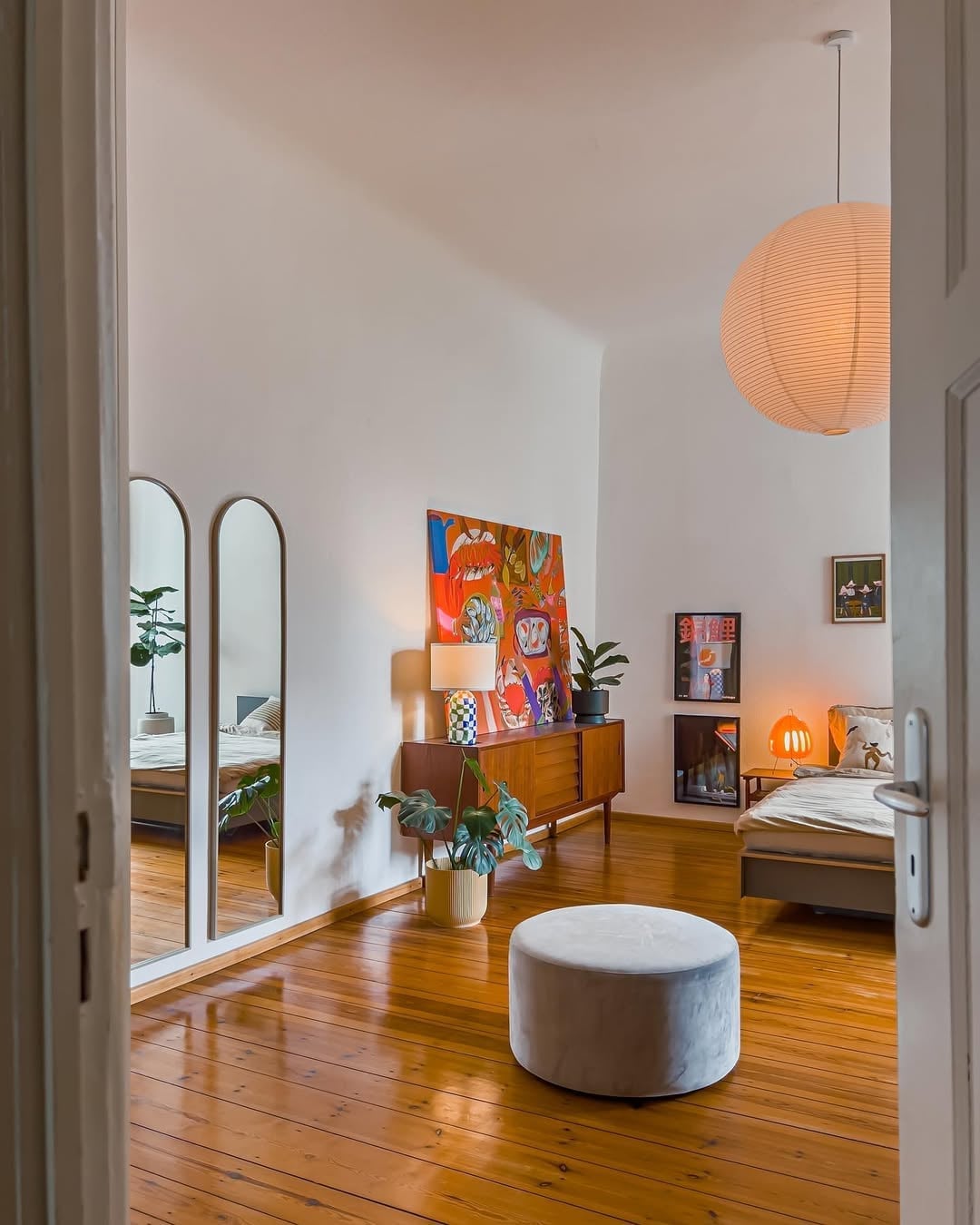
A mid-century modern bedroom can lean on a single bold piece to define the palette. The abstract artwork here uses orange, red, and yellow against white, with green and brown grounding it. The bed sits on the right, a mid-century sideboard on the left, and a round ottoman in the center. The pendant light and table lamps provide ambient and task light.
Where a room with orange walls asks the whole space to carry the color, this setup lets the artwork do the work. The sideboard and lamps stay neutral in wood and glass, so the painting becomes the focal point. It is a good way to add warmth without painting a full wall.
Gray sectional sofa with orange throw pillows
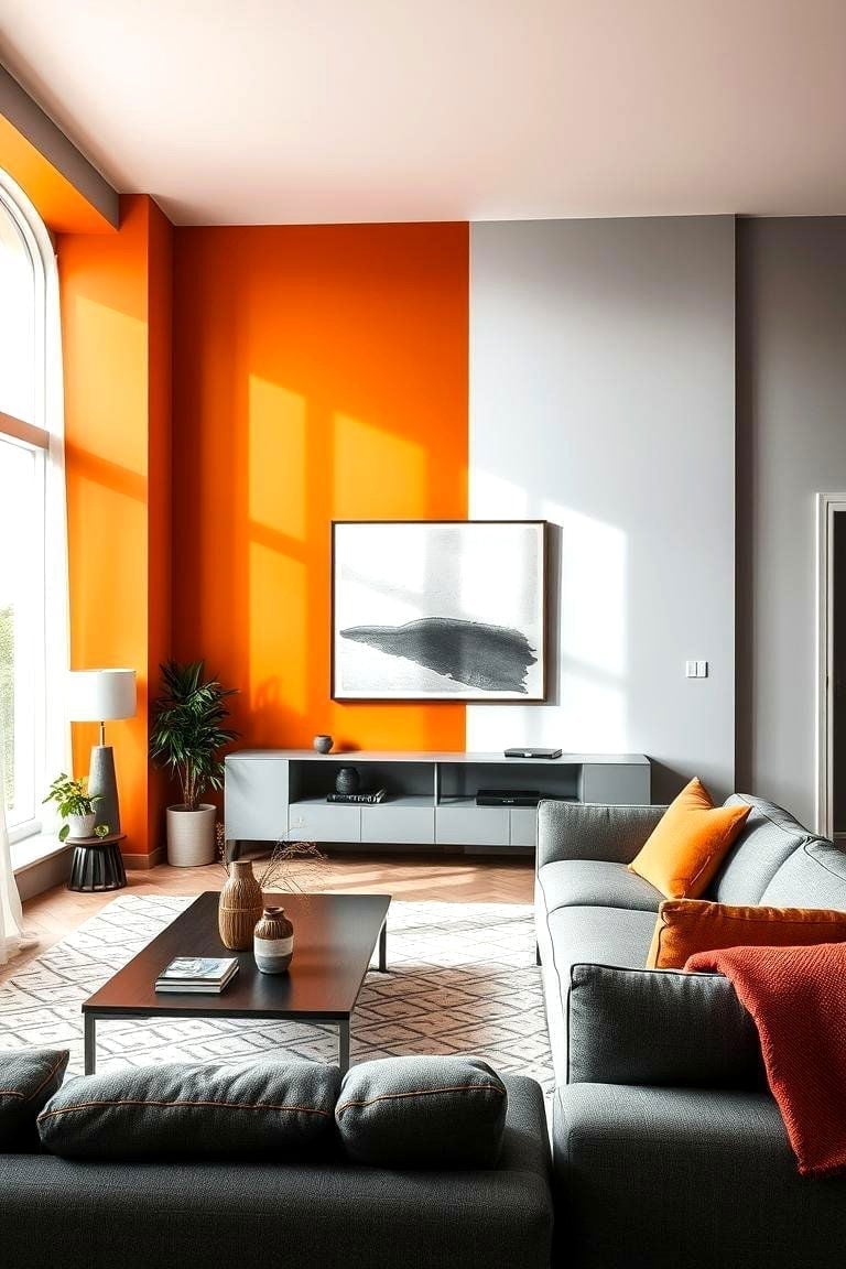
An orange accent wall behind a gray sectional sofa creates a clear contrast that feels intentional. The gray fabric cools the orange, while the white and black in the media console and floor lamp add structure. The open plan layout keeps the sofa facing the wall, with natural light from a window balancing the warmth. The orange throw pillows on the gray sofa tie the two colors together. This palette works because the gray is neutral enough to not fight the orange, and the white and black keep the room from feeling one-note.
Modern bedroom with illuminated orange shelving
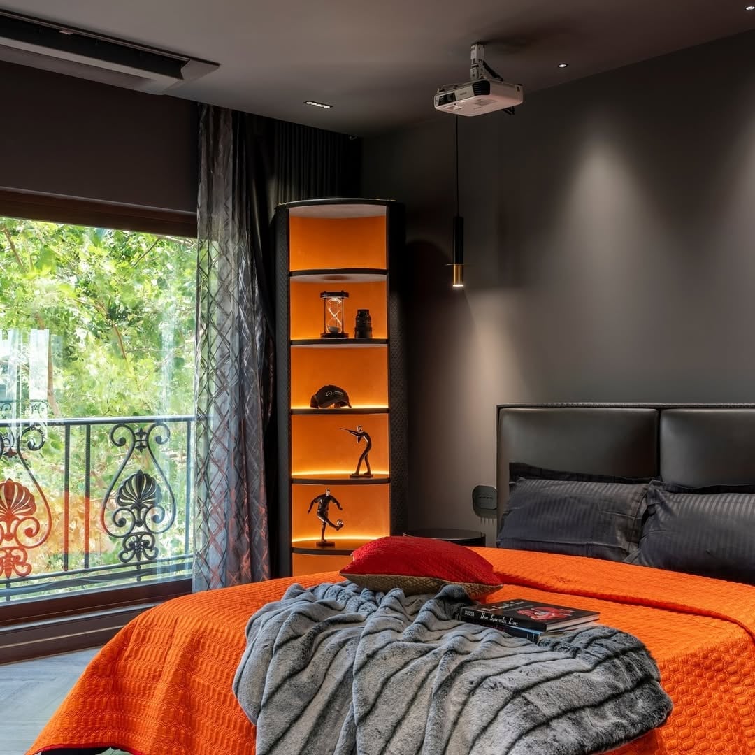
An illuminated shelving unit in orange works as both storage and a light source. The unit sits beside the window, with the bed facing the wall and a projector casting light from overhead. The orange shelves glow against the dark gray walls, and the pendant light adds a second layer of ambient light. The scale of the unit matches the roomy feel of the bedroom, so it does not crowd the space. For a similar effect without built-in wiring, place a floor lamp with an orange shade next to a dark bookcase to create a warm glow.
Cozy boho living room corner with burnt orange walls
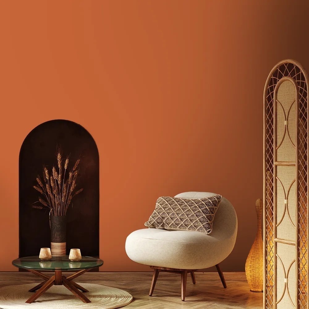
Keep the layout simple when the wall color is this strong. A corner vignette with a round armchair, a glass coffee table, and a rattan screen lets the burnt orange wall do the work. The arched niche filled with dried wheat becomes the focal point without competing for attention. Ambient light from a floor lamp and natural daylight keep the space from feeling too heavy.
This is style mode in action: the burnt orange, cream, dark brown, and natural wood tones define the boho look. What breaks it would be adding too many patterns or another bright color. The ratio here is about 60 percent warm neutral, 30 percent burnt orange, and 10 percent dark accents. That keeps the room grounded while the orange wall remains the star.
Cream boucle sofa against vibrant orange walls
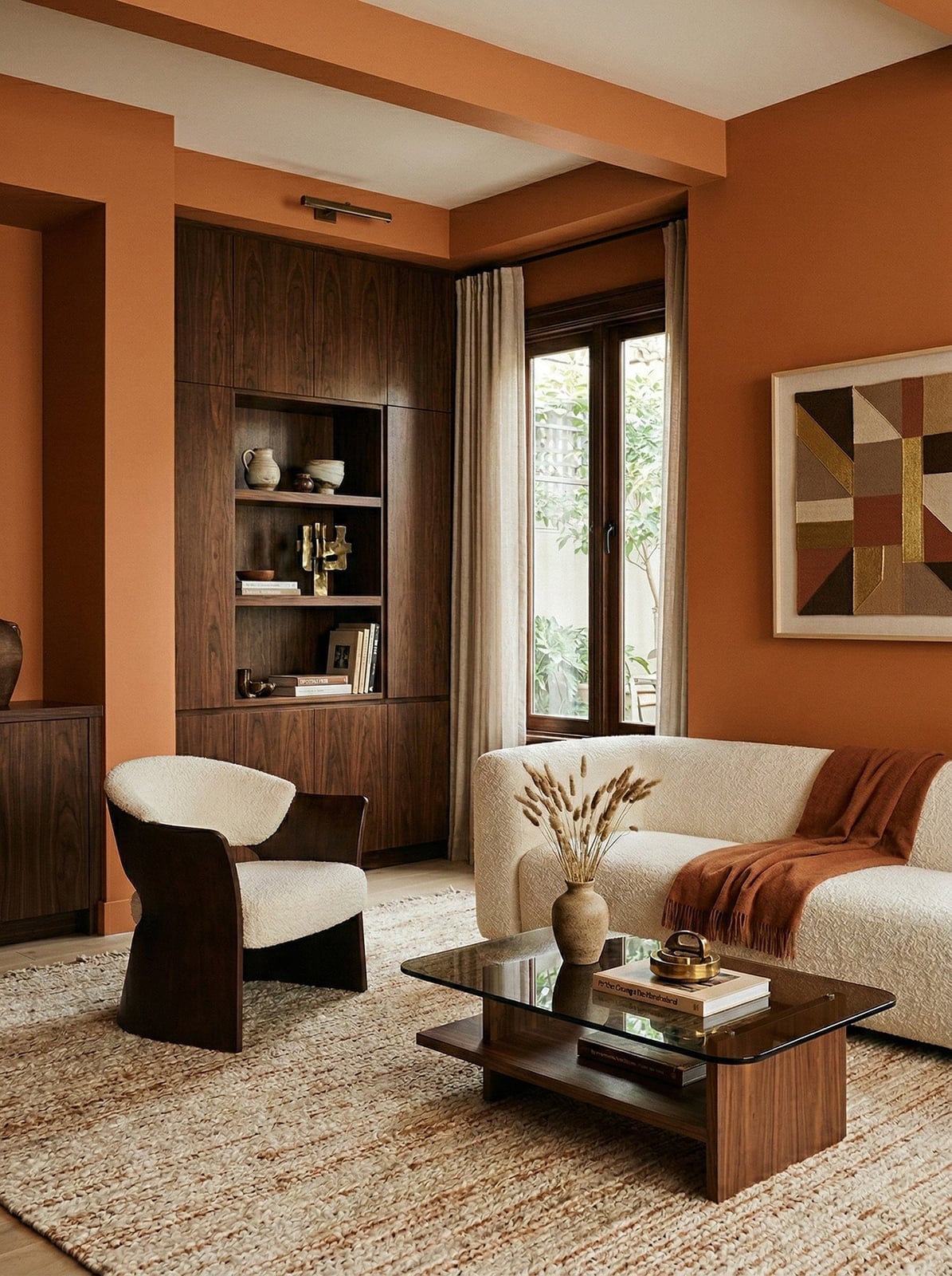
The palette works because the orange walls are the high-energy anchor, and the cream boucle sofa provides a soft, textured counterpoint. Brown wood tones and a neutral woven rug bridge the two extremes. A sculptural armchair and a glass coffee table keep the look modern. Overhead track light and window light make the orange feel warm without being overpowering. The ratio is roughly 40 percent orange, 40 percent cream, and 20 percent brown, which lets each material stand out.
Pops of orange in throw pillows and vases
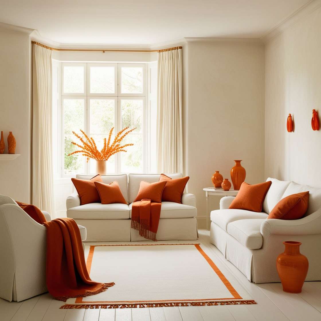
To use orange as an accent, keep the base neutral and let the orange do the talking. Here, cream walls and white furniture create a blank canvas. Two sofas face each other, with an accent chair off to the side, and the orange shows up in throw pillows and ceramic vases. The natural light hits the orange accents evenly, making them feel intentional. The materials stay simple, fabric, ceramic, wood, so the orange pops without clutter. This setup works for anyone who wants the energy of orange without committing to painted walls.
Dark brown velvet sofa against burnt orange wall
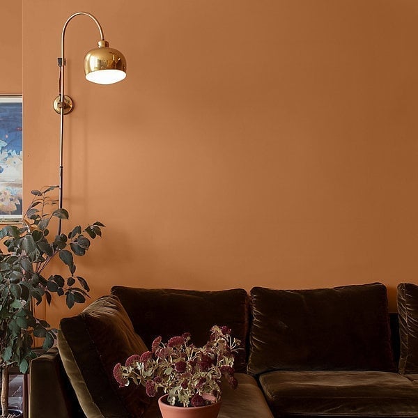
Some might reach for a lighter sofa against a bold wall, but this setup proves the opposite can work. A dark brown velvet sofa against a burnt orange wall creates depth that a pale piece would not. The brass wall lamp above adds a warm glow, and the green plant introduces a natural break. The hero element here is the wall paint itself, the burnt orange sets the mood, and the sofa grounds it.
The lighting is key: a single wall lamp casts a focused pool of light that highlights the velvet texture and the wall color. Without that directed light, the dark sofa could blend into the dark wall. The brass finish adds a reflective note that keeps the corner from feeling flat. This is a modern living room where the layout is simple, sofa against the wall, lamp above, and the color pairing does the heavy lifting.
Woven rattan plates on vibrant orange walls
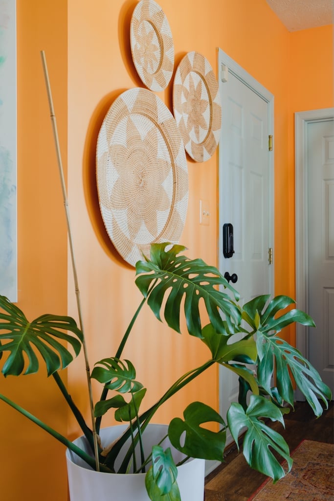
The precise observation here is that the woven rattan plates are not just decor; they function as a textural relief against the flat orange wall. In a compact hallway, wall-mounted decor above a potted monstera and a bamboo stalk creates a vertical rhythm that draws the eye up. The natural light hits the woven surfaces, casting soft shadows that add depth. The white ceramic pot and the green leaves break up the orange and tan palette, keeping the vignette from feeling one-note. This is a boho hallway where the storage is minimal, but the visual storage of pattern and texture fills the space.
Gleaming vibrant orange paint finish on vintage car
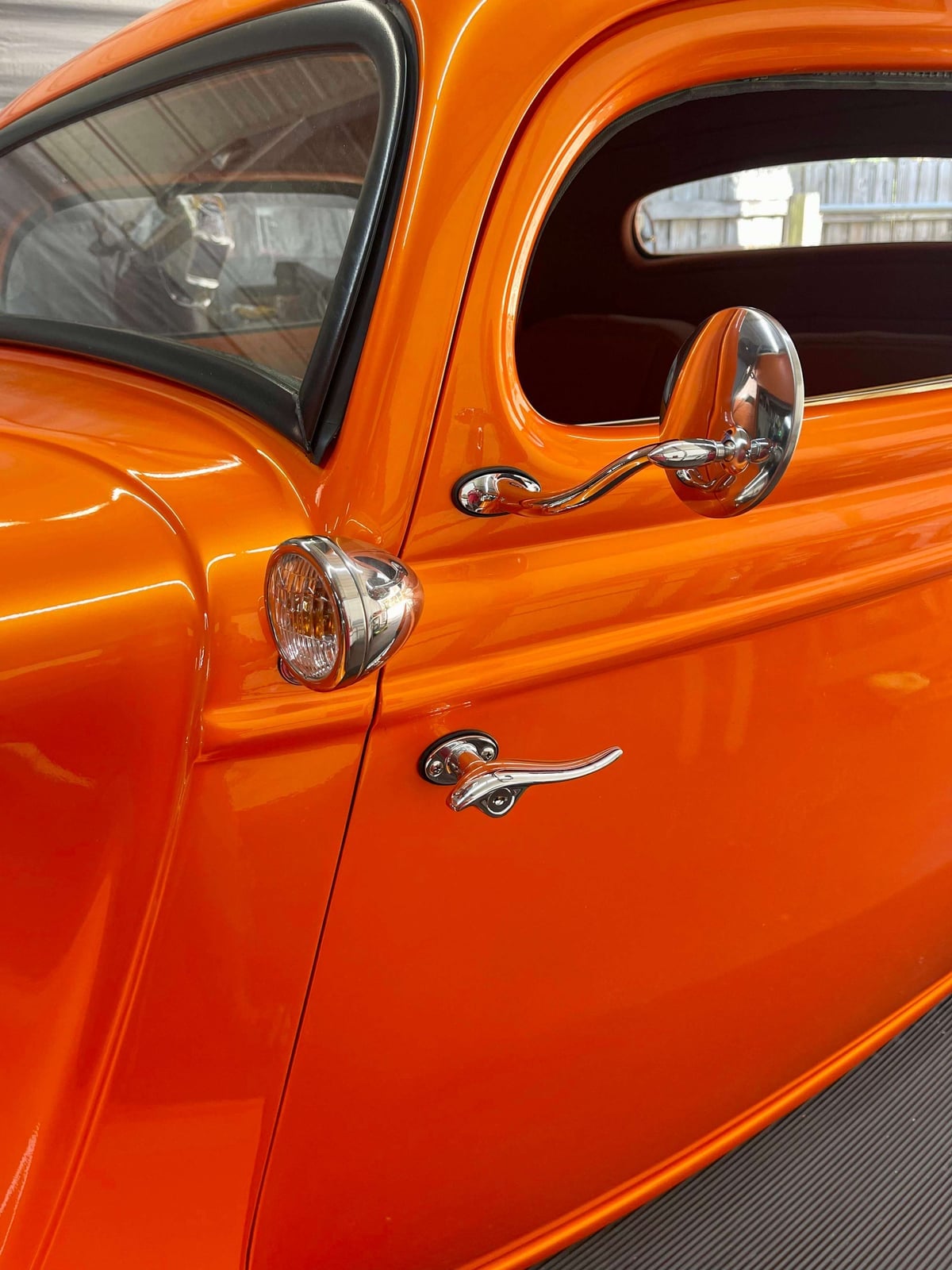
A vintage car body in bright orange shows how a bold paint choice can define a whole look. The vibrant orange paint finish on the metal door panels catches the light, while chrome accents on the side mirror, headlight, and door handle add contrast. Dark gray rubber trim and glass keep the palette grounded. This is a style that leans into saturation and gloss, using the car’s original details as natural partners. What breaks the scheme would be matte black or plastic parts, which would dull the interplay between shine and color. The ratio here is heavy on orange, with chrome as the secondary note and dark gray as a quiet anchor.
Rich vibrant orange paint for bold design choices
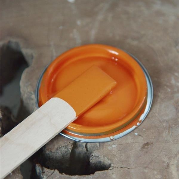
A can of rich orange paint with a wooden stirrer inside might look like a simple supply shot, but it points to a bigger question: how to use a color this bold without committing to a full wall. Renters know the hesitation. A rich orange paint like this one, with its warm, full-bodied tone, works as a temporary accent when applied to a single piece of furniture or a large canvas. The 2027 trend toward fearless color makes it easier to find inspiration, but the practical step is to test the shade on a poster board first.
Eclectic living room with a vibrant orange velvet sofa
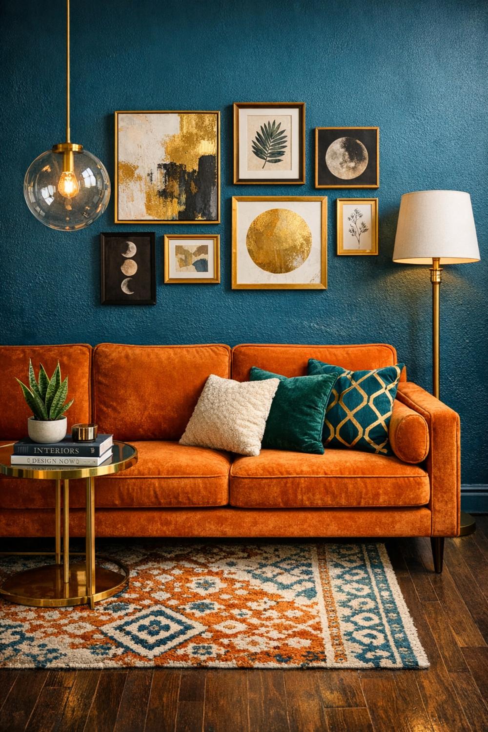
An orange velvet sofa anchors an eclectic living room with teal walls, a gallery wall above it, and a patterned rug in front. The velvet texture softens the bright color, making it feel inviting rather than loud. Brass and glass details on the side table and a globe pendant light add warmth, while the floor lamp provides ambient glow. Dark wood furniture keeps the palette from floating. The key to this look is balance: the orange sofa is the hero, but the teal, gold, cream, and dark wood around it give the room depth.
Final Thoughts
Orange paint in 2027 is not a dare; it is a choice. The rooms here show that the key is balance, pairing a bold wall with quiet neutrals, or letting a single orange piece anchor the whole space. Before you buy a gallon, test a few swatches at different times of day. Natural light shifts orange from coral to clay to copper, and what works in a south-facing living room might feel too heavy in a north-facing bedroom. If you rent, stick to peel-and-stick wallpaper or removable decals on one wall. For homeowners, a matte finish hides imperfections better than satin on textured walls. Keep the rest of the room simple: cream, beige, charcoal, or warm wood. That is what lets orange look elegant instead of exhausting. 28 looks that actually work.