
Christmas wrapping is the first impression your gift makes, and getting it right sets the tone for the whole season. These 20 pretty gift wrap ideas show you how to mix paper, ribbon, and natural accents for a look that feels thoughtful and put together. From elegant teal and botanical prints to rustic kraft paper and minimalist sage, there is something here for every style and skill level.
You get practical inspiration for choosing wrapping materials that work with your decor and your gift recipient’s taste, without overcomplicating the process. Each look focuses on one strong idea so you can recreate it or adapt it easily.
Elegant Teal Gift Wrap with Botanical Accents and Wax Seal
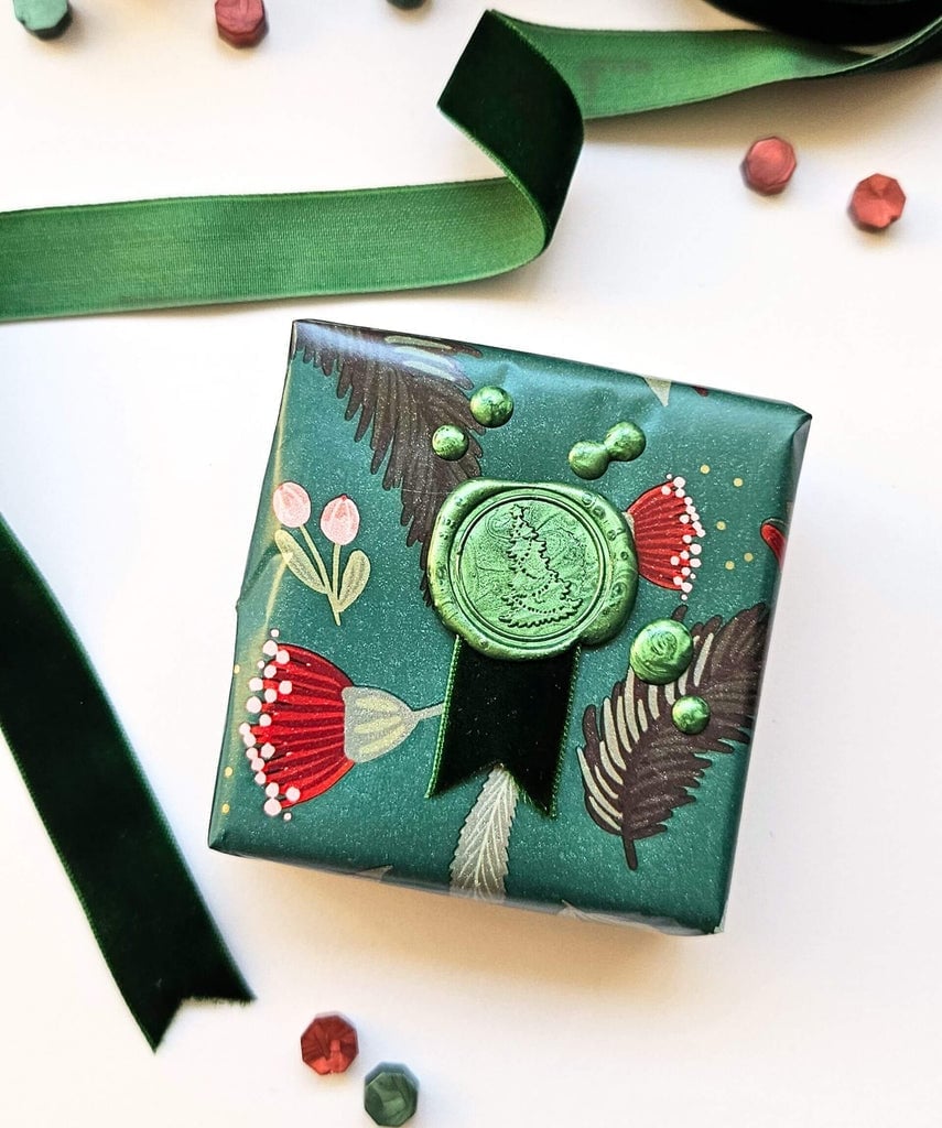
Teal paper paired with a deep green velvet ribbon sets a restrained, sophisticated tone. A single small square gift becomes the center of attention, finished with an ornate green wax seal that adds a tactile, handcrafted element. The gold accents in the ribbon catch soft natural light. The teal acts as a calm backdrop, while the ribbon and seal carry the ornament. A lighter ribbon would break the balance, so keep the accent weight equal to the paper’s richness.
Traditional Christmas Village Scene Gift Wrap with Gold Ornament
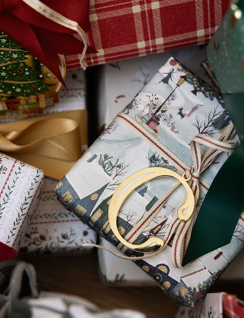
This wrap leans into a full winter village scene printed on the paper, with blue, white, green, red, and gold all present in one design. A small gold metal ornament tied with ribbon adds a dimensional anchor to the busy print. The palette is the whole story here, and the trick is not to add more colors. Stick to one metallic accent, gold in this case, and let the village illustration carry the rest. A red or green ribbon alone would pull the eye away from the paper’s detail, so match the ornament to the smallest color in the scene.
Rustic Kraft Paper Gifts Adorned with Candy Canes and Gingerbread
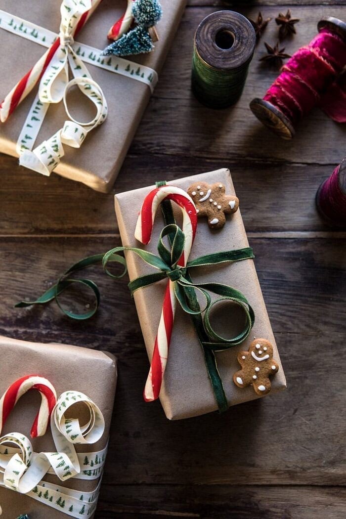
Can you dress up plain kraft paper without buying a single roll of printed wrap? Candy canes and gingerbread cookies clipped onto the ribbon are the answer here. The brown kraft serves as a neutral base, while red and green accents from the candy and cookie add festive color without extra paper. Ribbon spools sitting nearby suggest you can mix widths for more texture.
These edible embellishments mean the gifts need to stay upright and away from heat or moisture until they are opened. A wide jute or cotton ribbon works better than a thin one, because it holds the weight of a cookie or candy cane without slipping. The look reads as handmade rather than store-bought, which is the whole point.
Luxe Botanical Patterned Paper with Jewel Tones and Greenery
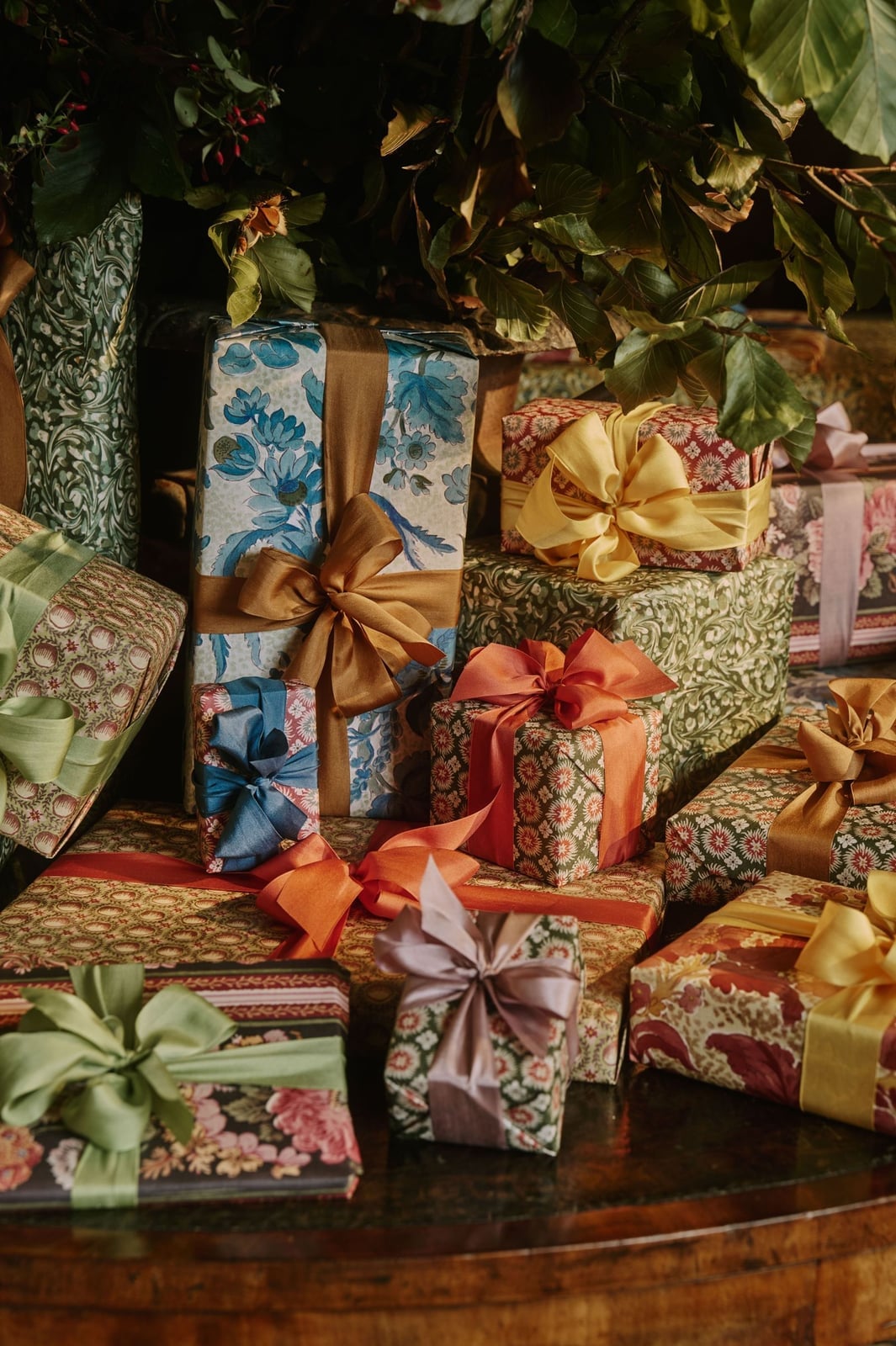
A botanical print with jewel tones, blue, green, red, gold, and pink, wraps these gifts in a layered, almost textile-like pattern. Fresh greenery tucked under the ribbon repeats the green in the paper and softens the geometry of the print. Ambient light brings out the gold flecks without washing out the deeper shades. The palette is dense, so keep the ribbon solid and neutral, here a natural green works, to let the paper do the work. A patterned ribbon would turn the whole thing into visual noise.
Traditional Christmas Papers Featuring Celestial and Festive Scenes
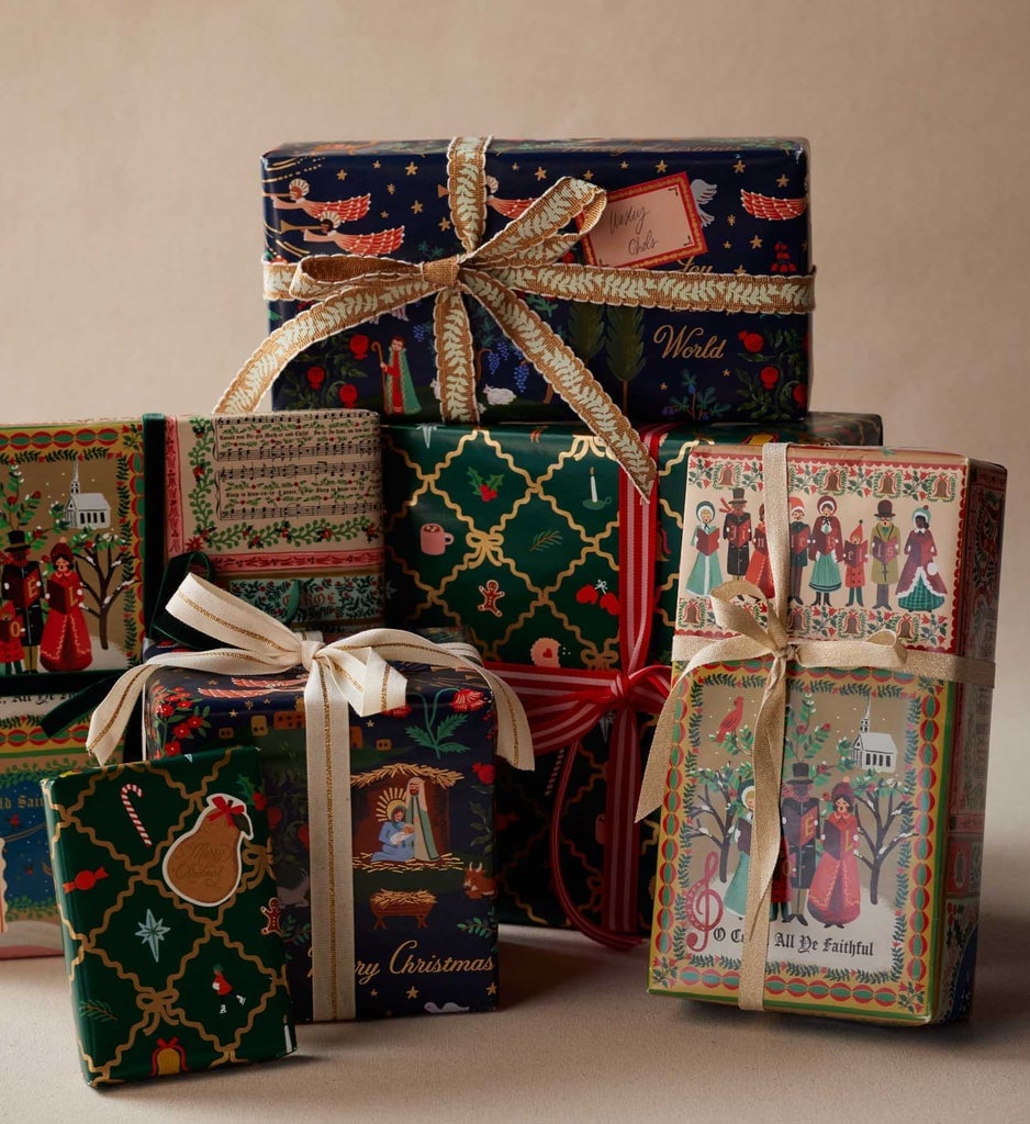
To mix patterns, keep the ribbon consistent across all gifts. Here, a stack of wrapped presents uses paper with navy, green, red, and gold scenes, some celestial with stars and moons, others with classic festive motifs. A single ribbon style ties them together so the pile looks coordinated. Soft studio light keeps the colors true, which helps when you are matching papers that were not sold as a set. Stack the largest pattern on the bottom and the smallest on top for a balanced arrangement.
Cozy Pile of Red and Patterned Gifts Under a Decorated Tree
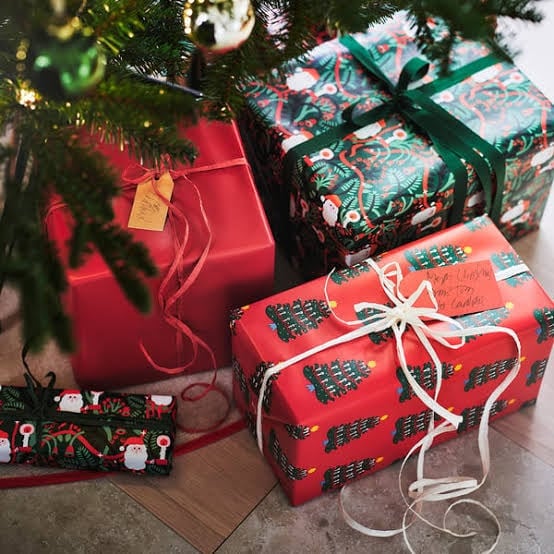
A single gift under the tree can look a little lonely. Stack a cozy pile of red, green, and gold wrapped boxes together instead. The traditional Christmas palette of paper, ribbon, and pine works because the tree becomes the backdrop, not the competition. Keep the wrapping simple, solid reds and classic patterns, so the eye moves across the pile without stopping. The layout itself does the decorating: a clustered base of gifts fills the space under the branches and makes the whole corner feel planned. If your tree skirt is neutral, the color stays in the gifts. If the skirt is already patterned, stick to one paper color across all the boxes. The ratio of tree to gifts should lean toward the tree being the taller element, with the pile as its grounded anchor.
Botanical Print Gifts Tied with Deep Red Velvet Ribbon
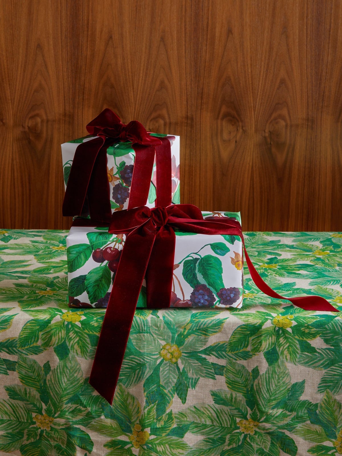
The botanical print on this wrap uses white and green as the base, then adds small touches of red, purple, and brown in the illustrations. That gives you room to tie on a deep red velvet ribbon without the look feeling busy. The velvet provides a richer texture against the paper, so the gift appears layered. Two stacked gifts with matching velvet bows keep the arrangement tight. Adding a second ribbon color disrupts the look. The velvet already carries enough weight.
Charming Duck Patterned Gifts with Simple Brown Ribbon
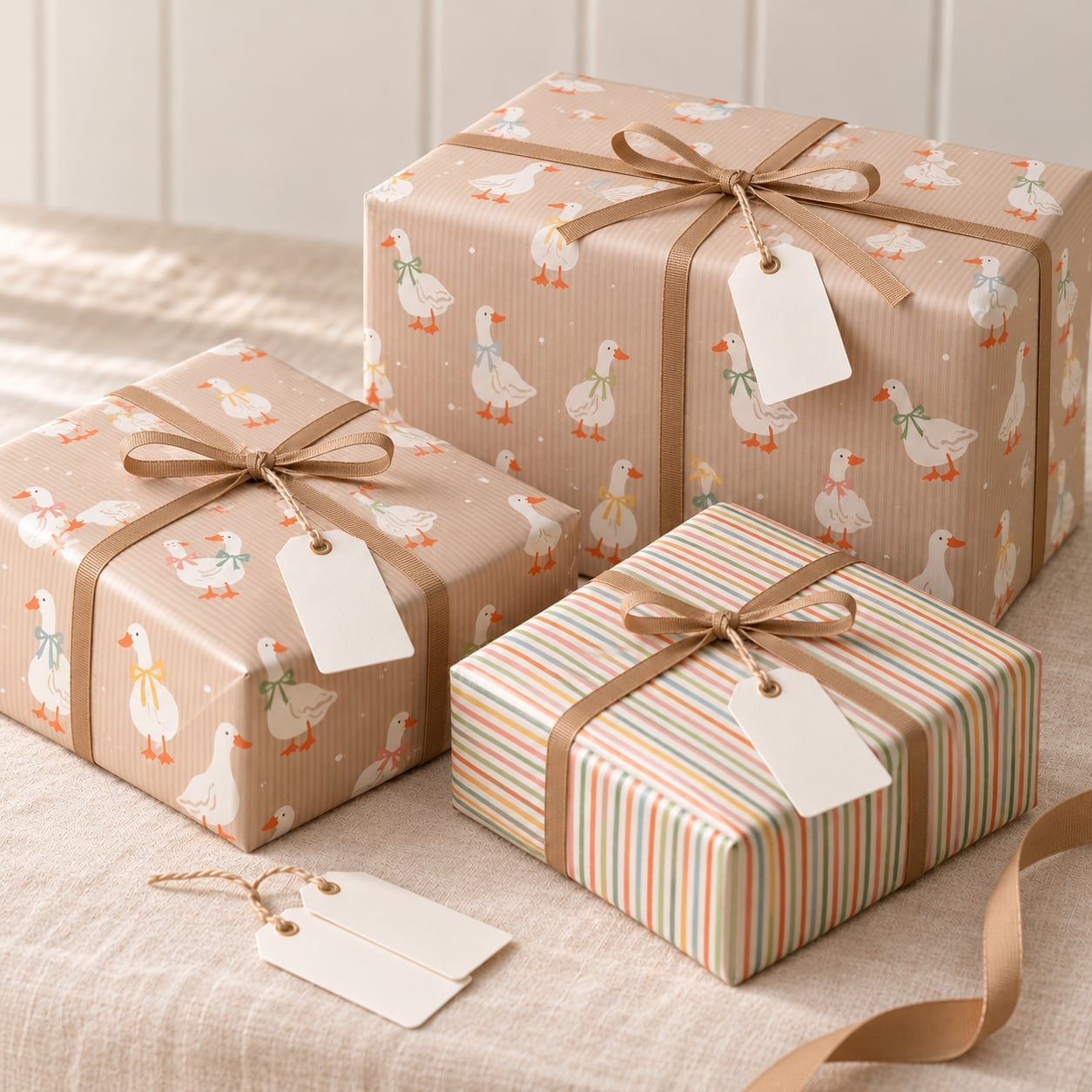
The duck pattern on this gift wrap is the kind of print that works because it does not try to be sophisticated. The charm comes from the unexpected subject, ducks in beige, white, green, and orange, paired with a plain brown ribbon and simple cardstock gift tags. There is no metallic finish, no layered bows, no extra embellishment. The styling variation here is about restraint: let the print be the personality and keep the rest of the wrapping minimal. If you add a second pattern or a bright ribbon, the ducks stop being the focal point and the whole thing reads as cluttered.
Festive Flat Lay of Gifts, Paper Rolls, and Wrapping Supplies
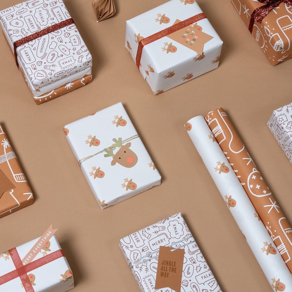
How do you arrange wrapping supplies without it looking like a mess? The flat lay approach solves that by treating the paper rolls, ribbon spools, and finished gifts as one composed scene. The palette stays tight, white, brown, red, and gold, so the reindeer and gingerbread patterns on the paper rolls read as accents rather than chaos. Arrange the rolls diagonally across the frame, then place the wrapped gifts at the corners to anchor the layout. The rolls become the visual diagonal that leads the eye across the whole surface. If you scatter the supplies randomly, the flat lay loses its structure. Keep the ribbon spools clustered in one spot so the eye rests between the patterned paper.
Minimalist Sage Green Gifts with Wide Burgundy Velvet Ribbons
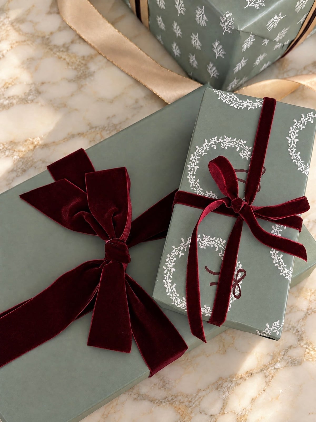
The wide burgundy velvet ribbon is the anchor here, not the sage green paper. The velvet makes a strong visual statement, so the paper stays quiet to balance it. The palette is just two colors, sage green and burgundy, which is the ratio that works for minimalist wrapping: one light, one dark. The bows are large enough to read as sculptural elements against the flat paper. A narrow ribbon or a third color disrupts the look. The velvet needs width to feel intentional, and the palette needs only two notes to stay elegant.
Geometric Harlequin Patterned Gift Wrap in Burgundy and Gold
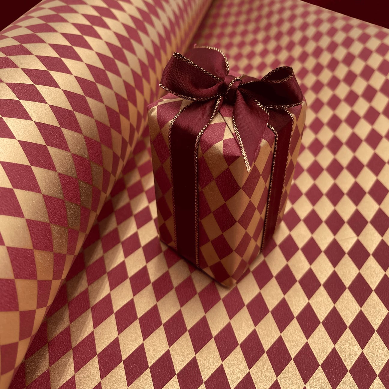
A geometric pattern like harlequin needs a solid anchor so the repeat doesn’t overwhelm the gift. The burgundy and gold palette here is strong enough to stand on its own, so a simple ribbon in a matching tone is all the trim required. The roll of paper in the background confirms the pattern is the point, not the bow. For a similar effect, match the ribbon color to the darkest shade in the paper. That way the geometry stays readable and the finish looks intentional rather than busy. It is a style that works best when you let the pattern do the talking.
Minimalist White Gift with Textured Crinkled Ribbon and Bokeh
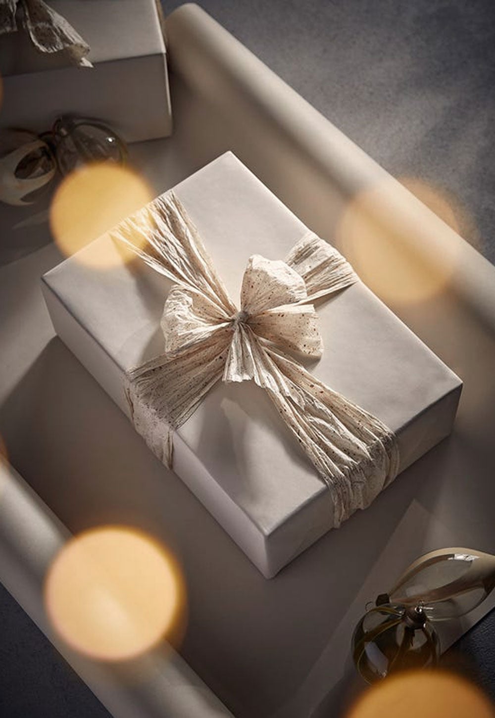
A white gift can look unfinished if the ribbon does not add texture. The crinkled ribbon here introduces an organic, handmade feel that keeps the package from looking like a blank box. The soft, diffused light and bokeh in the background soften the overall scene, making the gift feel part of a larger, restful arrangement.
The look depends on the relationship between the smooth paper and the irregular ribbon. The ratio is roughly one part texture to two parts flat surface. Any more ribbon and the package would feel top-heavy; any less and the texture would disappear. The glass ornaments nearby echo the neutral palette without competing. To recreate it, look for a white linen ribbon and crush it gently with your hands before tying. It gives the same crinkled effect without needing special materials.
Traditional Red Berry Paper with Baker’s Twine and Red Ribbon
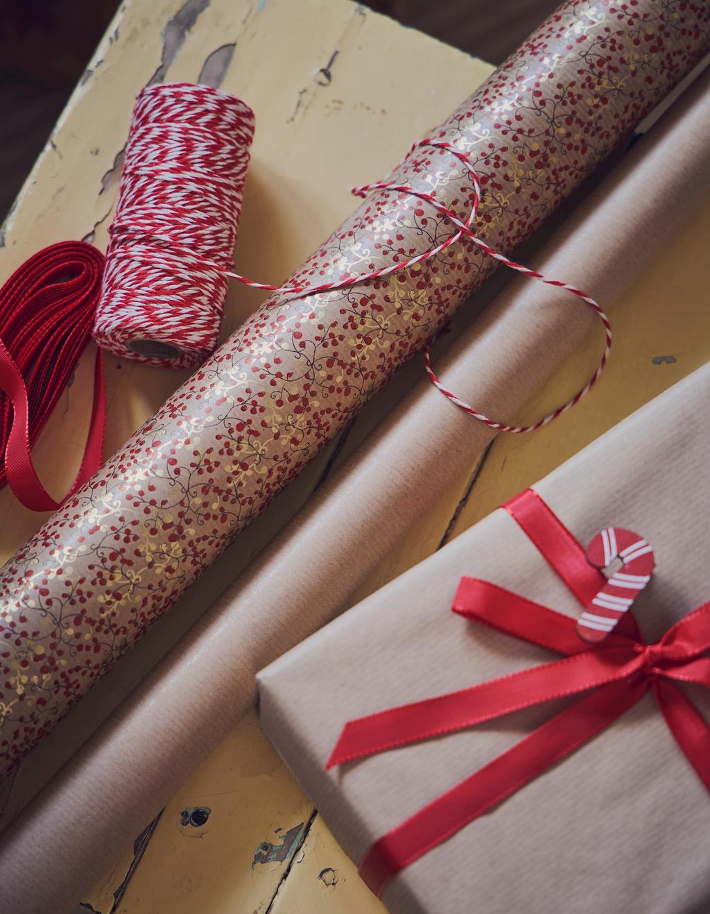
The red berry paper is a classic choice, but what sets this arrangement apart is the contrast between the matte kraft roll and the shiny red ribbon. The baker’s twine adds a fine, linear detail that breaks up the solid color blocks. When you pair a busy print with a neutral base like kraft, the eye has a place to rest. It is a simple material trick: one textured element, one shiny element, and one neutral element. That combination keeps the look from feeling flat or overly sweet.
Botanical Illustrations on Kraft and White Paper with Gold Accents
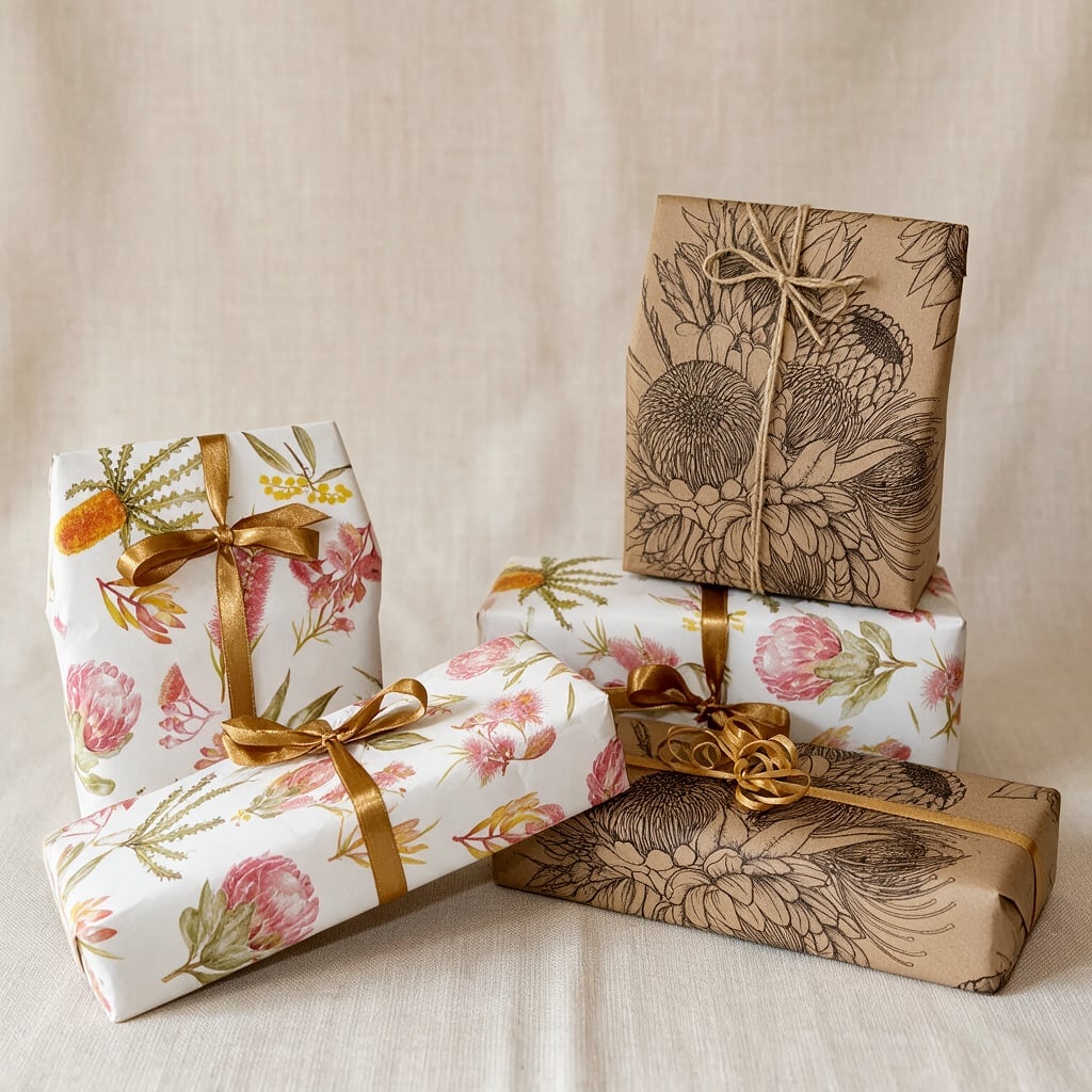
This stack of gifts works because the palette is deliberate but not loud. The kraft brown and white papers give the botanical illustrations room to breathe, while the pink, green, and gold accents add warmth without tipping into chaos. The soft, natural lighting helps the illustrations appear delicate. To recreate it, look for: two neutral paper colors and let the illustrations carry the color. That way the stack is cohesive even when the patterns are different. It is a collected look without the collection feeling random.
Whimsical Australian Wildlife Paper with Red and Gold Ribbon
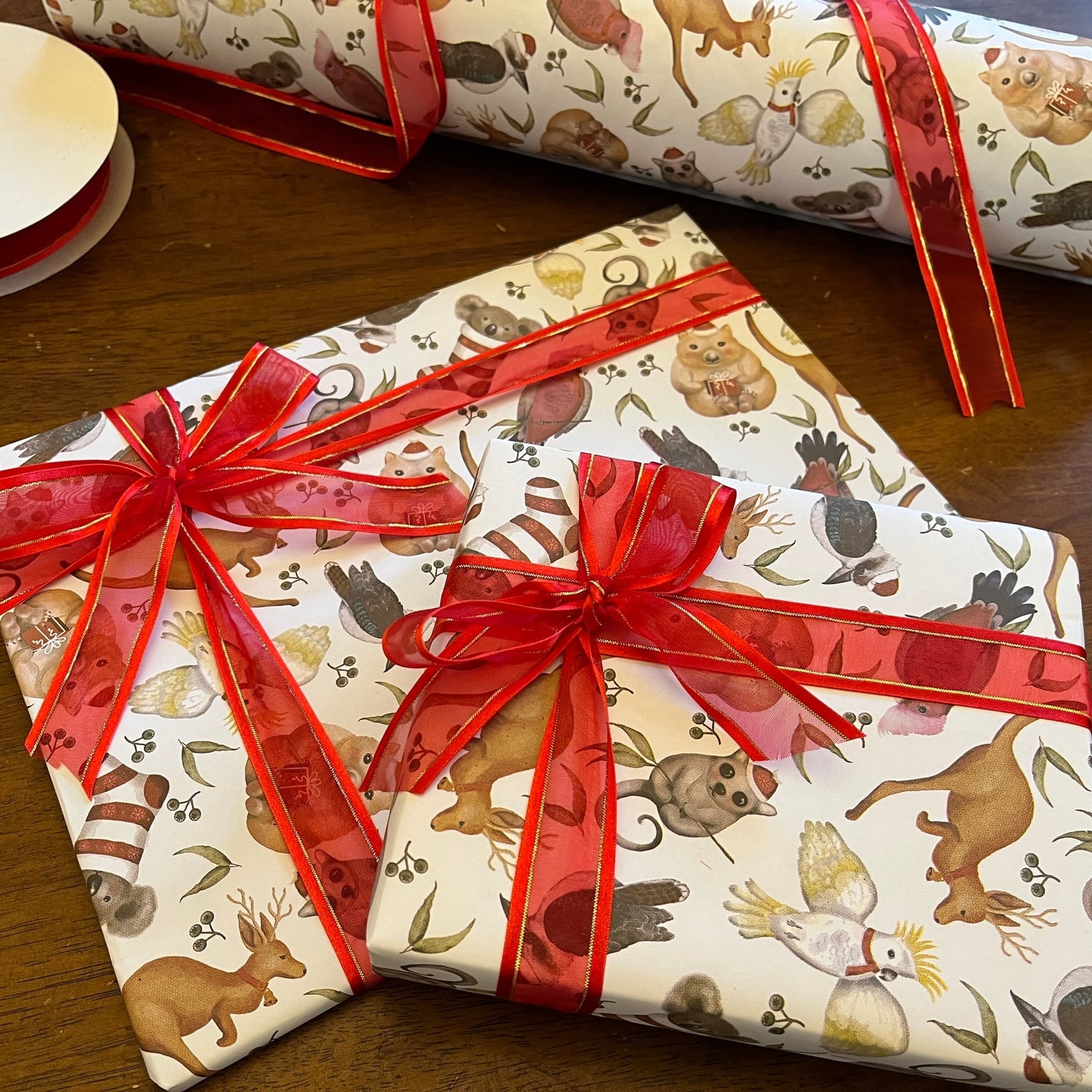
How do you wrap a gift when the paper is the gift? The whimsical Australian wildlife illustrations are the main event here, so the ribbon needs to complement without competing. The red and gold ribbon ties the cream background to the warm tones in the illustrations. The flat lay layout shows how the paper roll and wrapped gifts relate: the pattern is best seen in full, so keep the wrap tight and the folds clean. For storage, roll any leftover paper around a cardboard tube to prevent creases. Wildlife patterns are seasonal enough that you will want the paper in good shape for next year.
Peach Botanical Patterned Gifts Stacked on Books
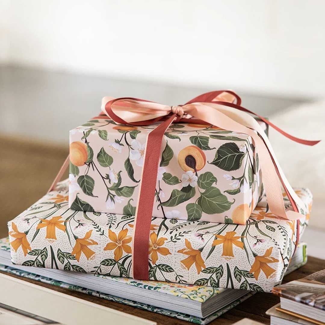
A stack of wrapped gifts gains presence when you vary the heights beneath them. The top gift uses a peach botanical print with green leaves and orange blossoms, tied with a simple ribbon. Setting it on a book lifts the pattern to eye level and breaks up the pile. The palette of peach, green, and white is softer than traditional reds, so the botanical motif stays the focus. The key is one patterned gift on top, with a solid or smaller print below. Avoid stacking two busy patterns of equal scale directly on top of each other.
Traditional Green Tree and Red Holly Berry Paper Rolls
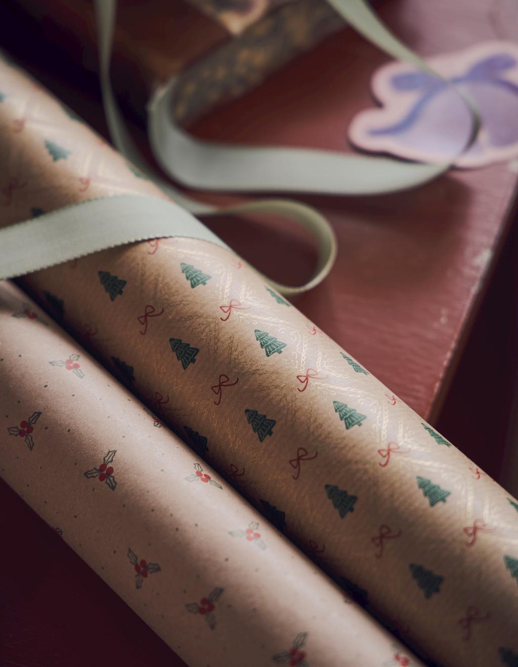
A practical rule for choosing wrapping paper: hold the roll at arm’s length before you buy. The patterns that look delicate up close, like tiny green trees or red holly berries on a pale background, can read as busy when wrapped around a large box. These rolls use a pink base with green tree motifs and gold accents, plus a separate roll with red holly berries. The warm soft light in the scene keeps the colors from feeling harsh. The traditional style works because the motifs are small and spaced evenly, so the paper reads as a texture rather than a pattern. A renter-safe swap: use plain kraft paper as a base layer and add a strip of this patterned paper across the center, so the design lands where it shows best without overwhelming the gift.
Whimsical Wren Patterned Gift with Red Ribbon and Paper Roll
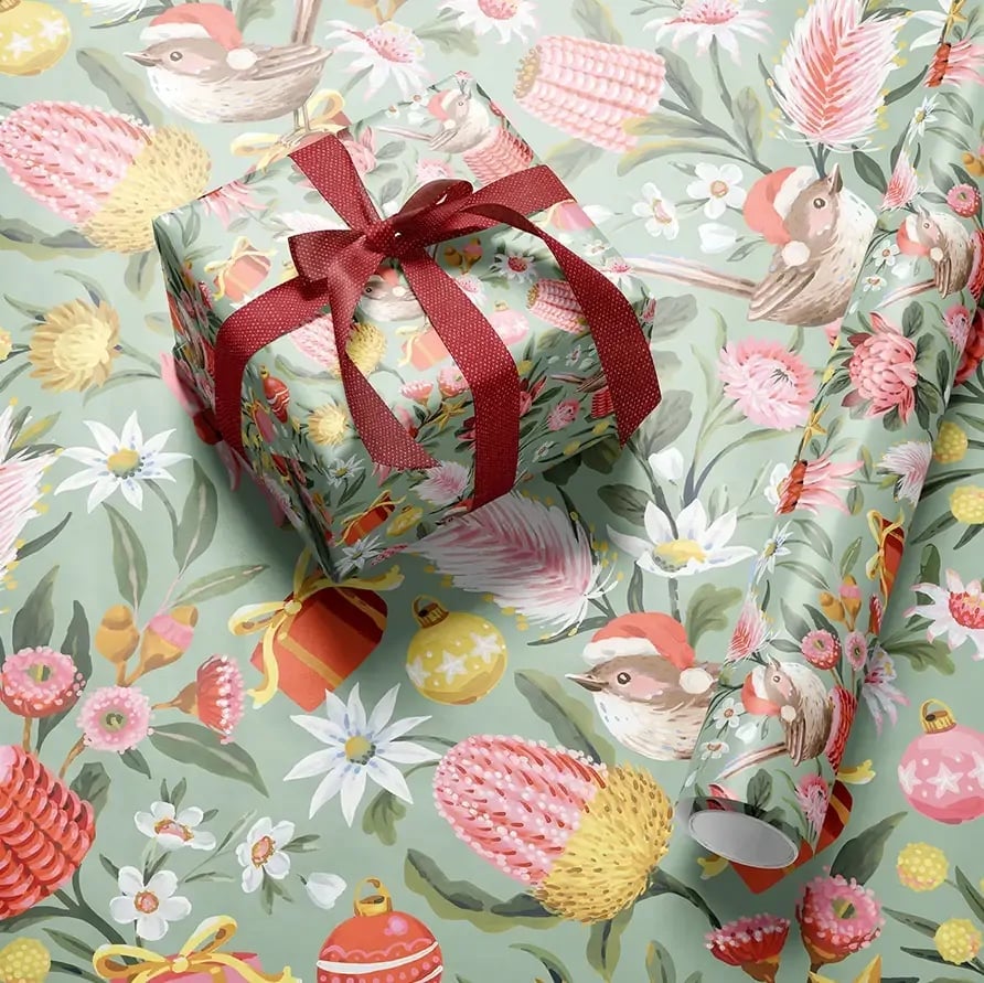
A close alternative to standard Christmas motifs is a wildlife pattern that still nods to the season. This wrapped gift uses paper printed with festive wrens in Santa hats, in sage green, pink, red, and yellow. The paper roll beside it shows the full pattern, so you can see how the birds repeat across the sheet. The whimsical style works because the colors stay muted enough that the red Santa hats pop without clashing.
For a styling variation, pair the wren paper with a solid ribbon in a color pulled from the print, like the red used here. The ribbon anchors the busy pattern and gives the eyes a place to rest. If the pattern feels too playful for a formal gift, wrap a small box with it and set it on a neutral tabletop. The soft diffused light keeps the colors from going flat, so the wrens stay charming without looking cartoonish.
Minimalist Bold Red and Green Striped Gift Wrap
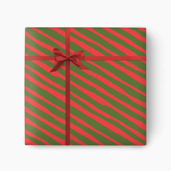
The stripe width determines whether this pattern looks classic or modern. Bold red and green stripes in equal proportion feel graphic and traditional, because the colors hit the eye at full strength with no white space between them. The minimalist style comes from the lack of any additional embellishment: no ribbon, no tag, no bow. The palette stays tight to just those two colors, so the gift reads as a single shape. The balance of red to green is roughly one to one. Adding a third color or a patterned ribbon would break the stripe rhythm.
Bold Floral Print Gift Wrap with Vibrant Orange and Red Accents
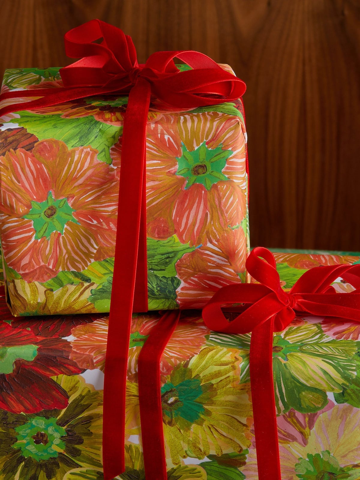
This paper makes a clear statement: large-scale florals in green, orange, red, and yellow, with no subtlety in the color choices. The bright direct light keeps the orange and red from turning muddy, which is the main risk with this palette. The velvet ribbon in a deep tone adds a tactile contrast to the glossy paper surface. The materials matter here because the velvet absorbs light while the paper reflects it, creating depth. The bold floral style works best on a single large gift, so the pattern has room to show its composition. Avoid pairing it with a competing pattern or a bright ribbon that pulls focus from the print.
Final Thoughts
The best gift wrap balances pattern, texture, and contrast. Stick to one or two paper prints per pile, then add ribbon or twine in a complementary color. Natural elements like greenery or cinnamon sticks add seasonal charm without extra cost. For a cohesive look, repeat one accent color across all presents. With 20 ideas to pull from, you can mix and match until your tree looks like a curated collection.