
Good wrapping paper is a small investment that makes a big impression. Whether you are dressing a birthday gift or a holiday present, the right paper sets the tone before the box is even opened.
This roundup of 21 pretty wrapping paper ideas covers florals, abstracts, and classic patterns to help you match any occasion or style. Expect fresh takes on botanical prints, vintage motifs, and modern minimalism.
Botanical Wrapping Paper with Real Pressed Flowers
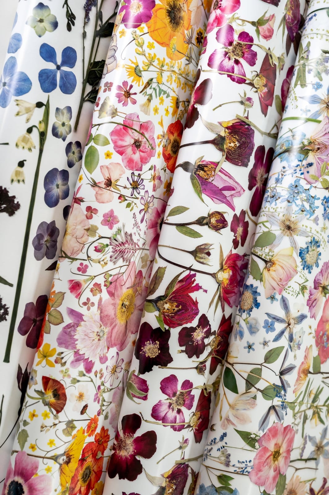
Real pressed flowers sit right on the paper surface, not printed on top of it. Each stem and petal keeps its true color and shape, so no two sheets look the same. The flowers scatter across white paper in a way that feels gathered rather than arranged. The paper becomes a frame for something that was alive. The palette stays within soft garden tones, so nothing competes with the actual botanicals. Adding a busy ribbon or tag disrupts the look; the whole point is letting the pressed flowers speak for themselves.
Dark Blue Botanical Gifts Tied with Twine
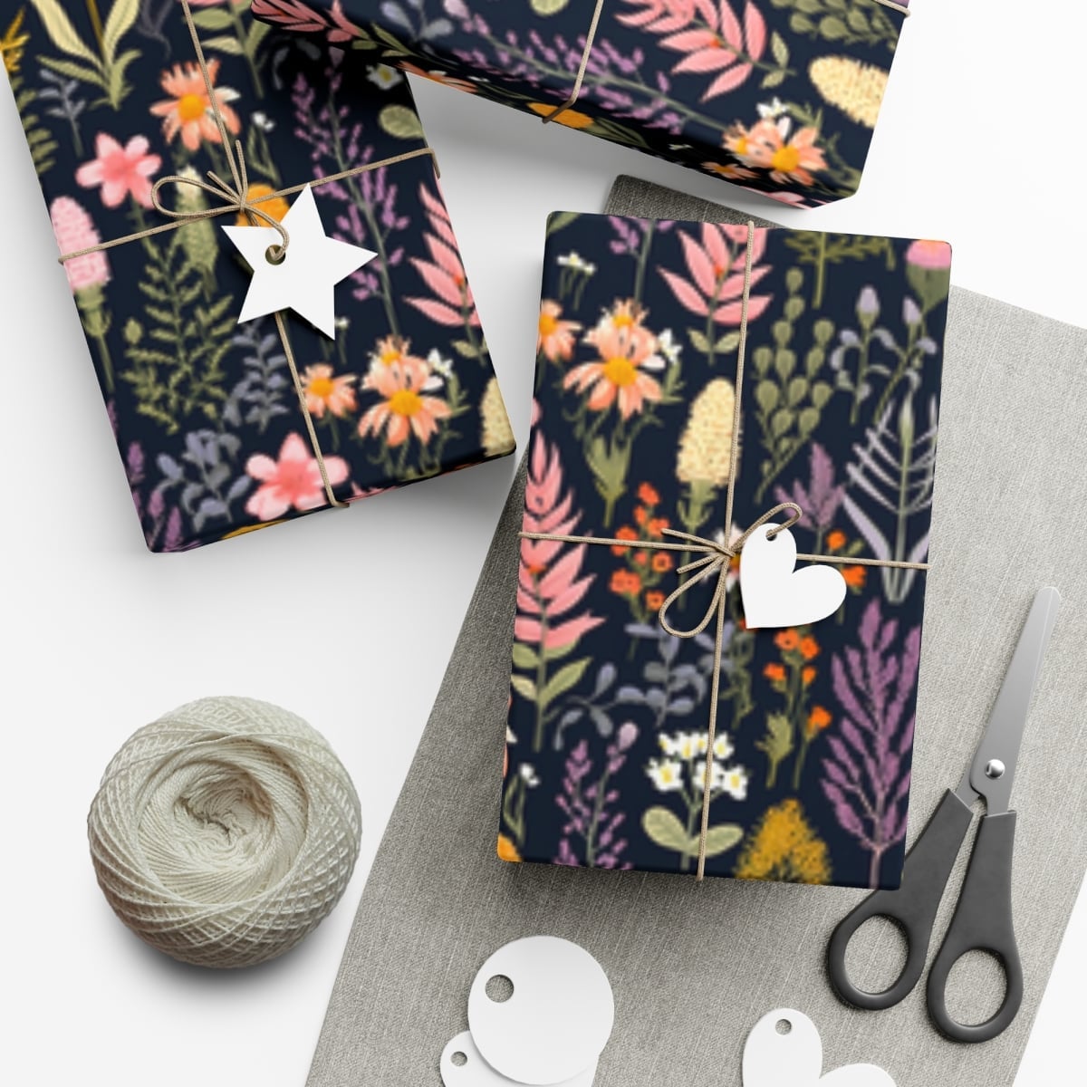
Dark blue paper with small pink and yellow blooms reads as formal without feeling stuffy. The deep background makes the botanical print stand out clearly, so even a small gift feels substantial. Twine keeps the finish grounded and prevents the look from tipping into fussy. A plain white gift tag adds a clean pause between the busy pattern and whatever you write on it. The palette ratio leans heavily on the dark blue, roughly three parts background to one part floral detail. What breaks the look is matching the ribbon to one of the flower colors; keep the tie neutral and let the paper hold the color.
Vibrant Multi-Color Floral Gifts with Satin Ribbons
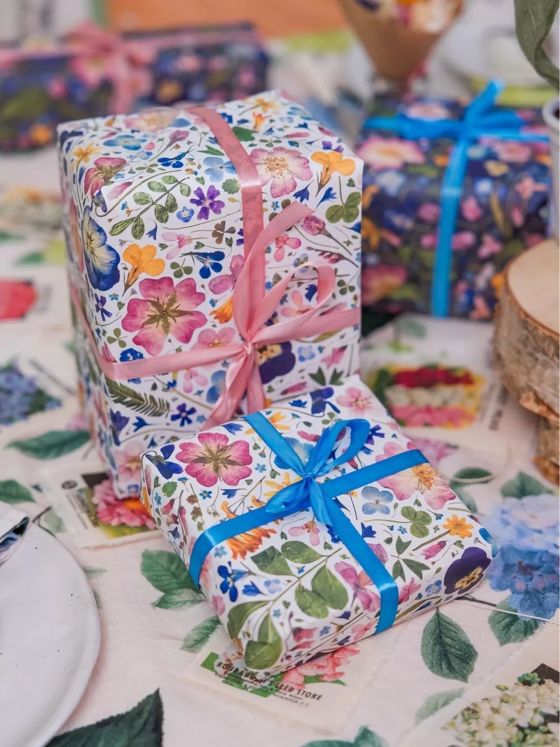
Can satin ribbon work with a busy floral print, or does it look like too much? It depends on the ribbon width and how you tie it. A wide satin bow in a solid color, pink, say, or cream, sits on top of the pattern without disappearing into it. The floral paper here mixes pink, blue, and green blooms on a light background, so the ribbon has room to read as a separate layer rather than getting lost.
Stacking two gifts in the same pattern creates a stronger visual block than scattering them around a table. The top box gets the bow; the bottom one stays simple. That one ribbon does the work of pulling the look together. If the paper already has multiple colors, a single-tone satin ribbon ties the whole stack to one focal point.
Vintage Floral and Bird Design Gift Wrap
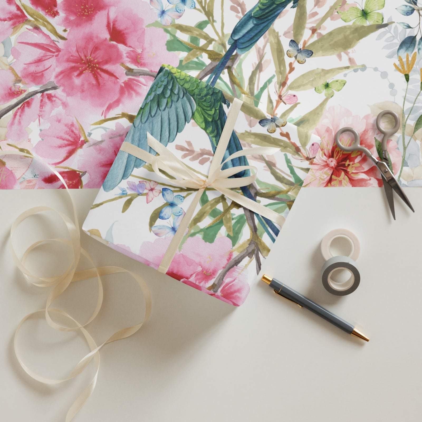
A small bird perches among pink and blue flowers on white paper, and the whole design feels lifted from an old botanical print. The bird is small enough that it reads as a detail rather than the main subject, which keeps the wrap versatile for different recipients. Soft studio light helps the pink tones stay gentle rather than bright. Scissors and tape sit nearby in the flat lay, a reminder that this pattern works best with clean, straight cuts. The vintage look gets muddy if the edges are ragged or the tape shows.
Art Deco Scalloped Fan Wrapping Paper Pattern
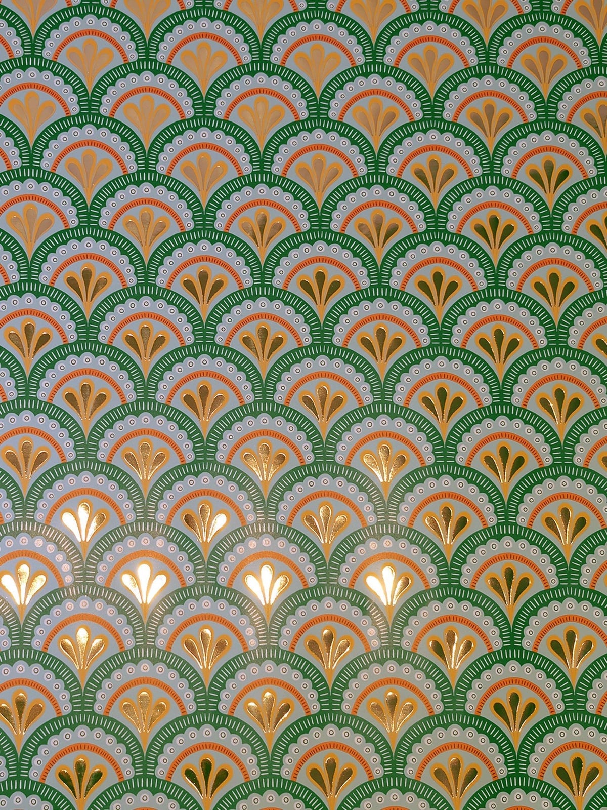
A practical rule for patterned paper is to store it rolled rather than folded. Creases show up fast on metallic finishes, and this green and gold scalloped fan pattern has a subtle sheen that catches the light evenly. The repeating fan motif in gold against a green background gives the paper a structured rhythm you don’t get from floral prints. The palette ratio is about two parts green to one part gold, which keeps the Art Deco feel without going full gilded. Store rolls upright in a tall bin or tube; stacked flat paper develops permanent lines that ruin the scalloped edges.
Cream Paper with Delicate Blue Floral Pattern
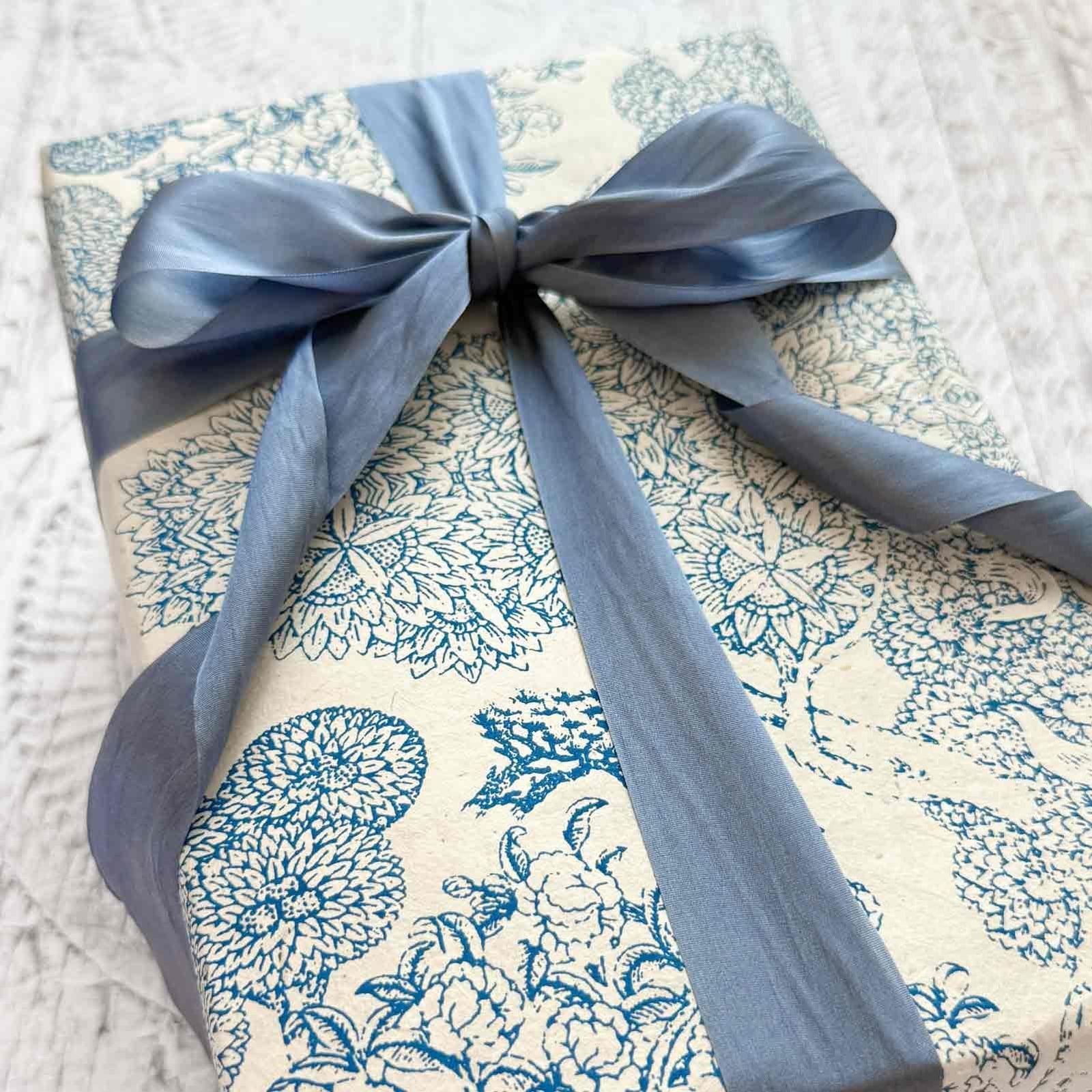
Cream paper with a delicate blue floral pattern often reads as more formal than it needs to be. The textured paper and the blue silk ribbon add a tactile quality that keeps the look grounded rather than fussy. The floral pattern is small and evenly spaced, which makes it work for a range of recipients. A palette of blue and cream is soft without feeling washed out. What defines the look is the contrast between the fine pattern and the smooth ribbon. What breaks it is adding a second pattern or a bright accent that fights the quiet tone. The ratio of paper to ribbon is generous, with the ribbon wrapping around the gift and tying in a bow that draws the eye to the center.
Shabby Chic Gifts with Pastel Floral Patterns
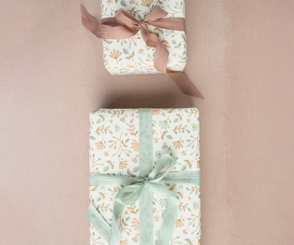
The pastel floral patterns here use cream, pale green, blush pink, and peach, a palette that is soft but not sugary. Two gifts are stacked vertically, creating a small vignette that feels deliberate. The delicate floral patterns are small and densely packed, giving the paper a vintage feel. The shabby chic style relies on the combination of faded tones and romantic motifs. The balance between the pale green and blush pink keeps it from tipping into saccharine. A bright white ribbon or a stark modern accent would pull against the soft, diffused lighting.
Blue and White Floral Gift with Natural Twine
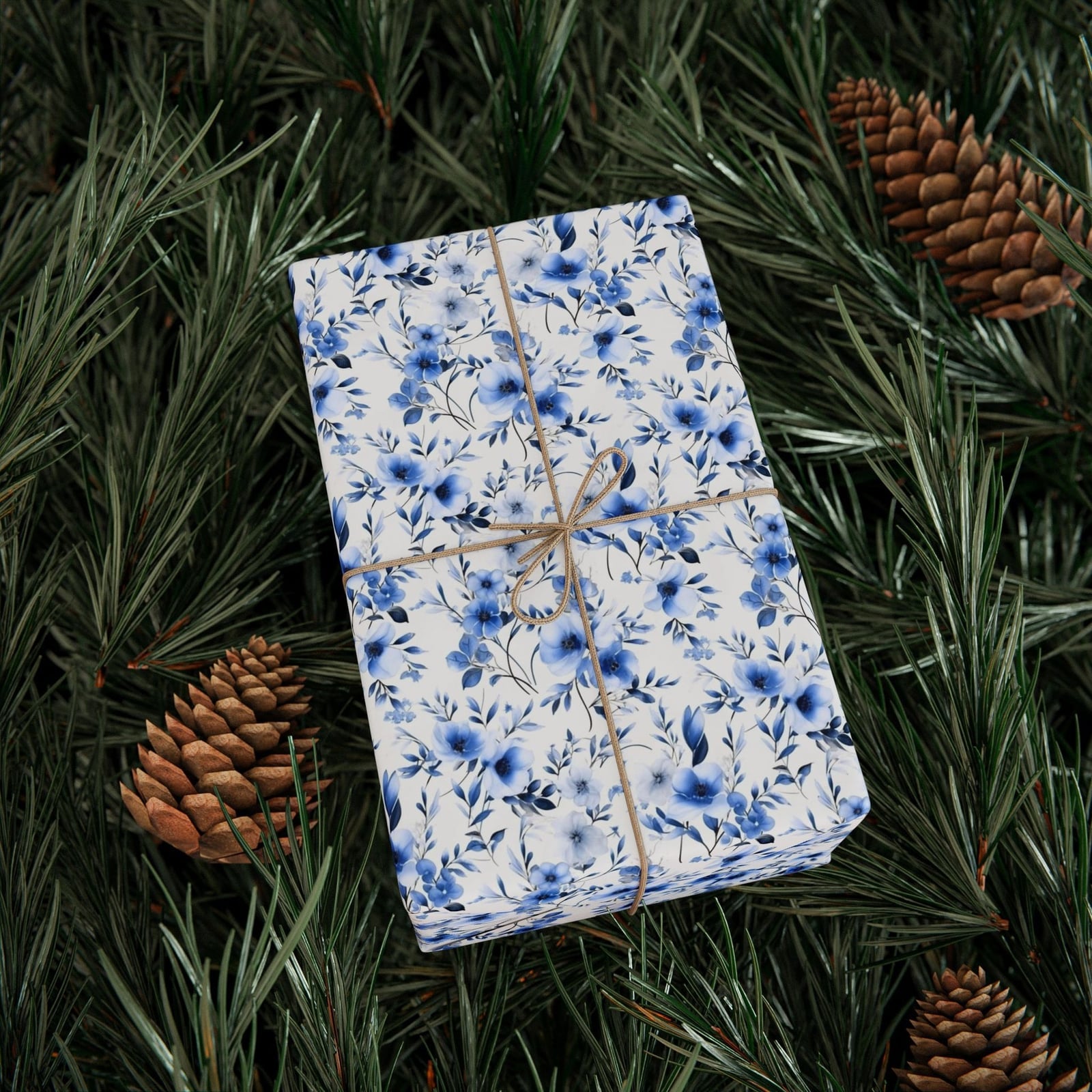
This is a straightforward take on a classic scheme. Blue and white floral paper paired with natural twine keeps the pattern front and center. The twine is wrapped around the gift in a simple cross, which avoids competing with the delicate blue floral print. The studio lighting makes the colors crisp but not harsh. The single gift is the hero element here. The palette is restrained, with only two colors and the natural brown of the twine. The fine floral pattern contrasts with the rough texture of the twine. A glossy ribbon or a metallic accent would shift the tone from natural to polished.
Modern Gifts with Polka Dots and Floral Prints
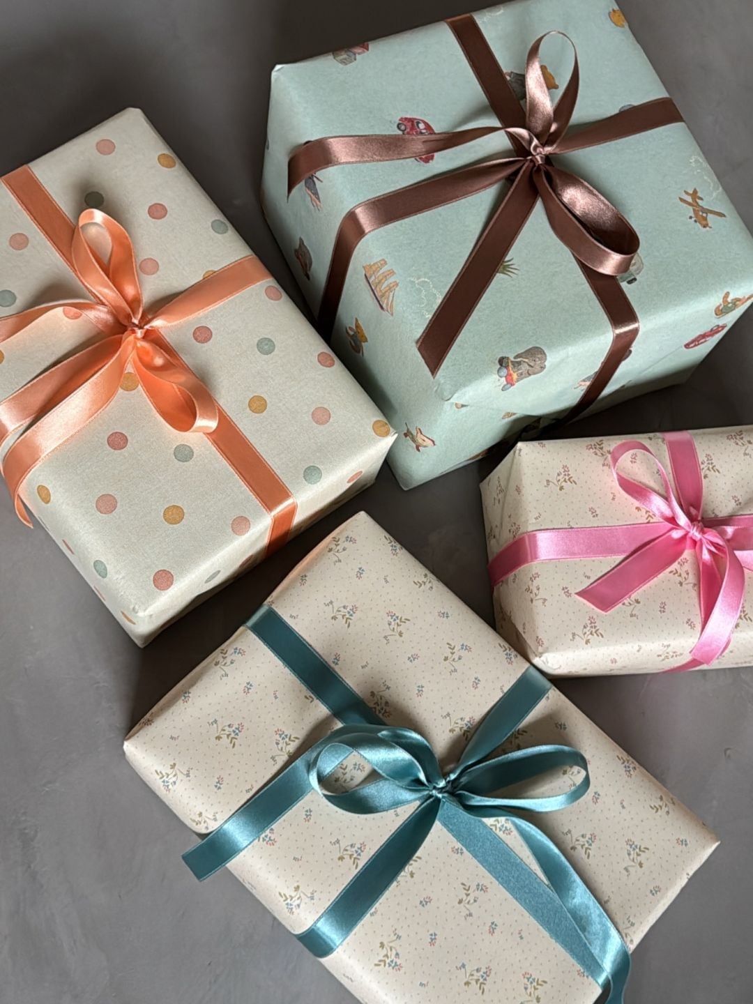
Can you mix polka dots and floral prints without the pile looking chaotic? Yes, if the palette stays consistent. Here, pastel blue, peach, and brown tie four gift wraps together in a flat lay arrangement. The polka dot paper is small and evenly spaced, while the floral print is larger but uses the same soft tones. Adding a high-contrast pattern or a neon ribbon would pull the eye away from the group. The layout works because the gifts are arranged close together, letting the colors do the connecting. Keep the ribbon color consistent across mixed patterns, as the brown ribbon here acts as a neutral anchor.
Natural Kraft Paper Gifts with Photo Embellishments
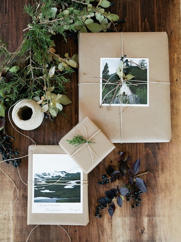
Kraft paper has a warm brown tone that makes greenery and small photos stand out. The twine ties the natural elements together, and the greenery adds a fresh green accent. The small photos are tucked into the twine, which keeps them visible but not overwhelming. The grouping of gifts in an overhead shot shows how the uniform base paper lets the embellishments do the work. The rough kraft texture contrasts with the glossy photo finish. Adding a bright colored ribbon or a metallic element would pull against the rustic feel.
Traditional Patterns: Paisley, Floral, and Geometric, Close-Up Take
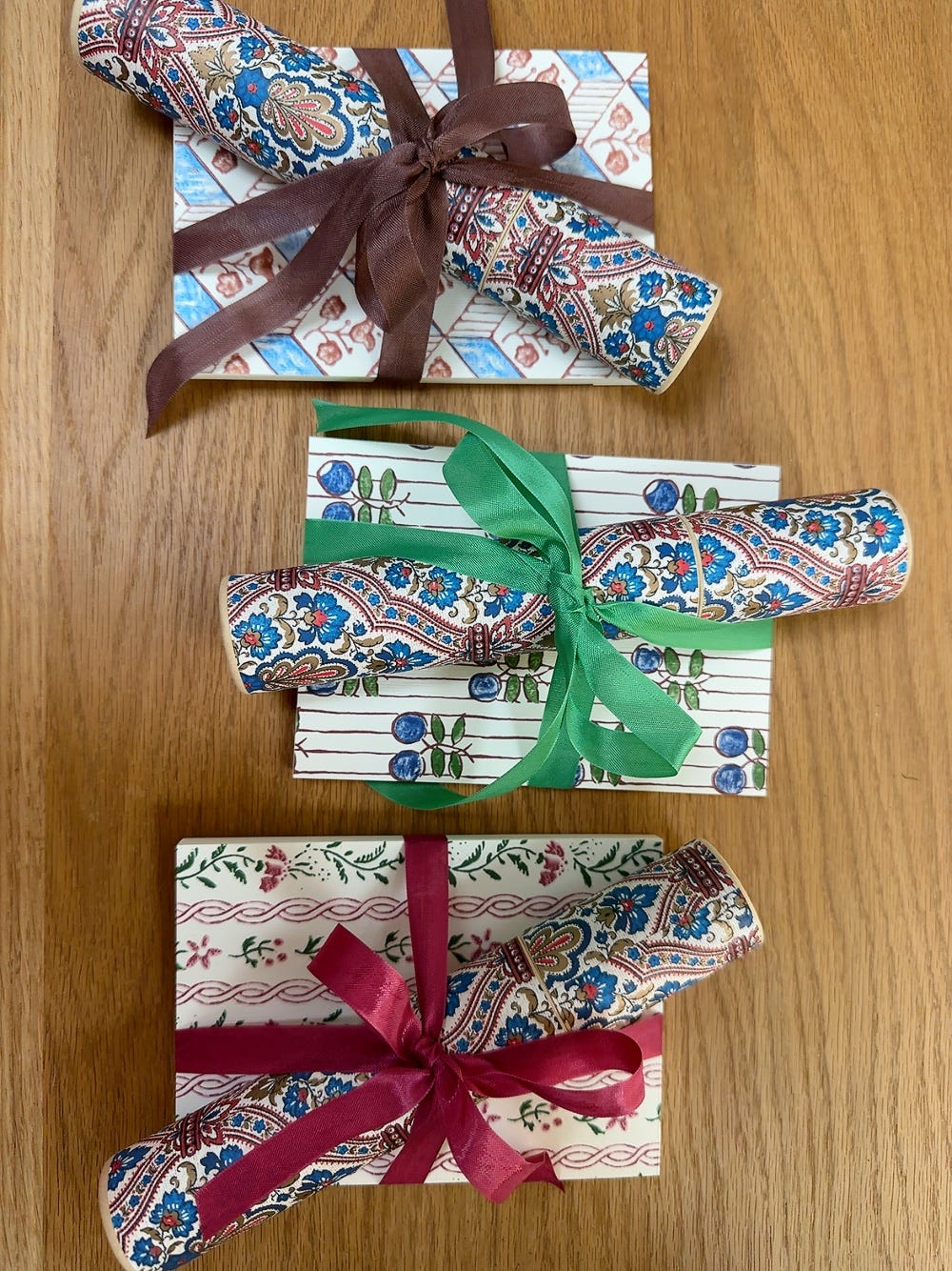
Traditional patterned gift wrap works best when the palette stays narrow so the patterns can coexist. Here, red, blue, brown, and cream tie three wrapped gifts and three rolls of paper together in an overhead shot, with the intricate paisley pattern as the standout. The gifts are stacked vertically, which lets each pattern hold its own space. The balance between the dense paisley and the simpler floral and geometric prints defines the look. Adding a pattern with a different scale or a color outside the red-blue-brown-cream range breaks it.
Classic Red Poppy Floral Gift with Black Ribbon
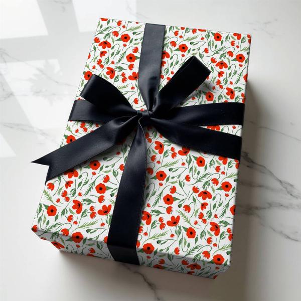
A red poppy floral print on white paper is bright and cheerful, but the black satin ribbon and bow shift the tone toward something more grounded. The contrast is what makes it work: the red poppies and green leaves against the white background are already graphic, and the black bow sits on top as a clear anchor.
The palette stays simple: white, red, green, and black. The black ribbon defines the style, turning a classic floral into something less sweet and more polished. A pink or gold ribbon would soften the look, making it more romantic. The black keeps it crisp and modern, so the gift fits equally well on a coffee table or a dining room sideboard.
Eclectic Gifts with Animal Print and Velvet Ribbons, Close-Up Take
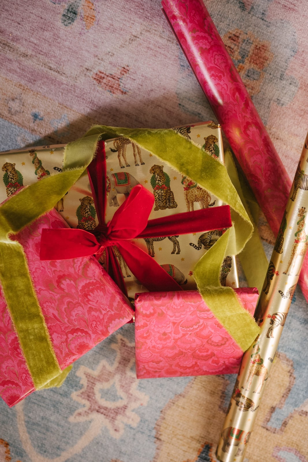
The animal print paper here uses gold, pink, green, and red in a flat lay on a rug, and the velvet ribbons in matching tones keep the look from feeling scattered. What defines the style is the contrast between the bold print and the soft ribbon texture. A shiny ribbon would compete with the pattern, but velvet absorbs the light and lets the animal print stay as the focal point.
Pale Grey Rose Patterned Gift with Peach Ribbon
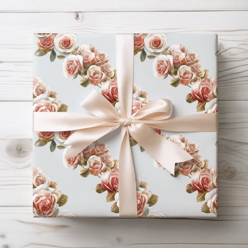
A pale grey background with a rose pattern looks refined without relying on stark white or deep color. The soft, diffused studio lighting keeps the grey flat and even, so the pink and cream roses hold the attention. The peach satin ribbon picks up the warm tone in the roses without matching them exactly, which gives the wrap a finished look that comes from coordination. The quiet contrast comes from the cool grey base against the warm pink and peach accents. A ribbon that fights the pastel range, like a dark or neon shade, would break this look.
Traditional Toile Patterned Gifts with Purple Ribbons, Close-Up Take
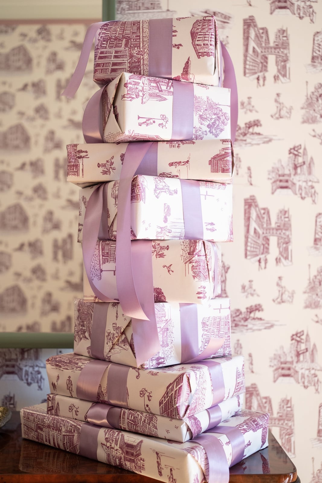
Can toile pattern feel fresh without reverting to a antique shop look? Yes, when the palette shifts from the expected blue or red to something bolder. Here, white toile against a purple background keeps the classic pastoral scenes intact while the ribbon in a deeper purple ties the stack together. The medium shot shows two stacked gifts, which is a practical way to present a set without needing a separate bag or box for each. The soft ambient light keeps the pattern readable without washing out the purple.
For storage, toile paper keeps best when laid flat or rolled loosely in a cool, dry spot. The detailed pattern means creases show more than they would on a solid color, so keeping sheets smooth matters for the final look. The traditional style works for formal occasions, but the purple update makes it feel current rather than borrowed from a decade you did not live through.
Abstract Painted Pattern Gifts with Gold Twine
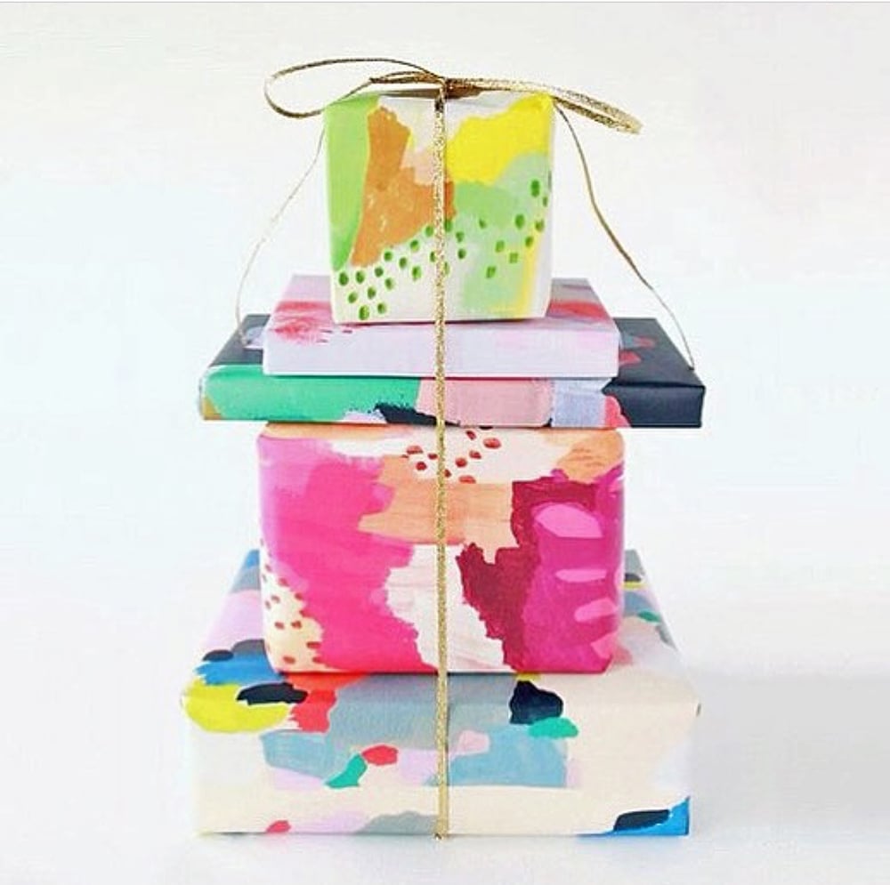
The gold twine wraps each box in a stack of abstract painted gifts, binding a multi-color palette of pink, green, and yellow into a single modern statement. The hero element stays central as the pattern, not the paper texture, carries the look. Brighter whites or neon tones would break the balance by competing with the painted marks. Stick to one metallic accent per gift to keep the arrangement readable.
Festive Teal Christmas Tree Gift Wrap
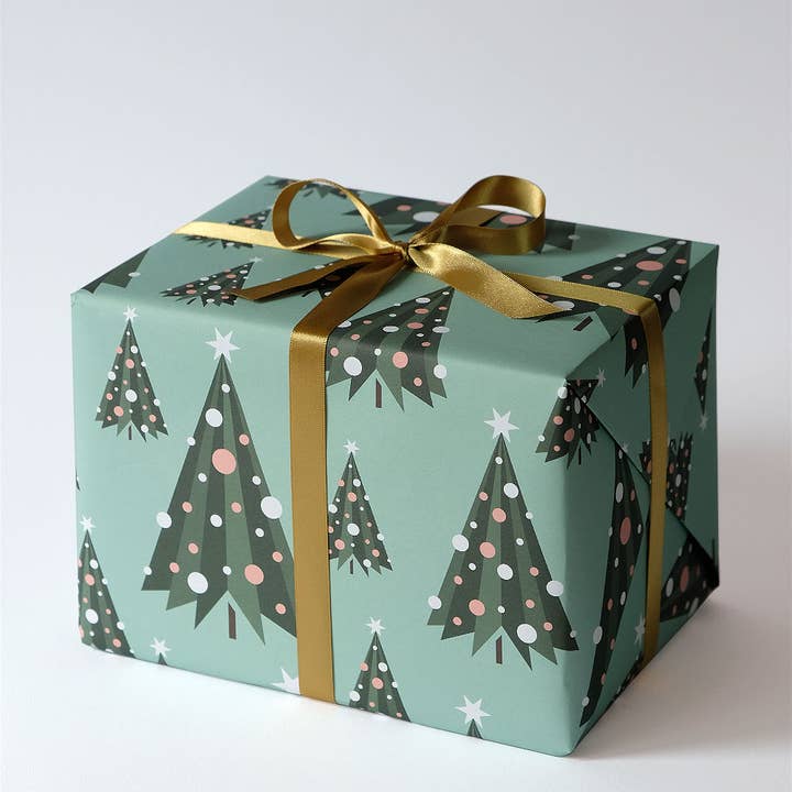
A general rule for patterned gift wrap holds true here: match the ribbon to an accent color in the print. The teal paper features a graphic Christmas tree pattern with pink and green details, and the gold ribbon picks up the warm note without overwhelming the design. The hero element is the tree motif, so keep the bow simple and centered. Layering multiple ribbons in contrasting colors would crowd the focal point and dilute the festive graphic look.
Modern Abstract Shapes and Stripes Wrapping Paper
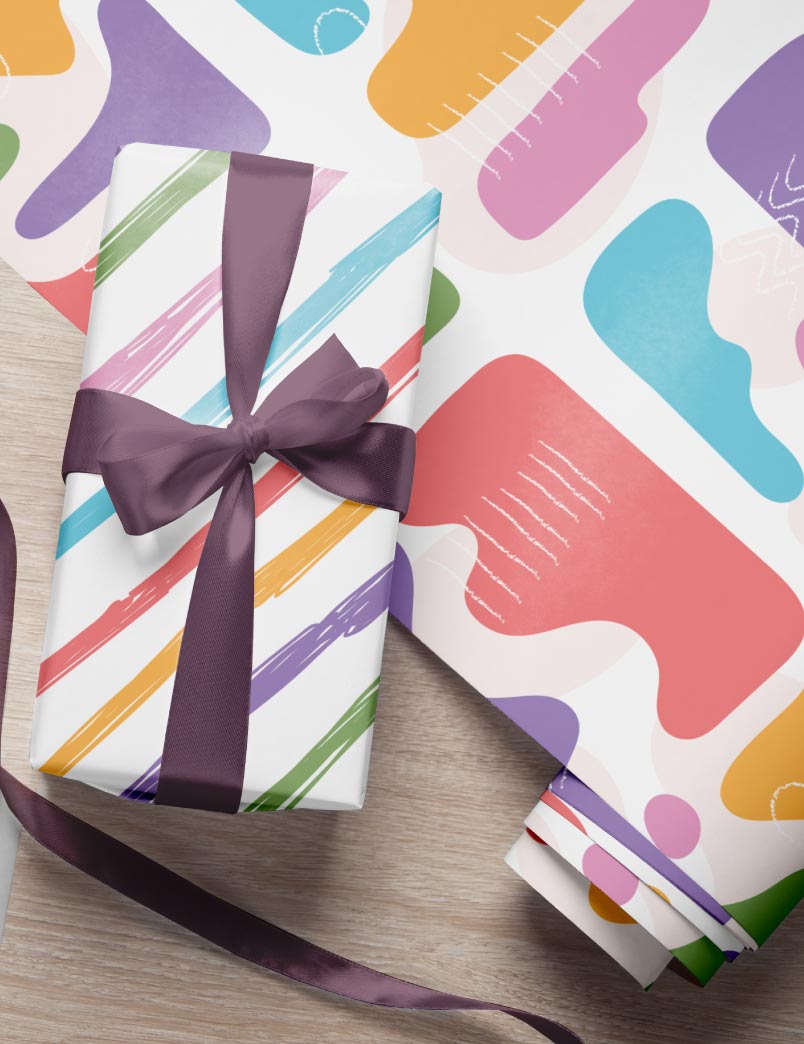
Where a solid color wrap relies on texture or finish for impact, this modern abstract paper uses bold shapes and stripes to do the work. The pastel multi-color palette is playful but stays grounded by the clean, graphic layout of the pattern. The print is visible on both the wrapped gift and the roll beside it in the flat lay. A plain satin ribbon in a single pastel shade keeps the look from feeling busy. The ratio of negative space to pattern allows enough white area for each shape to stand out. Adding patterned ribbon or a second print would break that clarity. This is a paper that suits a modern or minimalist presentation where the design is the decoration.
Whimsical Illustrated Patterns with Natural Twine
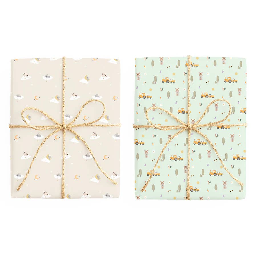
The cream background lets the green, yellow, orange, and brown illustrations breathe across two wrapped gifts set side by side. The palette stays natural and slightly muted, so the charm comes from the line work rather than saturation. A glossy ribbon or metallic finish would clash with the hand-drawn feel. Natural twine is the right match: it reinforces the whimsical style without adding a competing texture.
Minimalist Botanical Print with Solid Green Paper
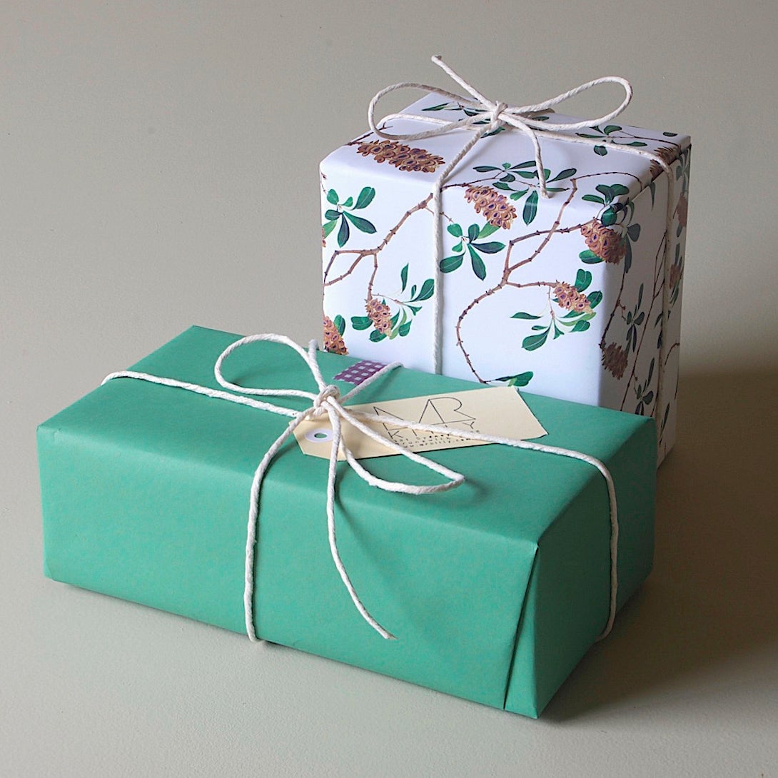
This combination works because the two wrapped gifts share a restrained palette of green, white, and brown. The upper gift carries a botanical print, while the lower one uses solid green paper, creating contrast without clutter. The hero element is the botanical pattern, so the solid paper acts as a visual pause. A paper tag and natural twine keep the look grounded. Adding a third pattern or a bright ribbon color would break the minimalist balance. This setup suits a gift where the wrapping reads as intentional but understated.
Textured Red Paper with Gold Band and Bow
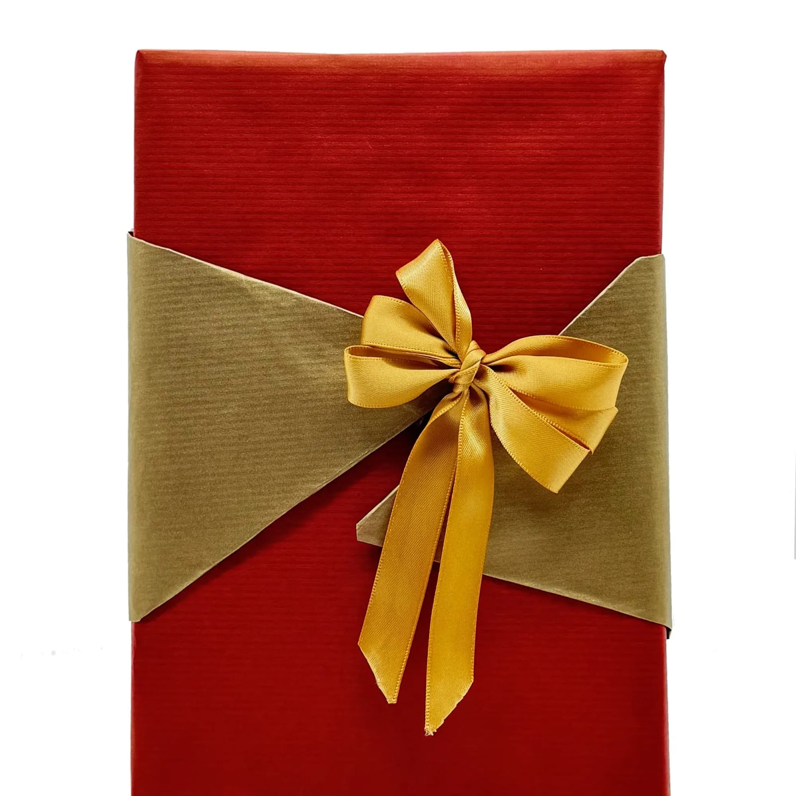
What makes a red gift feel festive without tipping into holiday cliché? The answer is texture. A red paper with a visible grain or ribbed surface creates depth before you add a single ribbon. The gold band and bow here are the payoff: the metallic finish sits against the matte red, not competing but completing it. This is a look that works in small stacks or as a single large box on a table. The palette stays in the warm end of the spectrum, so the gift reads as finished without needing a tag or sprig of greenery. The style is defined by the nubby paper and the smooth, reflective gold. Adding a second metallic color or a pattern that fights the texture would break it.
Final Thoughts
These 21 wrapping paper ideas show that a thoughtful wrap turns a simple present into a memorable one. The pattern, texture, and ribbon you choose all add to the story the gift tells before it’s opened. Keep a roll or two of your favorites on hand, and you’ll always be ready to make someone’s day a little brighter.