
Red paint can feel like a risk, but for 2027, it’s becoming the simplest way to add warmth and personality to any room. This roundup of 35 ideas shows how a single coat of red, whether on walls, a door, or a piece of furniture, can transform a space without requiring a full redesign.
From traditional hallways to modern bathrooms, these examples prove that red works in almost any setting when you keep the rest of the room restrained. If you’ve been curious about trying red but worried it might overwhelm, these photos will show you how to make it feel intentional and livable.
Traditional hallway with a red console table accent
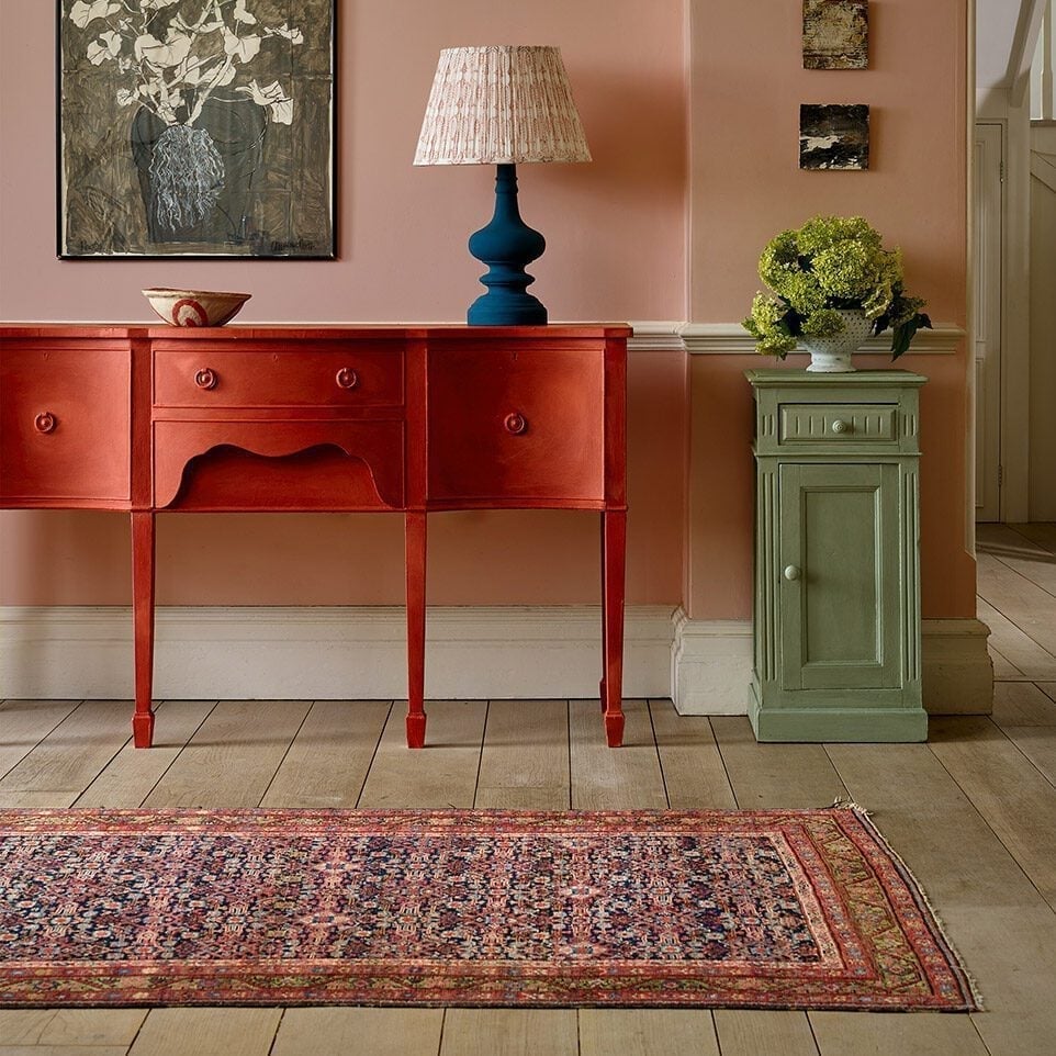
A red console table brings a jolt of heat to a hallway that might otherwise play it safe with pink walls and a green cabinet. The palette looks a deliberate wink: the blue lamp and patterned rug keep the red from feeling like a solo act. What defines this look is the ratio of color: one bold red piece against a softer pink backdrop, with green and blue as supporting players. What breaks it is letting any one color take over. Keep the red concentrated on the hero piece and the room stays balanced.
Modern living room featuring bold red walls
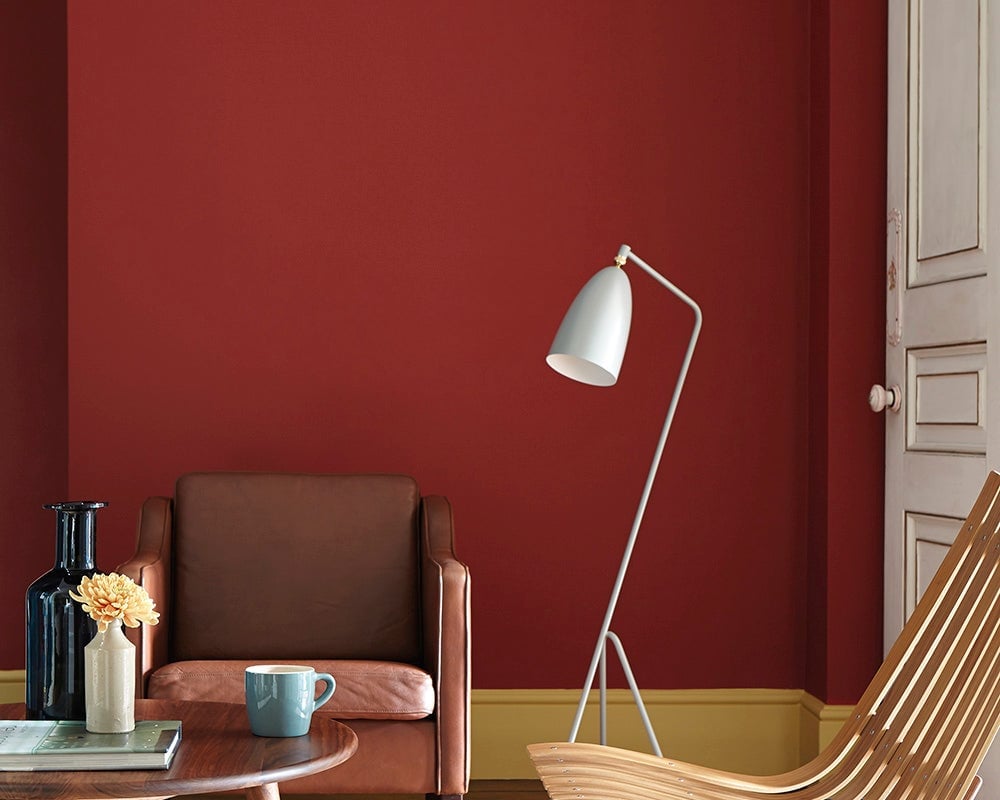
Red walls in a modern living room sound like a lot, but this one works because the palette stays tight. The red walls are the anchor, and the rest of the room follows a simple rule: warm neutrals and one accent. A brown leather armchair and a wooden chair ground the space, while a white floor lamp and a blue mug add contrast without competing. The ratio is about 70 percent red to 30 percent neutral and accent. What breaks it is adding another bold color. Stick to one red and let the furniture do the talking.
Minimalist space with an orange-red accent wall niche
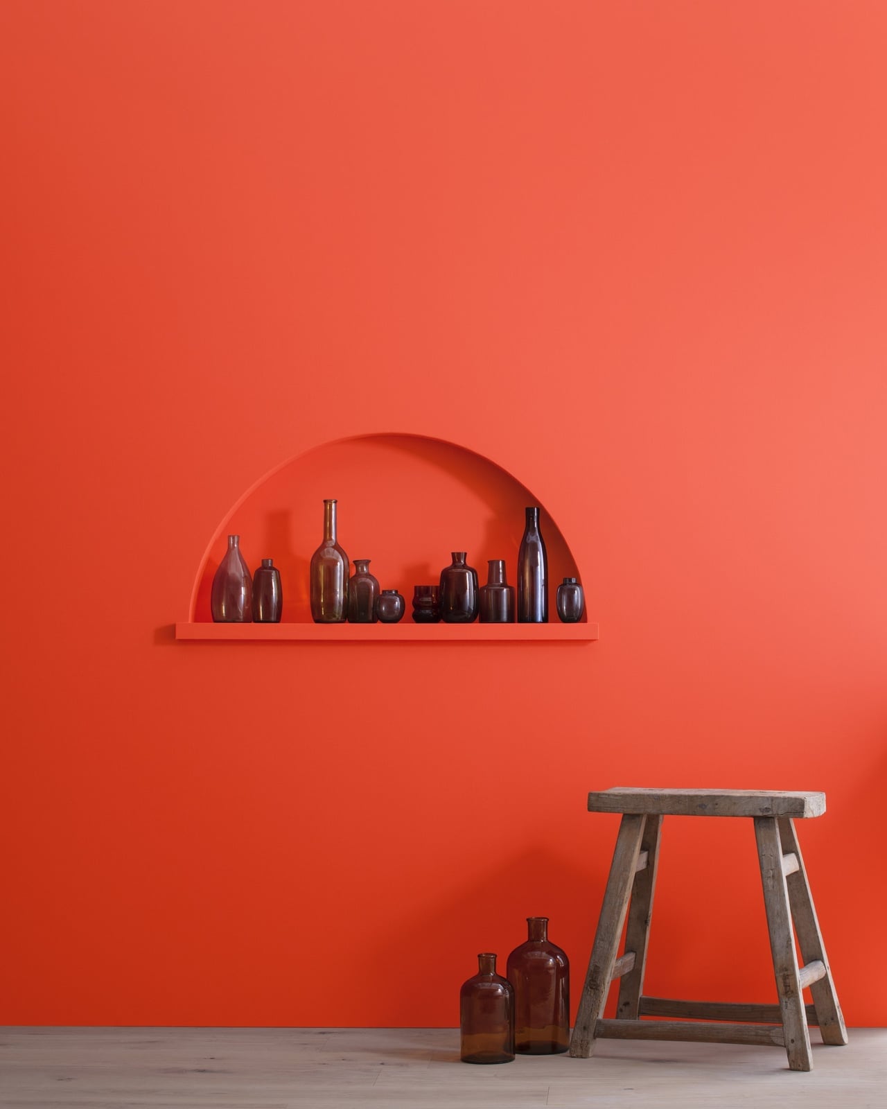
Can a single color make a minimalist room feel complete? This one says yes. The orange-red arched niche is the only saturated element in the space, and it does all the work. A wooden stool and a few amber glass bottles sit on the display shelf, but the wall is the story. The palette is one color plus natural wood and clear glass. The restraint is key: nothing competes with the niche. Adding a second color or pattern would break the focus. Let the wall hold the attention and keep everything else quiet.
Red and pink striped wall with decorative vignette
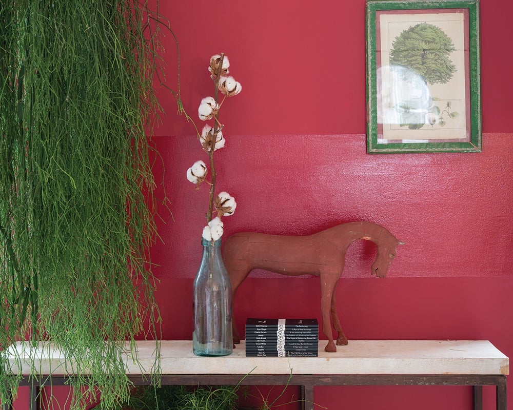
A horizontal stripe in red and pink gives this wall a graphic edge that a solid color could not match. The stripe runs across the wall at eye level, drawing attention to the vignette below: a wooden horse sculpture, a framed botanical print, a glass vase, and a stack of books. The palette is red, pink, and green, with the green from the botanical print breaking up the warmth. The ratio is roughly equal parts red and pink, with green as a small accent. What breaks this look is adding a third stripe color. Two is enough.
Modern bathroom with a vibrant red vanity
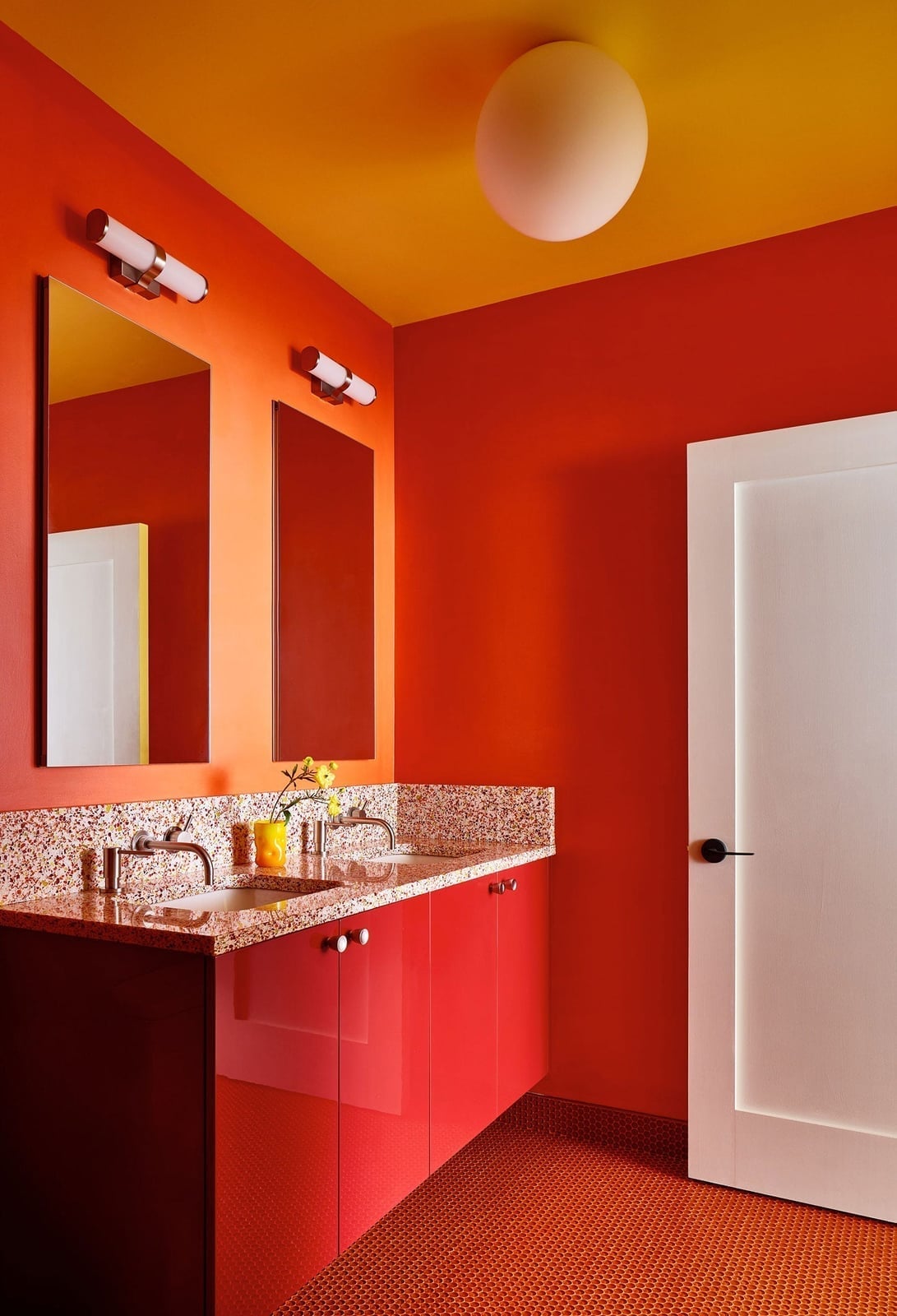
In a small bathroom, let one piece carry the color. Here, the red double vanity is the hero, and the surrounding surfaces stay neutral. The granite countertop and tile floor are light, and the wall sconces and ceiling light keep the space bright. The palette is red, orange, and yellow, with the red as the dominant note. The ratio is about 60 percent red to 40 percent warm neutral. What breaks this look is adding a competing color on the walls or floor. Keep the vanity as the only bold element and the room feels intentional.
Dining room with deep red walls and modern furniture
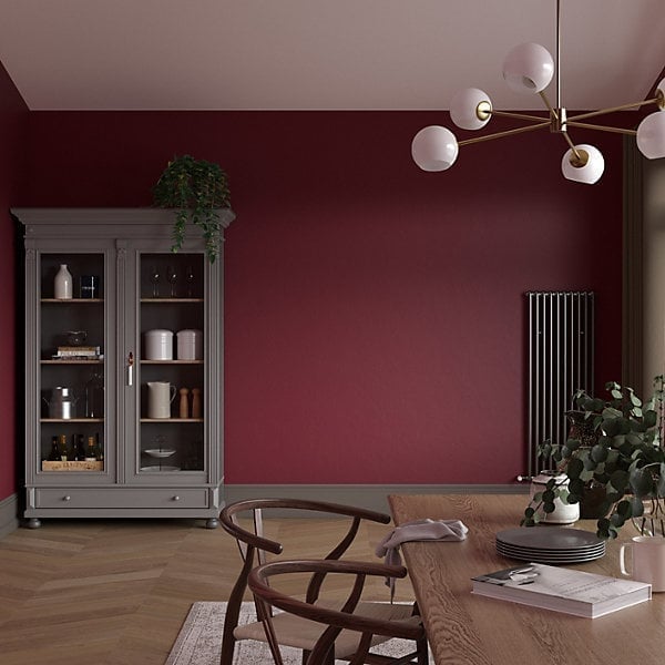
For a dining room that looks modern rather than formal, the palette relies on contrast. The deep red walls set a warm, enclosed tone that a softer neutral like beige or gray would not achieve. A glass-fronted cabinet keeps the look light and functional, while the wooden dining table and chairs introduce natural texture. The modern chandelier adds a clean, metallic line that breaks the warmth. The ratio of red to wood to glass is roughly equal, preventing a period reproduction feel. The balance is key: the red is dominant but the other finishes hold their own.
Bedroom with geometric deep red wall paneling
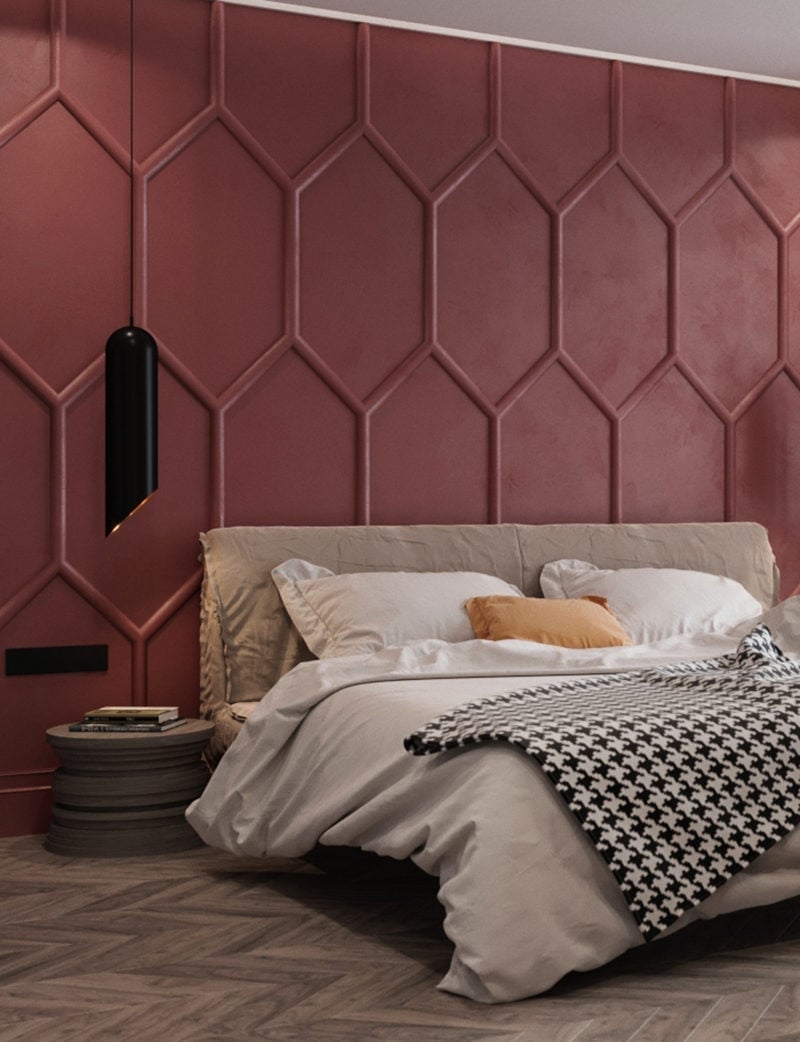
The geometric deep red wall paneling is the hero element here, and it works because the rest of the bedroom stays restrained. The beige bedding and white walls keep the eye on the pattern without competition. A single pendant light hangs centered over the bed, providing focused ambient light. For a renter, this look is achievable with peel-and-stick paneling or a large framed geometric art piece in the same red. The layout is simple: bed centered, bedside table to the left. The palette stays in beige, white, black, and brown, letting the red paneling do the work.
Outdoor scene with a classic red telephone booth

A classic red telephone booth in a snowy garden is a styling variation that looks playful and deliberate. The bright red against the white snow and green trees creates immediate visual interest. This is a hero element approach: the booth stands alone, surrounded by snow-covered trees, with no competing garden decor. The daylight makes the red pop. For a similar effect in your own yard, consider a salvaged phone booth or a bright red garden shed. The style is traditional, but the contrast of red against winter white keeps it fresh. The key is placing it where it can be seen clearly, not tucked behind shrubs.
Marble fireplace between light wood bookshelves
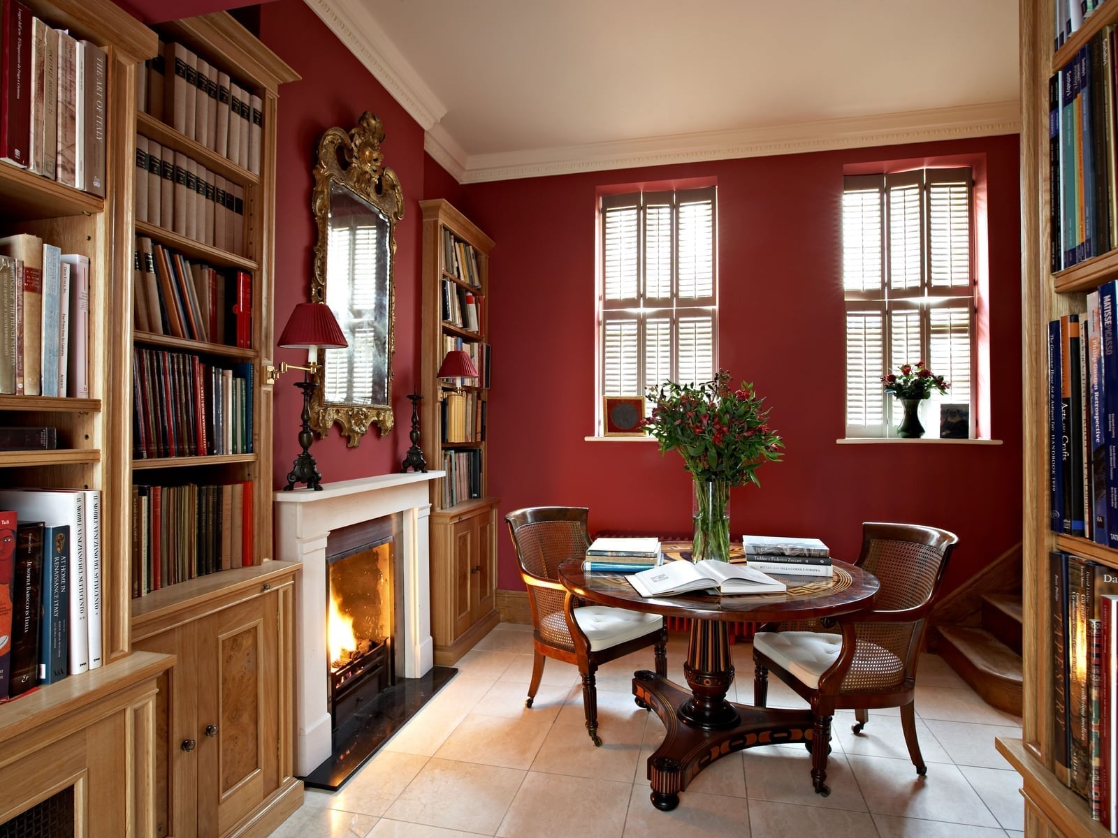
How do you keep deep red walls from feeling dark in a room with bookshelves? The answer is in the palette. The deep red walls are balanced by light wood built-in bookshelves on either side of a marble fireplace. The cream ceiling and natural light from windows keep the room from compressing. The bookshelves themselves become a neutral backdrop for the red, while the marble fireplace and brass details add a touch of formality. A round pedestal table with cane chairs near the windows creates a seating area that invites reading. The layout is symmetrical: bookshelves flank the fireplace, with lamps and fireplace glow providing warm, layered lighting.
Modern farmhouse porch with a vibrant red front door
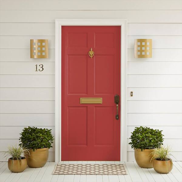
The vibrant red front door is centered on the porch, flanked by potted plants and gold wall sconces. The scale works because the door is the only saturated element against the white porch siding and beige stone tile floor. A doormat anchors the entry without competing. The modern farmhouse style relies on this kind of proportion: one bold color against a neutral backdrop. The gold sconces add a warm metallic accent that ties the red to the brass hardware. For a renter, a red door is a simple paint swap that changes the whole curb appeal.
Deep red wall as a backdrop for still life
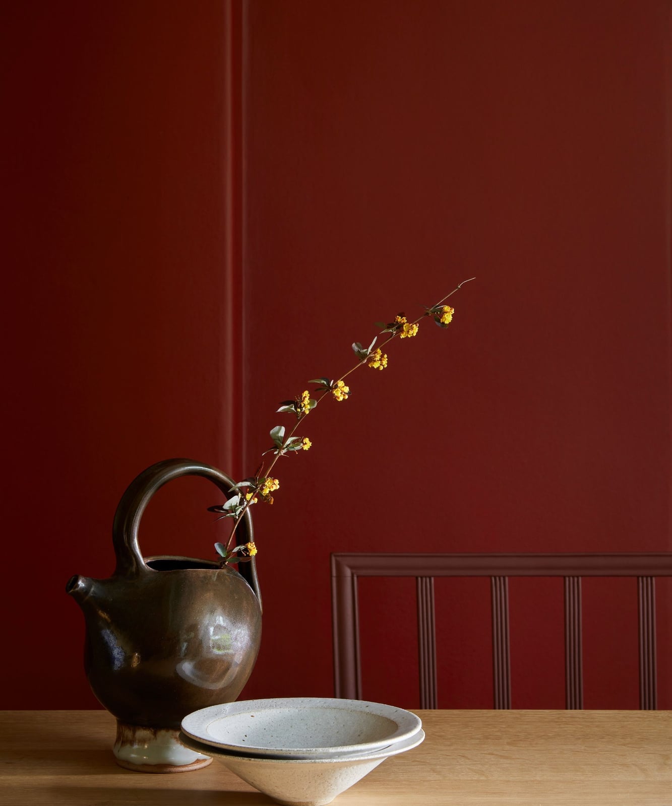
A deep red wall can anchor a still life arrangement without competing for attention. The color acts as a rich, neutral backdrop that makes warm tones like brown, cream, and yellow feel more saturated. In this traditional dining room, a large ceramic jug and two ceramic bowls sit on a wooden table, their earthy textures standing out against the painted surface. Natural light softens the scene, keeping the palette from looking too heavy. The style relies on the ratio of red to the other colors: the wall takes up most of the frame, while the objects add contrast in smaller amounts. What breaks the look is adding too many cool tones, which would fight the warmth of the red.
Eclectic dining room with high-gloss red lacquered walls
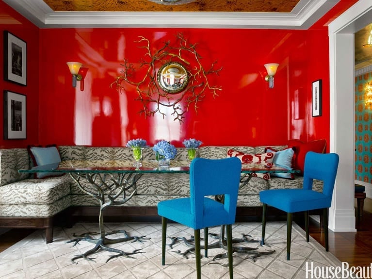
High-gloss red lacquered walls might seem like a maximalist choice, but this eclectic dining room proves they can work with a restrained palette. The sheen adds depth and reflects light from the wall sconces and overhead fixture, making the bright red feel dimensional rather than flat. Blue chairs and a tree-form table base introduce cool contrast, while cream banquette seating and brown wood tones keep the room grounded.
The hero element here is the lacquer finish itself, not just the color. The gloss creates a neat surface that appears deliberate. Glass and metal accents on the table and sconces echo that reflective quality. The style is defined by the balance of shine and matte: the walls are glossy, but the fabric on the banquette and chairs is not. Breaking that balance with another high-shine surface, like a glass table top, would make the room feel busy.
Rustic flat lay with red paint and tools
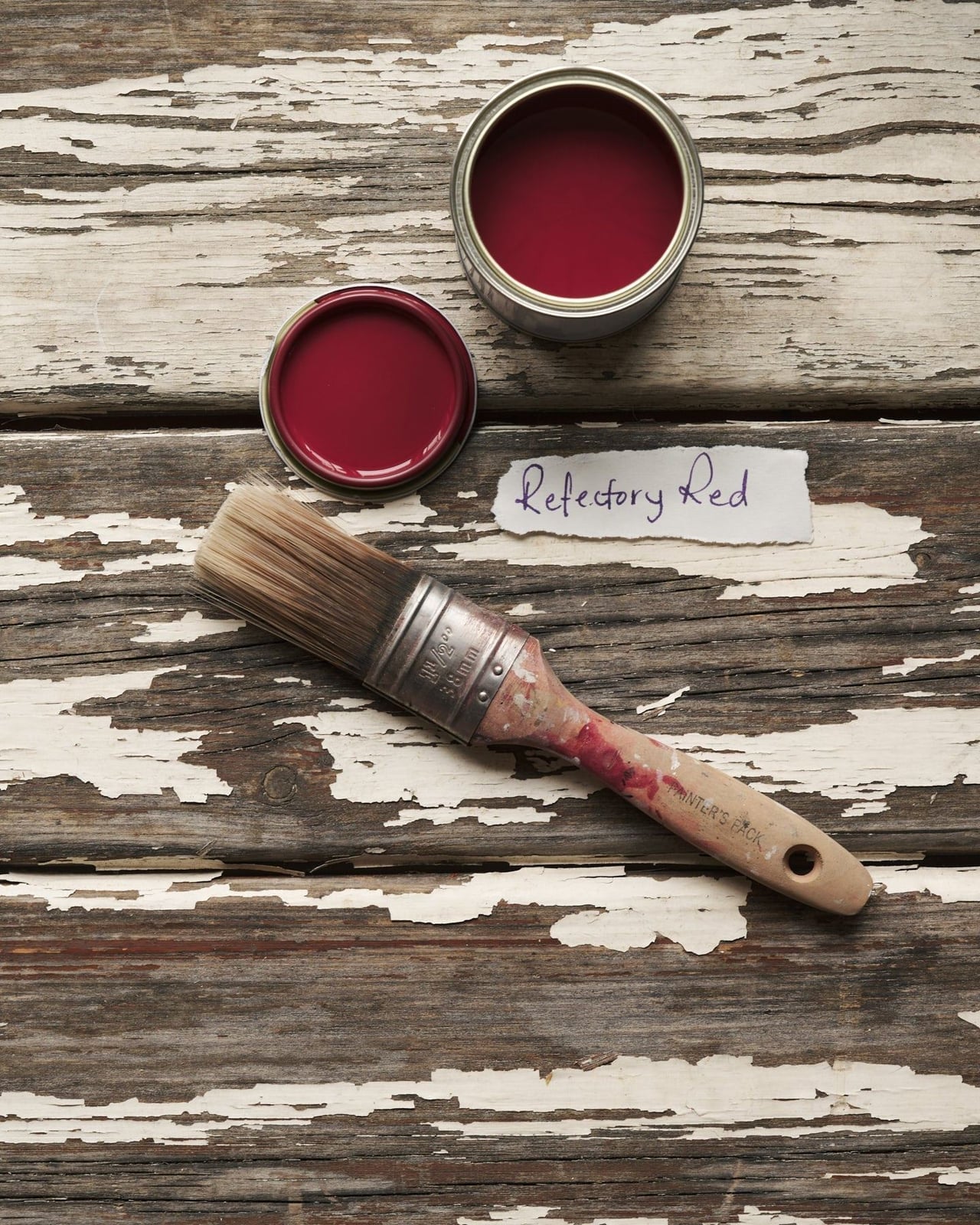
The peeling white paint on the wood surface tells you this is a working setup, not a styled display. An open metal paint can and a paint brush sit in natural daylight, their materials unpolished: wood, metal, and bristles. The red paint in the can is the clear focal point, but the rustic setting keeps it from feeling precious. This style works because the tools themselves have texture and age, which matches the practicality of painting a room.
Gold framed paintings above a dark console
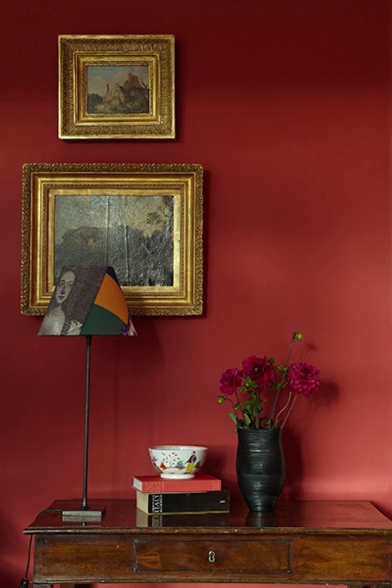
Deep red walls make gold frames pop without effort. In this compact traditional hallway, an antique console table in dark wood holds a table lamp and a vase with flowers, while framed art hangs above. The ambient light from an unseen source keeps the red from feeling flat. The palette here is simple: deep red, gold, and dark wood, with small touches of ceramic and paper from the vase and art. Gold works because it sits on the warm side of the color wheel, sharing undertones with the red wall. A silver frame would look cooler and create visual distance.
Hallway with vibrant coral red walls
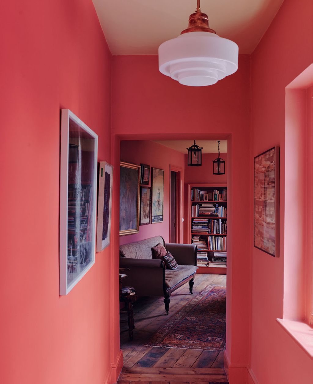
A narrow hallway benefits from a coral red wall color because it adds warmth without making the space feel smaller. The trick is to keep the rest of the palette light. In this traditional hallway, cream tones from a sofa, bookshelf, and rug balance the vibrant walls, while pendant and lantern lights provide both task and ambient illumination.
The hallway opens into an adjoining room, so the coral red acts as a transition color. It is warm enough to feel inviting but not so dark that it shrinks the passage. The storage here is built into the bookshelf, which uses the vertical space without adding bulk. For a renter-safe swap, use removable wallpaper in a similar coral shade on a single wall or the back of a bookshelf to get the color without painting the whole hallway.
Close-up of vibrant red paint in a metal can
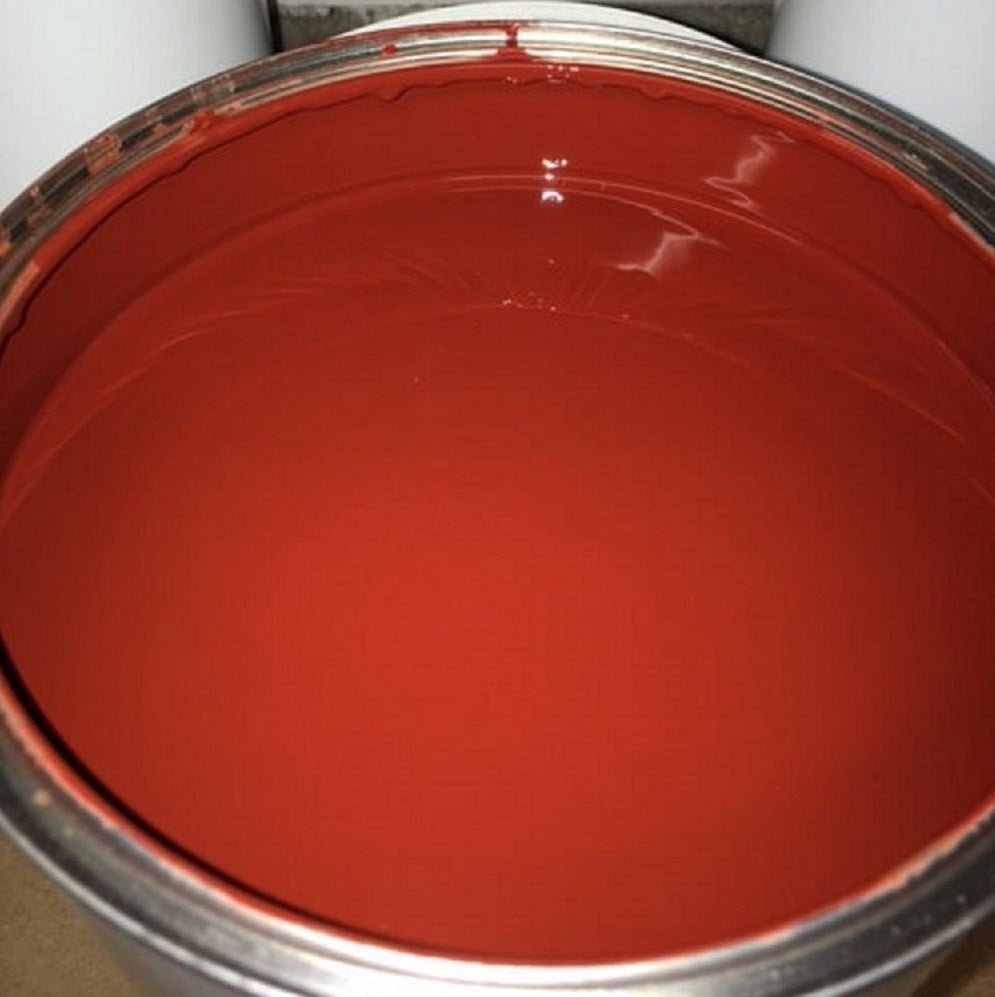
A paint can can be a design element in its own right when the color is this strong. The vibrant red paint inside the metal container becomes the focal point, its glossy finish hinting at what the finished wall might look like. This is a palette-first approach: the red is pure and unbroken, a statement of intent before the brush even touches the wall. The metal can itself, with its utilitarian shape, grounds the intensity. It is a reminder that the simplest container holds the most potent tool for changing a room.
Industrial living room with red accent wall and chair
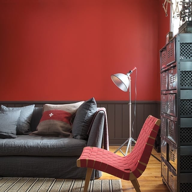
A practical rule for renting with color is to use a large, movable piece as your anchor. Here, a red woven chair does the work of an accent wall, pulling the eye without a permanent commitment. The room looks industrial thanks to the metal storage unit and floor lamp against gray and beige tones. The chair adds warmth to the cool palette of wood, metal, and linen. A renter can swap the chair out or slipcover it later, which is a simpler change than repainting a full wall. The daylight from a nearby window keeps the red from feeling too heavy.
Compact library with vibrant red walls and bookshelves
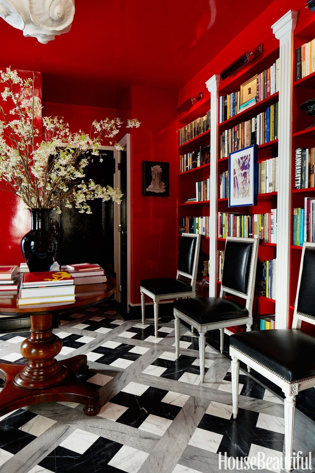
Where a lighter wall might recede, a vibrant red one in a compact library makes the space feel intimate. This room uses a single strong color for both the walls and the built-in bookshelves, which unifies the small footprint. The palette is red, black, white, gray, and wood tones, with red as the dominant hue. Marble and leather add a traditional weight, while paper from the books provides a natural texture break.
An overhead light fixture and daylight from a doorway prevent the room from being too dark. The two upholstered chairs face inward around a round table, creating a conversation area that feels purposeful. The red is the constant, but the materials, marble, leather, wood, prevent it from being one-note.
Rattan accents create a vibrant inviting space
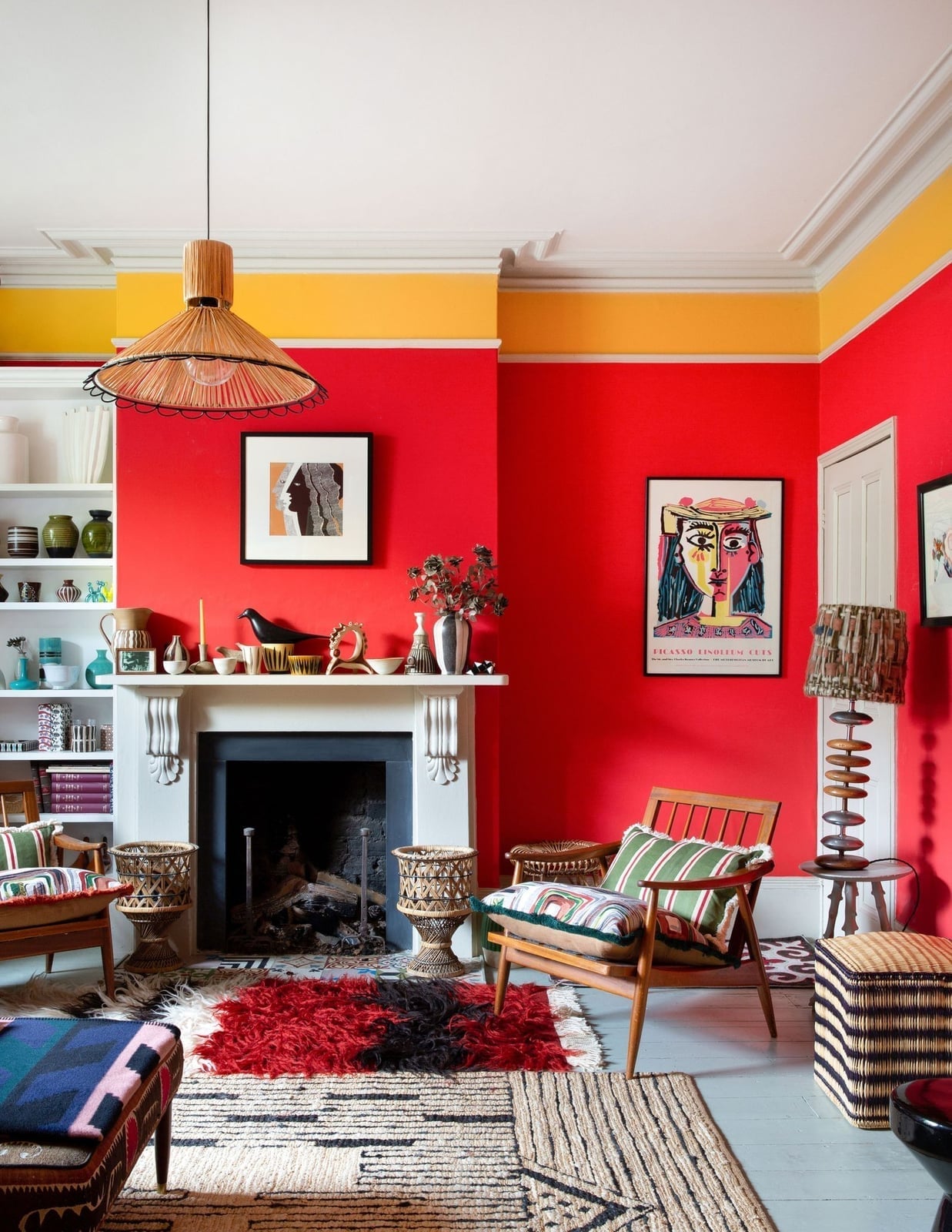
The red walls in this eclectic living room are the hero, but the rattan chairs and ottoman make the space feel approachable. The palette pairs vibrant red with yellow, green, and natural wood, creating a collected look. The fireplace anchors the seating arrangement, with a pendant light and table lamp providing warm, layered light. This style balances saturated color with natural texture: the red walls cover most of the visual field, while the rattan, wood, and tile materials break up the intensity. The jute rugs add a neutral base that tones down the heat.
Patterned sofa against richly colored walls
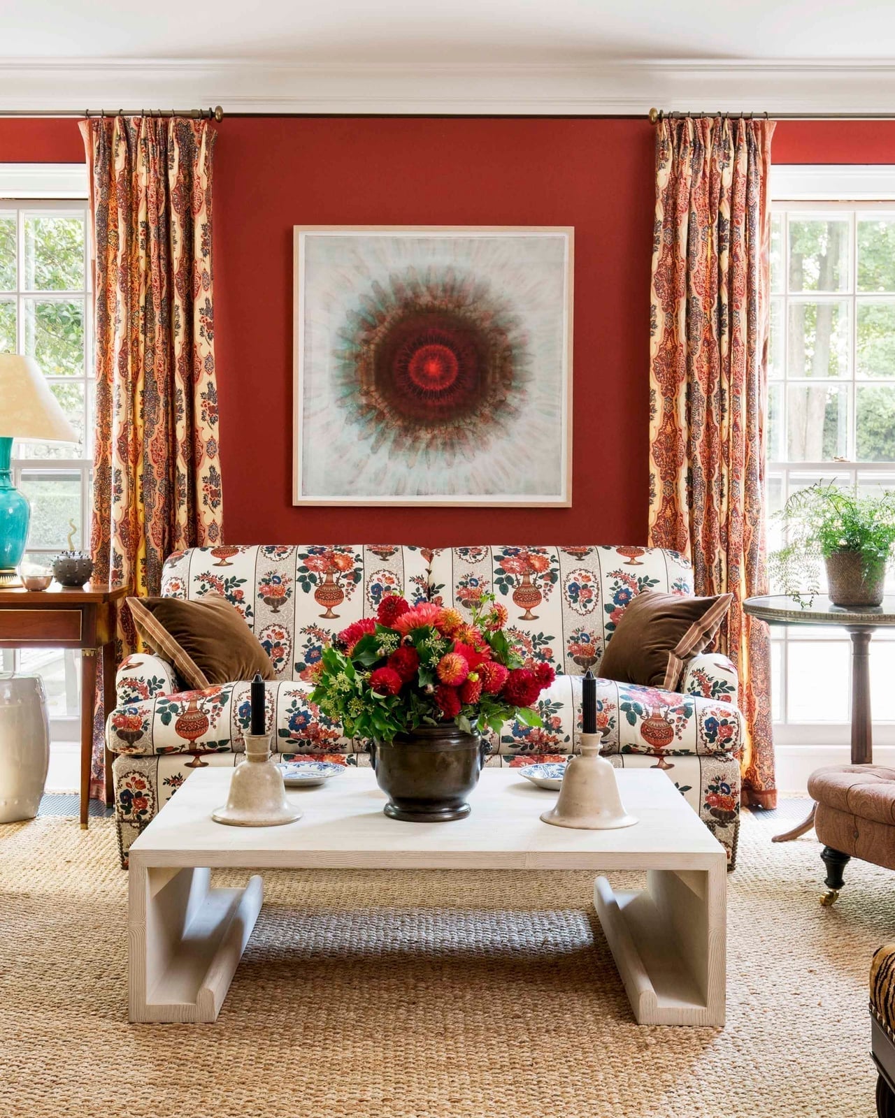
A patterned sofa against deep red walls could compete, but here the floral fabric and the wall color look complementary rather than chaotic. The sofa is the hero element, centered on the wall with a white coffee table in front. The palette stays in the red, neutral, and floral tones, with a rug that grounds the seating area without adding more pattern. Natural light from windows and a table lamp keep the room bright, so the red walls feel warm rather than heavy. What defines this style is the contrast between the bold wall color and the busy upholstery: the red is a solid backdrop, and the floral pattern becomes the detail that gives the room character.
Traditional living room with a vibrant red sectional sofa
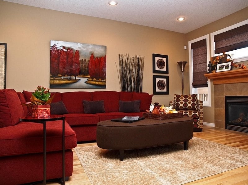
A red sectional sofa works best when the room around it stays neutral. Here, tan walls and a wood floor let the red fabric look a deliberate piece, not an accident. The sofa faces a fireplace, with a patterned armchair nearby for contrast.
An oval ottoman centers the seating area, keeping the layout open. Recessed ceiling lights and a floor lamp add even light, so the red stays rich without turning harsh. This is a room built around one strong color, letting the sofa do the talking.
Flat lay of red paint samples and tools, indoor
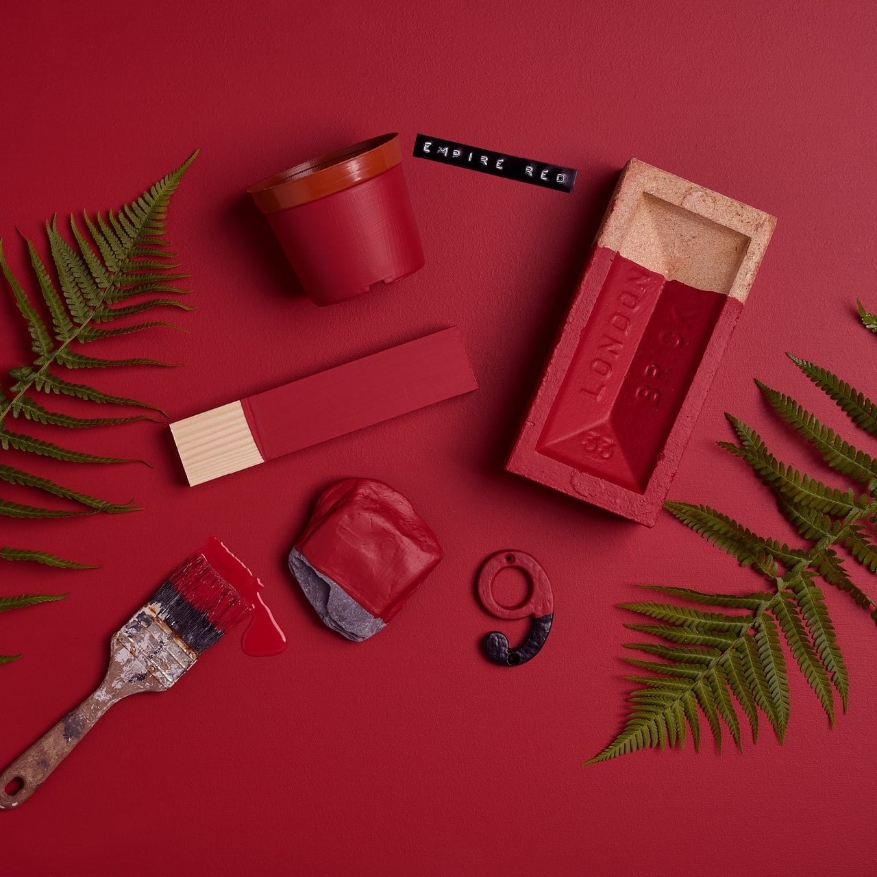
Red paint samples here sit beside a brush with dripping red paint, a green planter, and a brick mold. The flat lay includes wood tones, gray, and black, showing how red works with earthy and neutral partners. A number 9 tag adds a studio feel. This arrangement proves that paint swatches are not just for walls. They can guide a whole palette before you open a can.
Cozy living room with vibrant red paneled walls
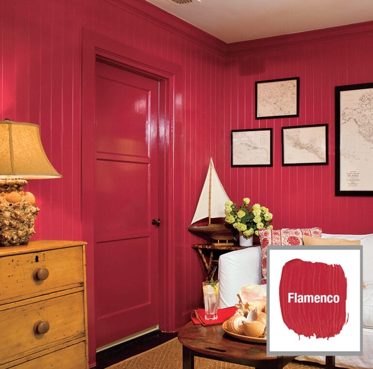
A compact living room with red paneled walls feels grounded when natural materials balance the color. A wooden dresser and a white sofa keep the red from overwhelming the space. A sailboat model and framed maps add personal character without competing. A table lamp provides warm light, softening the red into a cozy backdrop. The corner layout lets the wall color act as an accent, not a full-room commitment.
Traditional vignette with a bright red spindle chair
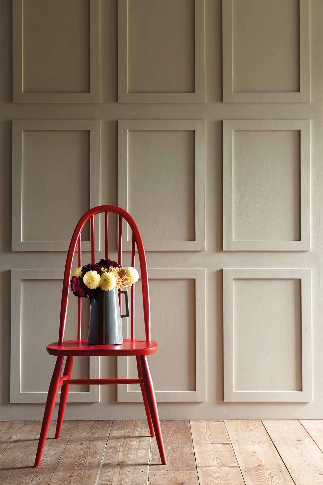
A bright red spindle chair could feel too formal, but here it sits against a beige paneled wall, with a gray pitcher and yellow flowers nearby. The daylight from a nearby window keeps the red from looking heavy. The chair becomes the focal point without demanding attention, the neutral wall and simple decor let the color speak for itself. This setup works for a compact hallway where a single bold piece can define the space.
White fireplace warms the red paneled room
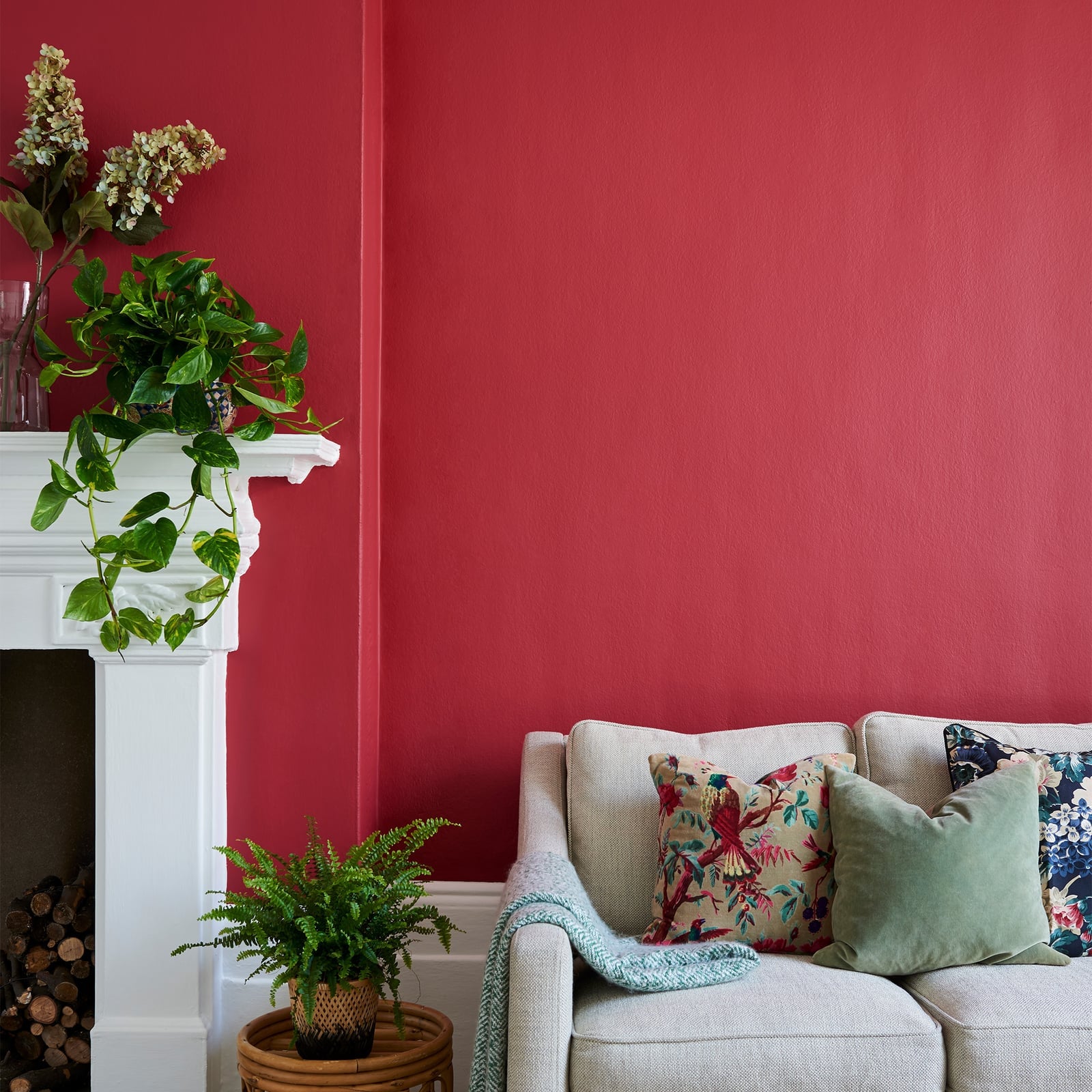
A white fireplace breaks up red paneled walls, keeping the room from feeling too dark. A sofa sits against the wall, with potted plants in wicker baskets adding green and beige. Daylight from a window softens the red, making the space feel lived-in rather than staged. The compact layout uses the fireplace as a visual anchor, so the bold walls stay inviting.
Traditional hallway with a vibrant red paneled front door
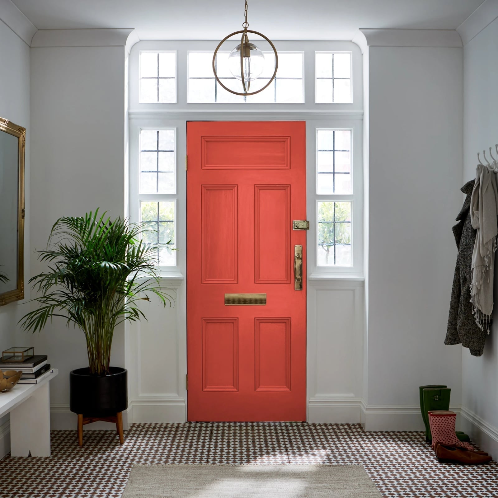
In this traditional hallway, the vibrant red paneled door becomes the focal point, with a wooden bench on the left and a coat rack on the right. The palette of red, white, brown, gold, and green keeps the look grounded without competing for attention. A pendant light and windows make the door feel welcoming. The traditional style here is defined by the door’s classic paneling and the simple bench. What breaks the formality? The potted plant and the gentle brass details. For a renter, swapping a door color is a big commitment, but a removable high-quality film or a temporary door wrap can give the same pop without painting the wood.
Ornate lantern hangs above tiled fireplace
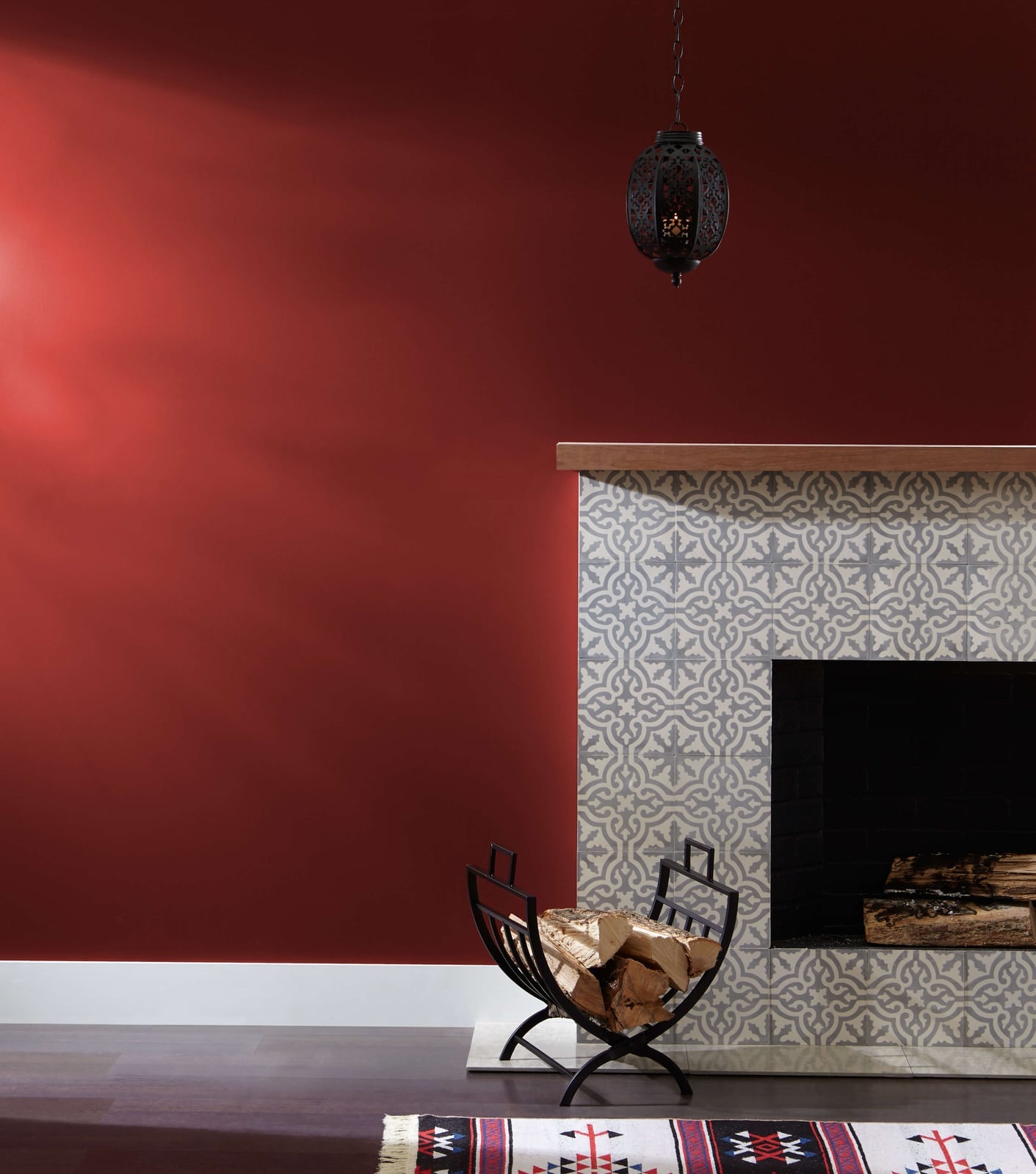
A practical rule for decorating with deep red walls: let the fireplace anchor the room, and use lighting to keep the color from feeling heavy. This eclectic living room centers on a tiled fireplace, with an ornate lantern hanging overhead. The deep red painted wall extends across the room, but the gray, white, black, and wood tones in the tile, brick, log holder, and patterned rug balance the intensity. Daylight helps too, softening the red so it looks rich rather than dark. The eclectic style here comes from mixing the ornate metal lantern with the rustic log holder and the patterned rug. What breaks the traditional feel? The modern tile work and the casual wood accents. If you rent, this setup works well because the red is only on the wall, not on the fireplace or built-ins. You can repaint the wall when you move out without touching the tile or the lantern.
Mid-century modern patio with vibrant red chairs and wall
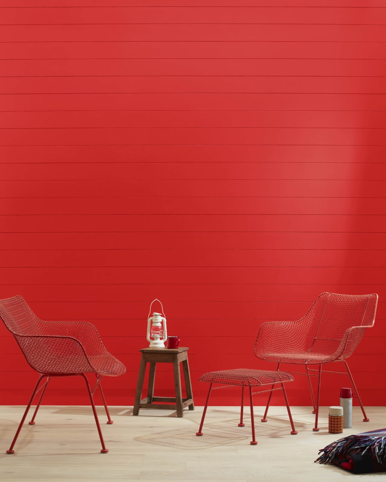
A concrete fact about this patio: the vibrant red wall and matching wire mesh chairs create a strong color story that ties the whole outdoor space together. The mid-century modern style is clear from the clean lines of the metal chairs and the simple wooden stool. A side table and an ottoman complete the seating arrangement, while a lantern adds a soft touch. The bright red is balanced by wood tones, white accents, and plaid fabric on the stool. What defines this look? The ratio of red to neutral is roughly half and half, so the color feels intentional without overwhelming. What breaks the mid-century feel? The plaid pattern introduces a slightly rustic note. For an outdoor space like this, check your USDA zone for plant choices near the wall, and consider a UV-resistant paint for the red wall to keep it from fading in direct daylight.
High gloss red floor and walls gleam
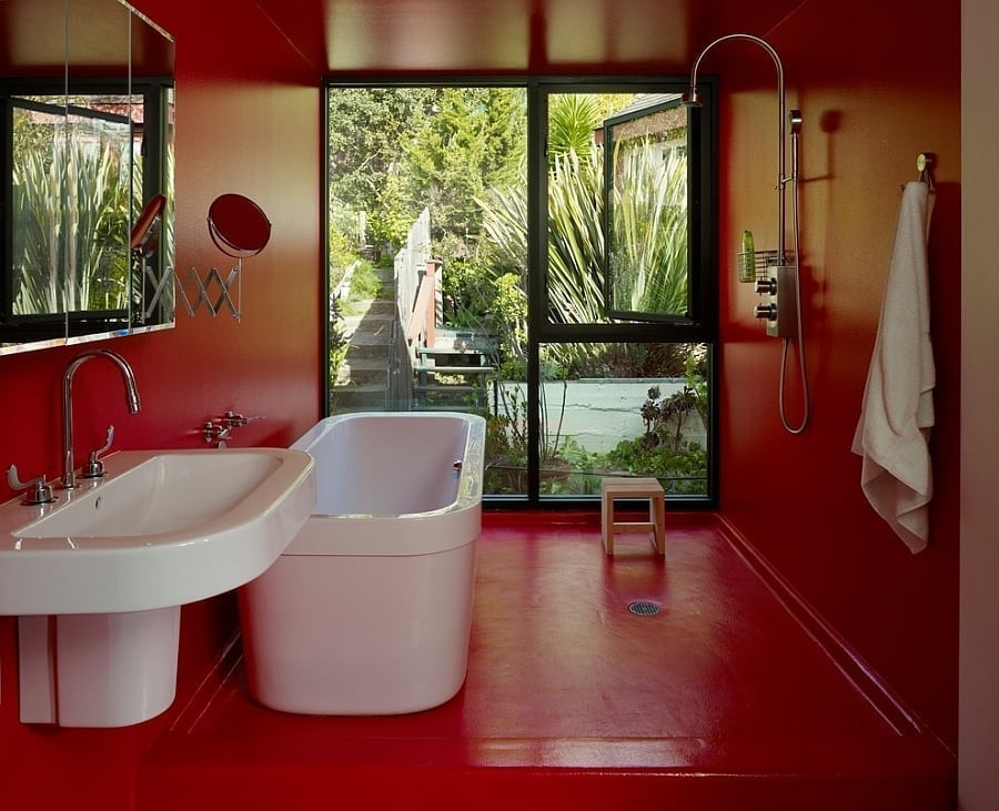
A precise observation about this bathroom: the high-gloss red paint on both the walls and the floor creates a smooth, almost monochromatic look that makes the space feel larger. White fixtures, including a freestanding bathtub and a pedestal sink, stand out against the vibrant red. Chrome fixtures and green plants add contrast and a touch of freshness. Daylight from a window prevents the room from feeling too enclosed. The modern style is defined by the open plan layout, with fixtures placed along the walls. What breaks the sleekness? The wooden stool introduces a warm, organic element. For durability in a bathroom, high-gloss paint resists moisture and wipes clean easily. But painting a floor requires careful prep and a durable floor paint, not standard wall paint. A renter might opt for a large red bath mat or a red shower curtain to mimic the look without committing to paint.
Pomegranates and melon on weathered crates
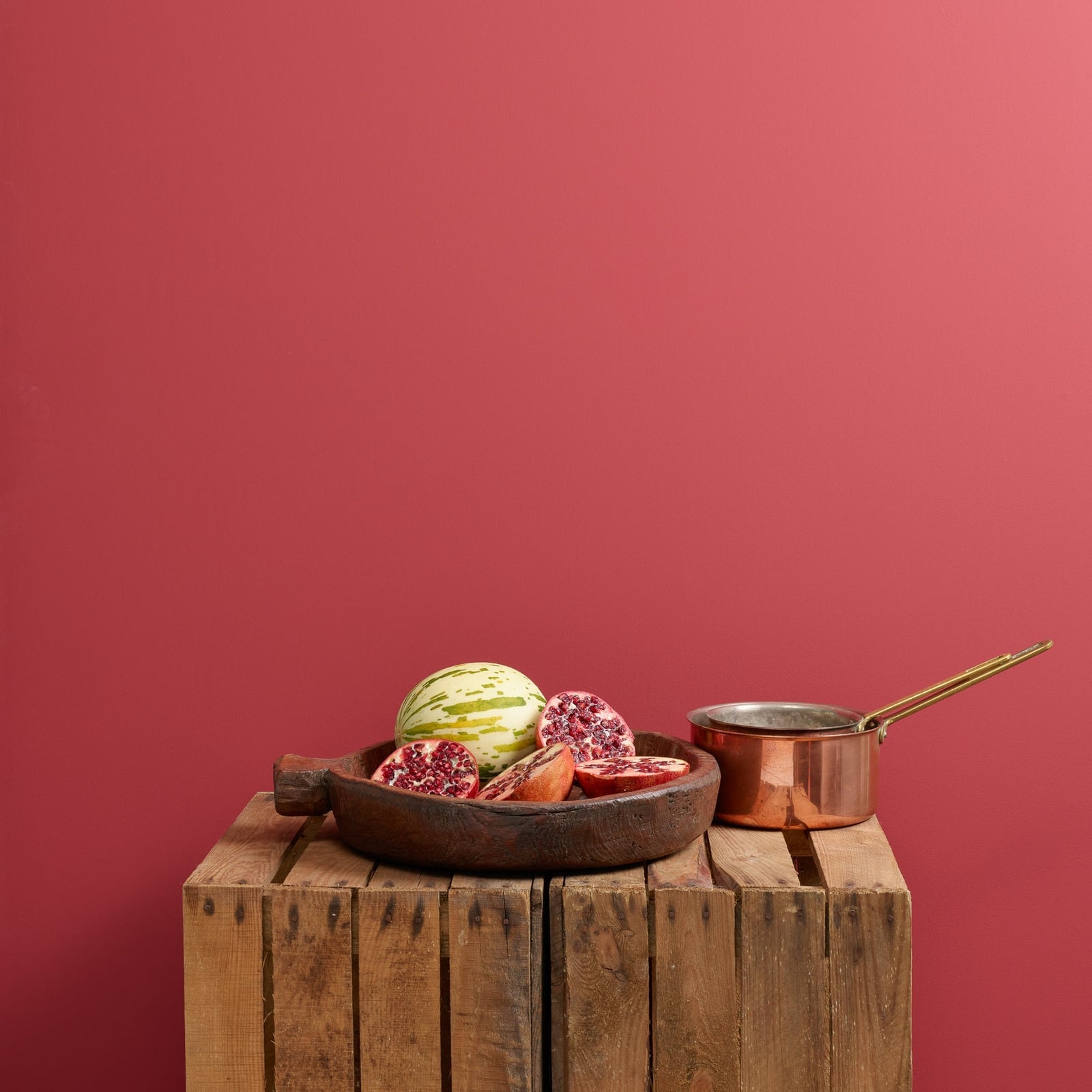
Instead of a traditional centerpiece, this rustic vignette uses a fruit display as the hero element against a vibrant red wall. The arrangement of pomegranates and melon sits on weathered wooden crates, with a wooden bowl and a copper pot adding texture and warmth. The red, green, white, brown, and copper palette feels natural and earthy. The soft ambient light makes the fruit look ripe and inviting without harsh shadows. The weathered wood and simple, unpolished presentation define the rustic style. What breaks the rustic feel? The bright red wall adds a modern punch that keeps the scene from looking antique. Use seasonal fruit in a wooden bowl on a crate or a simple shelf. The red wall acts as a backdrop that makes the green and copper pop, so the whole display feels deliberate. Check your climate for how long fresh fruit will last in this setup.
Bold red cabinetry brightens the kitchen
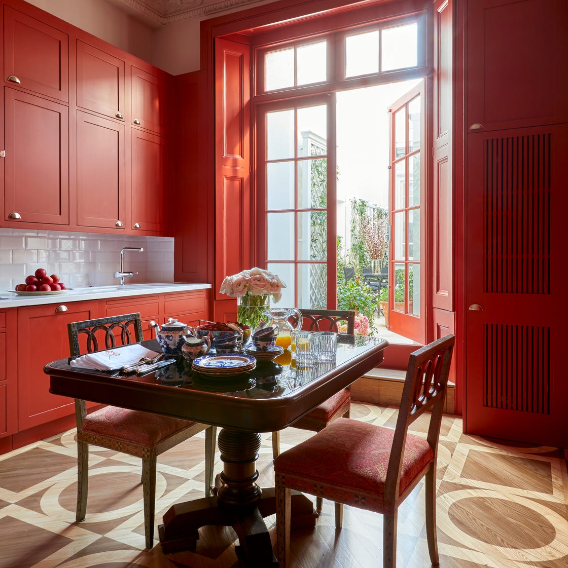
Red painted cabinetry wraps this compact kitchen in warmth, turning the dining zone into the natural focal point. A pedestal table in front of a large window keeps the layout open, with upholstered chairs adding softness against the wood and tile finishes. The white countertops and backsplash stop the red from feeling heavy, while daylight keeps the space airy. A single saturated color on cabinetry works best when you let the rest of the room stay neutral, so the red acts as an accent.
Foosball table adds playful element
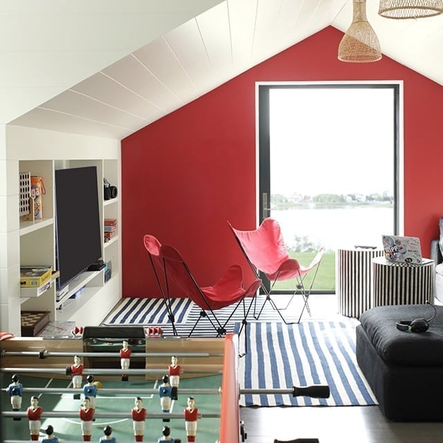
The palette here is a direct hit: a vibrant red accent wall anchors the room, while white, blue, and black keep the energy high without chaos. Butterfly chairs and a foosball table bring a casual, game-room feel, and the striped side tables echo the wall color just enough to tie it together. The ratio of red to the other colors is key. The red covers one wall, leaving the surrounding area in lighter tones, so the space stays playful without looking too intense. Pendant lights and daylight from the window keep the palette grounded, and the wicker chair adds a natural break from all the bold solids.
Bedroom with red paneled walls and gingham curtain
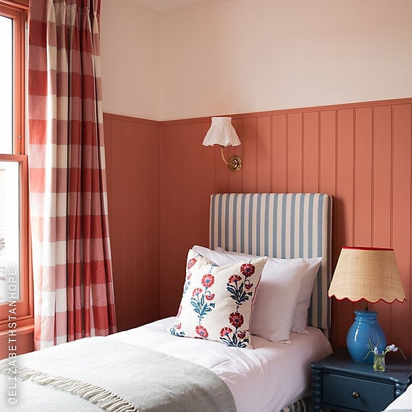
This bedroom could have gone full colonial with the red paneling, but a gingham curtain and a floral pillow steer it toward something lighter. The palette of red, white, blue, and cream keeps the room traditional without feeling stuffy. The striped headboard echoes the vertical lines of the paneling, while the scalloped lamp and brass accents add a touch of polish. The wicker basket at the bedside breaks up all the wood and fabric with a natural texture. The second paragraph here is about balance: the red on the walls is bold, but the white trim and cream bedding keep it from overwhelming the small space. A table lamp and wall sconce provide layered light, so the room feels cozy rather than stark.
Eclectic hallway with high-gloss red walls and ceiling
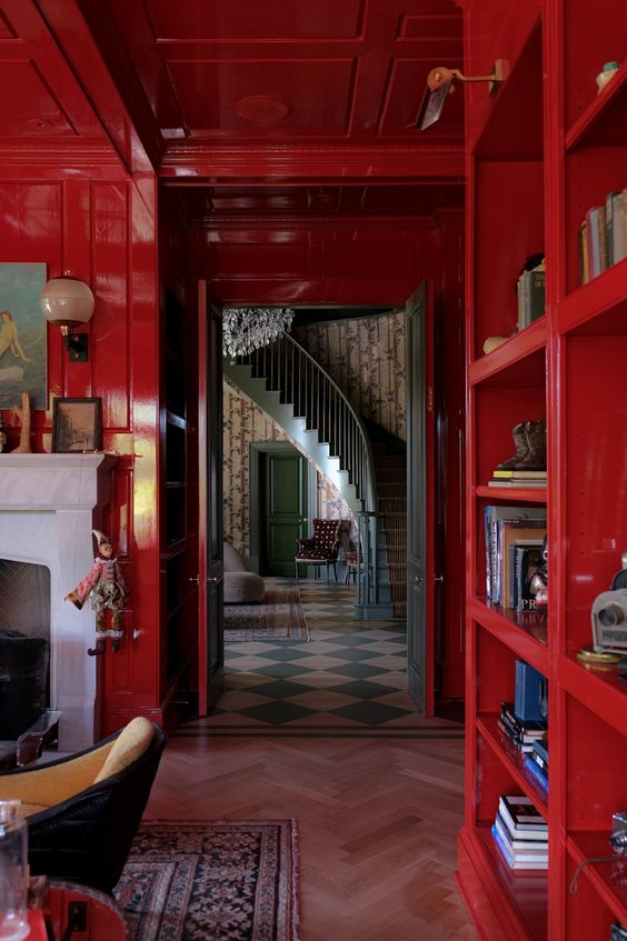
High-gloss red lacquer on both walls and ceiling turns this hallway into a jewel box, but the finish matters more than the color. The gloss reflects light from a wall sconce and overhead fixture, creating reflections that make the space feel larger. Bookshelves on one side and a fireplace with an armchair add function to what could be a pass-through. A high-gloss finish on a bold color works best when you have enough light sources to bounce around, so the shine looks planned.
Traditional living room with deep red walls and fireplace
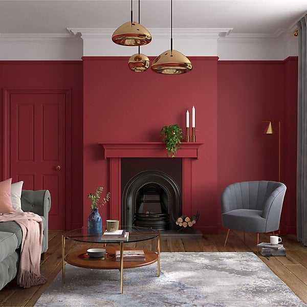
Deep red walls in a traditional living room can feel heavy, but this space keeps it balanced with a central fireplace, a gray sofa, and plenty of daylight. The seating is arranged around a coffee table, with an armchair adding a second conversational spot. Pendant lights and a floor lamp provide warm, layered lighting that softens the red. The principle here is that a deep wall color needs contrast in the furniture and light layers to avoid looking a cave. Gold and blue accents in the decor add small moments of brightness, while the white trim around the fireplace breaks up the red at eye level.
Final Thoughts
Red paint in 2027 is not about drama for its own sake. These 35 looks show it works best when it has a job to do: grounding a hallway, waking up a kitchen, or framing a view. Start small if you are unsure. A front door or a single wall gives you the color without the commitment. Keep the rest of the room simple so the red has room to breathe. That is the whole trick. Red is a tool, not a personality. Use it that way and it will never feel like too much.